- What is a grid system in UI design?
- What comprises the anatomy of a Grid system?
- Fixed vs. Fluid vs. Hybrid Layouts: Which should you choose?
- How do you establish Vertical Rhythm?
- How to handle Responsive Breakpoints and Adaptation?
- What is a Masonry Layout?
- Best Practices for Developer Handoff
- Grid Systems key takeaways
- What is the difference between a grid and a layout?
- How do I choose the right column width?
- What is the purpose of a gutter in UI design?
- Can I mix a 12-column grid with an 8pt grid?
- Why do designers use 4 columns for mobile?
- What is a modular grid?
- Do I always need to stick to the grid?
- What is the difference between CSS Grid and Flexbox?
- How do I handle grids in Figma or Sketch?
- What is a baseline grid?
- Should margins be fixed or fluid?
- How do grids help with accessibility?
- What is a hierarchical grid?
- How does the grid affect typography?
- Is the Golden Ratio related to grid systems?
- Grid Systems key takeaways
- External Resources
What is a grid system in UI design?
A Grid System is a structural framework used in User Interface Design to arrange content. It utilizes a series of intersecting vertical and horizontal lines (columns and rows) to guide the placement of elements. This ensures visual consistency, precise alignment, and scalable responsiveness across different screen sizes.
Does your design feel chaotic? Are you constantly shifting elements by one or two pixels, hoping they “feel” right? This is the symptom of designing without a structure. Without a mathematical foundation, User Interface Design becomes a game of guesswork, leading to inconsistent products and frustrated developers. The solution lies in mastering the invisible framework that holds the web together.
By implementing a robust framework, you move away from arbitrary decisions. In this guide, we will cover the industry-standard 12-column grid, the precision of the 8pt grid system, and how to handle a fluid layout. We will explore CSS grid compatibility for easier handoff, the importance of baseline alignment, and how to manipulate gutters and margins. Whether you are building a complex dashboard or a masonry layout portfolio, understanding responsive breakpoints is non-negotiable.
Let’s structure your workflow.
What comprises the anatomy of a Grid system?
Before diving into complex layouts, we must define the core entities. A grid is not just lines; it is a relationship between space and content.
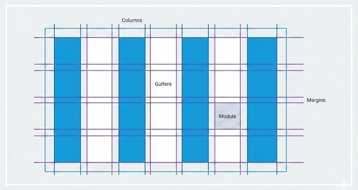
- Columns: These are the vertical blocks where your content lives. In a standard 12-column grid, the column width determines how much horizontal space an element occupies.
- Gutters: The empty space between columns. Gutters and margins provide breathing room. If your content feels cramped, your gutters are likely too narrow. [Internal Link: White Space Mastery]
- Margins: The outside edges of your grid. These separate the main content area from the edges of the viewport.
- Modules: The intersection of columns and rows creates modules, the building blocks of your design structure.
Why is the 12-Column Grid the Industry Standard?
You will frequently encounter the 12-column grid system in web design. But why 12?
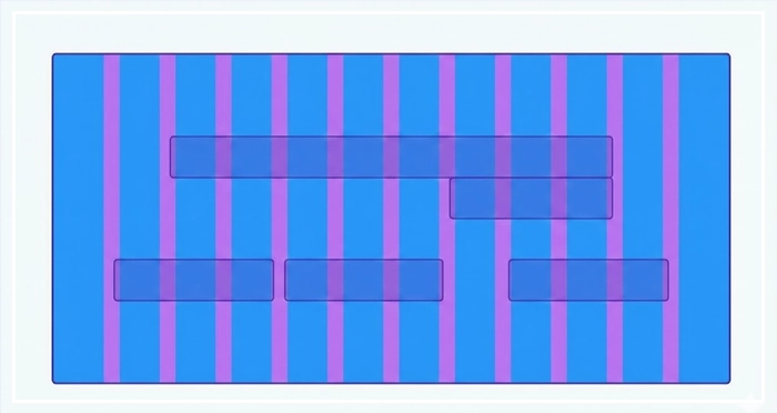
The number 12 is highly composite. It can be divided evenly by 1, 2, 3, 4, 6, and 12. This mathematical flexibility allows designers to create halves, thirds, quarters, or sixths easily without dealing with half-pixels.
According to Bootstrap’s documentation—one of the world’s most popular front-end frameworks—the 12-column system is the default because it accommodates the widest variety of layout requirements while maintaining CSS grid compatibility.
When you need an asymmetrical layout, you might span content across 8 columns and use the remaining 4 for a sidebar. This flexibility is vital for establishing a clear [Visual Hierarchy in UI].
How does the 8pt Grid System improve consistency?
For product designers, the 8pt grid system is the gold standard for sizing and spacing.
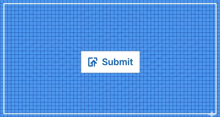
The principle is simple: use multiples of 8 (8, 16, 24, 32, 40, etc.) to define dimensions, padding, and margins.
- Hard Grid: Elements are placed on a strictly defined background grid of 8px squares.
- Soft Grid: Elements are spaced relative to one another using 8px increments, but not necessarily locked to a background grid.
Why 8? Most modern screen resolutions are divisible by 8. Using this system ensures that your designs render crisply on standard devices (@1x) and high-density Retina displays (@2x, @3x) without anti-aliasing artifacts. This creates a predictable rhythm that developers love during handoff. [Internal Link: Design Systems 101]
Fixed vs. Fluid vs. Hybrid Layouts: Which should you choose?
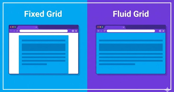
Choosing the right behavior for your Grid Systems depends on your product goals.
| Layout Type | Behavior | Best Used For |
| Fixed Grid | Container width remains constant until a breakpoint is hit. Margins automatically adjust. | Traditional websites where content width control is prioritized over full-width immersion. |
| Fluid Grid | Columns and gutters scale as percentages of the viewport. The content stretches continuously. | Modern apps and dashboards requiring 100% screen real estate usage. |
| Hybrid Grid | A mix of both. For example, a fluid main content area with a fixed-width sidebar. | Complex web applications (SaaS) and blogs with advertising sidebars. |
How do you establish Vertical Rhythm?
While columns handle horizontal spacing, Vertical Rhythm handles the flow down the page. This is largely dictated by Baseline Alignment.
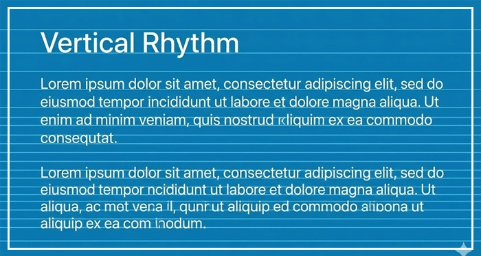
Your text should sit on a baseline grid (often 4px or 8px). If your body text has a line height of 24px and your heading has a line height of 32px, both are multiples of 4. This ensures that as the eye scans down the page, the spacing feels harmonious.
Misaligned vertical rhythm is a subtle error that makes a design feel “off” or cluttered. Proper usage of [Typography Scales] is essential here to ensure your font sizes and line heights mathematically align with your grid.
How to handle Responsive Breakpoints and Adaptation?
Grid Systems are not static. They must adapt to the device. This is where Responsive Breakpoints come in.
A breakpoint is a specific viewport width (e.g., 768px for tablets, 1024px for desktops) where the layout shifts.
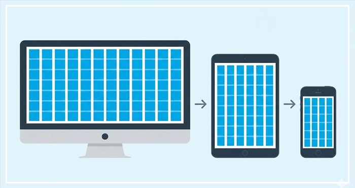
- Desktop: Usually 12 columns.
- Tablet: Often reduces to 8 columns.
- Mobile: Collapses to 4 columns.
Google’s Material Design guidelines emphasize that layouts should be “adaptive,” meaning the grid architecture changes at specific breakpoints to serve the user best, rather than just shrinking content until it breaks.
When designing for mobile, you aren’t just squishing the desktop grid. You are reflowing content. For a deeper dive into this behavior, check our [Internal Link: Responsive Web Design Guide].
What is a Masonry Layout?
Sometimes, rows don’t need to be uniform. A Masonry Layout (popularized by Pinterest) places elements in optimal vertical spaces based on available vertical height, rather than strict row adherence.
While this breaks the traditional “row” structure, it still adheres to column widths and gutter consistency. It is highly effective for image-heavy feeds but requires careful planning regarding [Internal Link: CSS Flexbox Guide] or CSS Grid implementation.
Best Practices for Developer Handoff
The ultimate test of your grid is whether a developer can code it.
- Define your constraints: clearly document the total width, number of columns, gutter width, and margin width.
- Stick to the logic: Don’t break the grid “just because.” If you break the grid, have a specific reason (like a full-bleed image).
- Use tokens: Name your spacing units (e.g.,
spacing-md= 16px).
Clear communication prevents “pixel-pushing” during the coding phase. Always refer to your [Internal Link: Developer Handoff Checklist] before finalizing your design files.
Grid Systems key takeaways
- Grid Systems provide the mathematical structure necessary for scalable User Interface Design.
- The 12-column grid is the industry standard due to its divisibility and flexibility.
- Use the 8pt grid system to ensure crisp rendering on all screen densities.
- Fluid layouts use percentages to fill the screen, while Fixed layouts use static pixel widths.
- Vertical rhythm is achieved through consistent baseline alignment and typography line heights.
- Responsive breakpoints should alter the number of columns (e.g., 12 for desktop, 4 for mobile).
What is the difference between a grid and a layout?
A grid is the underlying structure (lines and guides), while the layout is the actual arrangement of design elements (images, text, buttons) placed upon that grid.
How do I choose the right column width?
Column width should be determined by your total container width minus the gutters and margins. In fluid grids, this is a percentage; in fixed grids, it is a pixel value.
What is the purpose of a gutter in UI design?
Gutters provide white space between columns to separate content. They prevent elements from blurring together and improve readability.
Can I mix a 12-column grid with an 8pt grid?
Yes. The 12-column grid handles horizontal layout (width), while the 8pt grid usually handles spacing, padding, and vertical rhythm. They work best when used together.
Why do designers use 4 columns for mobile?
Mobile screens are narrow. A 12-column grid on a phone creates columns that are too thin to be useful. 4 columns provide enough flexibility for simple layouts without clutter.
What is a modular grid?
A modular grid adds horizontal rows to the vertical columns, creating a matrix of “modules.” It is useful for complex data visualization or magazine-style layouts.
Do I always need to stick to the grid?
No. You can break the grid intentionally for visual impact or emphasis, but you should master the grid before you break it to ensure it looks intentional, not accidental.
What is the difference between CSS Grid and Flexbox?
CSS Grid is a 2-dimensional layout system (rows and columns), while Flexbox is 1-dimensional (rows OR columns). [Internal Link: CSS Flexbox Guide] explains this in detail.
How do I handle grids in Figma or Sketch?
Most design tools have built-in “Layout Grid” features. You can define count, color, type (stretch/center), width, and gutter settings in the property panel.
What is a baseline grid?
A baseline grid is a series of horizontal lines (usually spaced 4px or 8px apart) used to align the bottom of text lines, ensuring vertical harmony.
Should margins be fixed or fluid?
Margins can be fixed (e.g., always 24px) or fluid (increasing as the screen gets wider). Fluid margins are often used to constrain content on ultra-wide monitors.
How do grids help with accessibility?
Grids create a predictable reading order and logical structure, which aids screen readers and helps users with cognitive disabilities navigate content more easily.
What is a hierarchical grid?
A hierarchical grid is an intuitive placement of elements based on importance rather than a strict uniform structure. It is often used in web design where content varies greatly.
How does the grid affect typography?
The grid dictates the measure (line length) of your text. For optimal readability, text blocks should generally span 4-6 columns, not the full width of a 12-column wide monitor.
Is the Golden Ratio related to grid systems?
Yes. Designers often use the Golden Ratio (1.618) to determine the proportional relationship between column widths and content areas to create naturally pleasing compositions.
External Resources
Here are 3 credible sources to further explore this topic:
- Material Design (Google) – Responsive Layout Grid
- MDN Web Docs (Mozilla) – CSS Grid Layout
- Bootstrap – Grid System Documentation


