- Typography Secrets: Boosting UI Readability
- What is the role of typography in UI design?
- How does Typography dictate User Experience?
- Why is Line Height (Leading) Critical for Readability?
- What is the Ideal Line Length for Reading?
- How do you Master Typography Hierarchy?
- Why should you use a Modular Scale?
- What is Vertical Rhythm in UI?
- Best Practices for Font Pairing in Typography
- Variable Fonts vs. Web Safe Fonts
- Serif vs. Sans-Serif: When to use which?
- How does Contrast affect Accessibility?
- 1. What is the best font size for mobile UI design?
- 2. How many different fonts should I use in one interface?
- 3. Why is tracking (letter-spacing) important in UI?
- 4. What is the difference between kerning and tracking?
- 5. Are serif fonts bad for web accessibility?
- 6. What is a "measure" in typography terms?
- 7. How do variable fonts improve website performance?
- 8. What is the 8pt grid system in UI typography?
- 9. Can I use system fonts for a professional UI?
- 10. How do I test my typography for accessibility?
- 11. What is the optimal paragraph length for UI?
- 12. Should I justify text in web design?
- 13. What is a typographic baseline?
- 14. How does font weight affect user attention?
- 15. What are display fonts and when should I use them?
- External Resources
Typography Secrets: Boosting UI Readability
Typography is not just about choosing pretty fonts. It is a mathematical and artistic discipline involving modular scale, line height (leading), and rigorous font pairing guides. Unlock the secrets of UI typography for superior readability. Master font pairing, hierarchy, and vertical rhythm to elevate your interface design today.
A beautiful interface that nobody can read is a failed product. In the fast-paced world of User Interface Design, aesthetics often overshadow the workhorse of the web: text. Yet, text makes up over 90% of the internet. If you fail to master the nuances of a typographic hierarchy or ignore the cadence of vertical rhythm, your users will bounce.
What is the role of typography in UI design?
Typography in UI design is the strategic arrangement of type to make written language legible, readable, and appealing when displayed. It functions as a primary interface tool to establish hierarchy, guide user attention, convey brand personality, and ensure accessibility across different devices and screen sizes.
Whether you are debating serif vs sans-serif usage, implementing modern variable fonts, or sticking to web safe fonts for performance, the goal remains the same: clarity. Let’s dismantle the secrets of readability.
How does Typography dictate User Experience?
Typography is the voice of your design.
When used correctly, it acts as an invisible hand guiding the user. When used poorly, it creates cognitive load.
User Interface Design relies on text to facilitate interaction. [Internal Link: Visual Hierarchy Mastery]. A button isn’t a button without a label; a form is useless without instruction. To master this, we must look beyond the font family and look at the physics of reading.
Why is Line Height (Leading) Critical for Readability?
Leading, or line-height in CSS, is the vertical space between lines of text. If your lines are too tight, the eye struggles to track from the end of one line to the start of the next. If they are too loose, the text block feels disjointed.
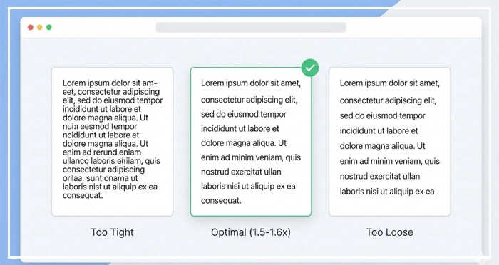
Best Practices for Leading:
- Body Text: Aim for a line-height of 1.5 to 1.6 times the font size.
- Headings: Tighter leading works better, usually 1.1 to 1.2.
- Accessibility: [Internal Link: Accessibility Standards (WCAG)] suggests that line height (line spacing) should be at least 1.5 times the font size for body text.
Entity Optimization:
Leading refers to the distance between the baselines of consecutive lines of type. In digital design, this is controlled via the line-height property.
What is the Ideal Line Length for Reading?
The measure, or line length, dictates how comfortable the reading experience is. If a line is too long, the reader’s eye fatigues while scanning back to the left. If it is too short, the rhythm breaks due to frequent eye movements.
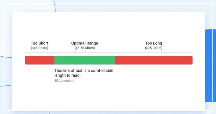
The Golden Rule:
Keep your line length between 45 and 75 characters (including spaces).
According to the Baymard Institute, the optimal line length for body text is 50-60 characters. This ensures the eye can track easily without fatigue.
To achieve this in responsive design, utilize container queries or max-width properties effectively. [Internal Link: Mobile Responsiveness Guide].
How do you Master Typography Hierarchy?
Hierarchy tells the user what to look at first.
Without typographic hierarchy, a page is just a wall of gray noise. You establish hierarchy through size, weight, color, and contrast.
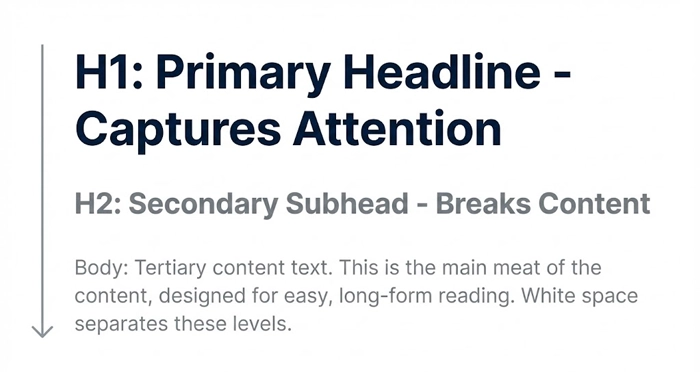
The Three Levels of Hierarchy:
- Primary (H1): The headline. It captures attention immediately.
- Secondary (H2/H3): Subheads. They break content into scannable chunks.
- Tertiary (Body): The meat of the content.
[Internal Link: White Space in Web Design] is essential here. Space acts as a punctuation mark in your layout, separating these hierarchy levels so the brain can process them.
Why should you use a Modular Scale?
Stop guessing your font sizes.
A Modular Scale is a sequence of numbers that relate to one another in a meaningful way. It ensures that your font sizes feel harmonious rather than random.
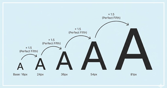
Common Scales:
- Major Third (1.250): Great for versatile, modern UIs.
- Perfect Fourth (1.333): Good for blogs with distinct hierarchy needs.
- Golden Ratio (1.618): Ideal for artistic layouts, though aggressive for mobile.
By using a scale, you automate harmony. [Internal Link: Design Systems Handbook].
What is Vertical Rhythm in UI?
Vertical Rhythm is the structural heartbeat of your page.
It keeps the vertical spacing between elements consistent. Imagine your page has a lined notebook background; every text element should sit perfectly on a line.
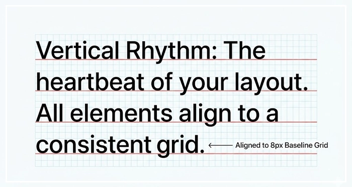
How to achieve it:
Set a baseline grid (usually 4px or 8px). Ensure your line-heights and margins are multiples of this base number.
If your base unit is 4px:
- Font size: 16px
- Line-height: 24px (Divisible by 4)
- Margin-bottom: 16px (Divisible by 4)
This invisible grid creates a subconscious sense of order and trust.
Best Practices for Font Pairing in Typography
Mixing fonts is dangerous for beginners.
A general font pairing guide suggests using one font for headings and another for body text. The contrast creates interest.
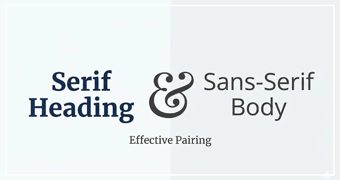
Pairing Strategies:
- Serif header + Sans-Serif body: Classic and authoritative.
- Sans-Serif header + Serif body: Modern but academic.
- Weight Contrast: Use the same font family (Superfamily) but pair a heavy weight (Bold/Black) with a light weight (Regular/Light).
Avoid pairing two fonts that look too similar. If the user can’t tell they are different, it looks like a mistake.
Variable Fonts vs. Web Safe Fonts
Technology has changed how we load type.
Variable Fonts:
These are single font files that behave like multiple fonts. You can adjust weight, width, and slant programmatically. They reduce HTTP requests and allow for fluid animation.
Web Safe Fonts:
These are fonts pre-installed on most operating systems (Arial, Georgia, Times New Roman). They load instantly.
The Verdict:
use Variable Fonts for branding and distinctiveness, but always have a Web Safe stack as a fallback to prevent layout shifts.
Serif vs. Sans-Serif: When to use which?
The debate is old, but the rules have evolved with high-density screens.
Font Category Comparison Table
| Font Category | Best Use Case | Readability Score (Digital) | Personality Traits |
| Sans-Serif | User Interfaces, App Menus, Small Text | High. Clean lines render well on low-res and high-res screens. | Modern, Clean, Minimalist, Tech-focused. |
| Serif | Long-form Reading, Editorials, Headlines | Medium-High. Serifs guide the eye along the line. | Traditional, Trustworthy, Elegant, Academic. |
| Monospace | Code Blocks, Data Tables, Financial UIs | Medium. Uniform width makes comparing data easy. | Technical, Retro, Precise, Utilitarian. |
| Display | Hero Sections, Large Headlines | Low (at small sizes). Designed for impact, not reading. | Loud, Creative, Unique, Playful. |
How does Contrast affect Accessibility?
Readability is physically impossible without contrast.
Typography must meet WCAG AA standards. This usually requires a contrast ratio of at least 4.5:1 for normal text and 3:1 for large text. Low contrast text (like light gray on white) causes eye strain and excludes users with visual impairments. [Internal Link: Color Psychology in UI] plays a role here—colors evoke emotion, but contrast ensures utility.
Always validate your choices with a [UX Audit Checklist].
- Typography is the foundation of UI; it dictates hierarchy and usability.
- Line Height should be 1.5x the font size for body text to ensure breathing room.
- Limit Line Length to 45-75 characters to prevent eye fatigue.
- Use a Modular Scale to mathematically generate harmonious font sizes.
- Establish Vertical Rhythm by aligning all spacing to a 4px or 8px grid.
- Adhere to WCAG standards for contrast to ensure inclusivity.
1. What is the best font size for mobile UI design?
For mobile body text, 16px is generally considered the minimum accessible size. For secondary text or captions, you can go down to 14px, but anything smaller risks readability issues on smaller viewports.
2. How many different fonts should I use in one interface?
Stick to a maximum of two font families. A single “Superfamily” (which includes serif and sans-serif variations) is often safer and more cohesive than trying to mix two completely different typefaces.
3. Why is tracking (letter-spacing) important in UI?
Tracking adjusts the spacing between all characters in a block of text. It is crucial for uppercase text (which needs more spacing) and small text sizes to prevent characters from blurring together.
4. What is the difference between kerning and tracking?
Kerning adjusts the space between two specific characters to fix optical awkwardness (like the gap between ‘A’ and ‘V’). Tracking adjusts the spacing of a whole group of text evenly.
5. Are serif fonts bad for web accessibility?
No. Modern high-resolution screens render serifs perfectly clearly. Serif fonts are excellent for long-form reading as the serifs help guide the eye horizontally along the line.
6. What is a “measure” in typography terms?
The measure is the length of a line of text. In web design, this is controlled by the max-width property of the text container to ensure the eye doesn’t have to travel too far across the screen.
7. How do variable fonts improve website performance?
Variable fonts package multiple styles (bold, italic, thin) into a single file. This reduces the number of HTTP requests the browser must make, speeding up page load times significantly.
8. What is the 8pt grid system in UI typography?
The 8pt grid system uses multiples of 8 (8, 16, 24, 32) to define spacing, margins, and line heights. This reduces decision fatigue for designers and ensures consistent vertical rhythm.
9. Can I use system fonts for a professional UI?
Yes. System fonts (like San Francisco for Apple or Segoe UI for Windows) are highly optimized for their respective OS, load instantly, and feel native to the user, providing an excellent UX.
10. How do I test my typography for accessibility?
Use tools like the WebAIM Contrast Checker or browser plugins like Stark. Check color contrast ratios and ensure your text can be resized up to 200% without breaking the layout.
11. What is the optimal paragraph length for UI?
For UI design, keep paragraphs short—typically 3 to 4 sentences max. Users scan interfaces rather than reading them deeply; large walls of text cause users to abandon the task.
12. Should I justify text in web design?
Avoid justified text on the web. It creates “rivers” of white space running down the paragraph, which disrupts reading flow and is particularly difficult for dyslexic users to read.
13. What is a typographic baseline?
The baseline is the invisible line upon which most letters sit. Aligning text and elements to a consistent baseline grid creates vertical harmony and structural balance in the design.
14. How does font weight affect user attention?
Heavier weights (Bold, Black) attract the eye first and signal importance. Lighter weights suggest secondary information. Use weight variance to build a visual map for the user.
15. What are display fonts and when should I use them?
Display fonts are eccentric or highly detailed typefaces designed for large sizes. Use them sparingly for headlines or hero sections to inject personality, but never for body text.
External Resources
Here are 3 credible sources to further explore this topic:
- The Baymard Institute: “Readability: The Optimal Line Length“
- Google Material Design: “The Type System“
- WebAIM: “Typefaces and Fonts“


