- What is White space in User Interface Design
- Why is White space Important for Cognitive Load?
- The Anatomy of Space: Macro vs. Micro vs. Active
- How Does the Proximity Principle Define Relationships?
- How to Balance Negative Space in Complex Layouts?
- Strategies for Clutter Reduction
- How White space Impacts Conversion Rates
- 1. What is the difference between negative space and white space?
- 2. Why is whitespace important in web design?
- 3. Can you have too much white space in a design?
- 4. How does white space affect mobile UI design?
- 5. What is active white space?
- 6. How does whitespace improve text legibility?
- 7. What is the best spacing system for UI design?
- 8. Does whitespace help with SEO?
- 9. How do I convince clients to use more whitespace?
- 10. What is the difference between padding and margin?
- 11. How does whitespace influence brand perception?
- 12. What is visual breathing room?
- 13. How does whitespace affect visual hierarchy?
- 14. Should I use whitespace or lines to separate content?
- 15. Is whitespace effective for eCommerce sites?
- External Resources
What is White space in User Interface Design
White space (or negative space) is the unmarked area between design elements in a user interface, including margins, padding, and gutters. It is not merely “empty background”; it is an active design element that dictates layout structure, reduces cognitive load, and guides user attention to critical interaction points.
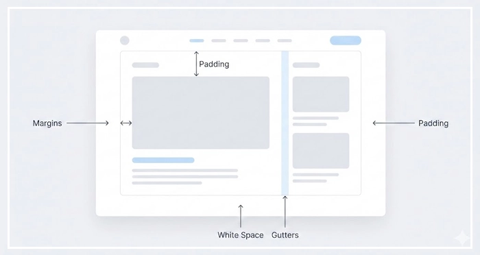
Have you ever visited a website that felt “suffocating”? Elements crowd against one another, text is dense, and your eyes don’t know where to rest. This is the result of ignoring the most vital element in design: white space.
In this guide, we will move beyond the basic concept of “empty space.” We will explore macro vs micro whitespace, how to achieve visual breathing room, and the proximity principle that governs logical grouping. By mastering layout balance, you will transform cluttered interfaces into sophisticated, high-converting experiences.
Prioritizing clutter reduction isn’t just aesthetic; it is a business requirement. Let’s explore how whitespace acts as the air that allows your design to breathe.
Why is White space Important for Cognitive Load?
Whitespace is the primary tool for managing the user’s mental effort. When a user lands on a page, their brain instantly processes the visual hierarchy to find relevant information.
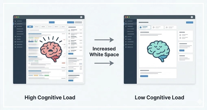
Cognitive load reduction occurs when you remove visual noise. A cluttered interface forces the user to expend energy filtering out unnecessary elements. By increasing negative space, you lower the processing power required to understand the interface.
[Internal Link: Reducing Cognitive Load]
Authority Signal: According to a study by Human Factors International, the proper use of whitespace can increase user comprehension by nearly 20%.
When elements are too close, they compete for attention. This competition creates visual tension. Ample spacing resolves this tension, allowing the user to focus on one task at a time. This focus is critical for retention and interaction.
The Anatomy of Space: Macro vs. Micro vs. Active
To master layout, you must distinguish between the different types of space. Not all voids are created equal.
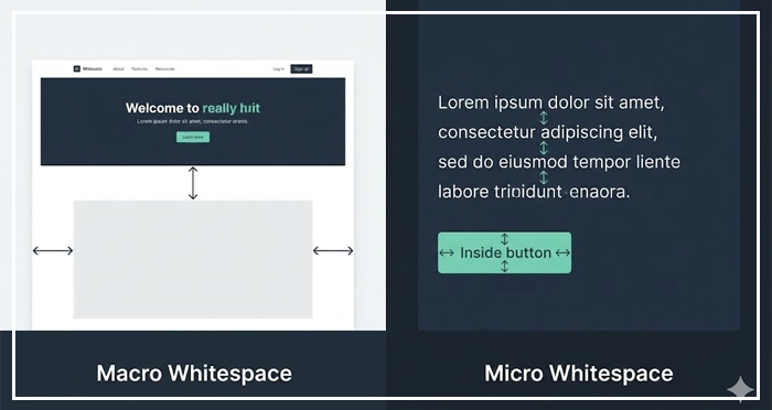
Macro whitespace refers to the large areas between major layout elements. This includes margins on the left and right of the content container and the space between distinct sections.
Micro whitespace is the small space between smaller elements. This includes the space between lines of text (leading), between list items, or between a button and its label.
We must also distinguish between Passive and Active whitespace.
Comparison: Macro vs. Micro vs. Active White space
| Feature | Macro Whitespace | Micro Whitespace | Active Whitespace |
| Definition | Large spaces between major layout sections or containers. | Small spaces between individual items (letters, lines, icons). | Intentional space used to guide the user‘s eye. |
| Primary Goal | Defines the overall structure and layout balance. | improves legibility and creates smoother visual flow. | Emphasizes specific elements (CTAs, Headlines). |
| Context | Margins, gutters, hero section padding. | Line-height, letter-spacing, button padding. | Asymmetrical layouts, spotlighting a product. |
| Impact | Reduces “clutter” feeling significantly. | Subtle; affects reading speed and comfort. | High impact; drives conversion and focus. |
How Does the Proximity Principle Define Relationships?
The Proximity Principle is a Gestalt law of psychology. It states that objects that are near each other tend to be grouped together.
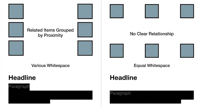
If you place a headline close to a paragraph, the user assumes they are related. If you place a “Buy Now” button far away from the product image, the connection is broken. Whitespace is the tool you use to enforce these relationships.
Inadequate spacing breaks the logic of your layout. Users should not have to guess which label belongs to which input field. The spacing should make it obvious.
[Internal Link: Visual Hierarchy Mastery]
How to Balance Negative Space in Complex Layouts?
Balancing negative space requires a systematic approach. You cannot rely on “eyeballing” spacing.
Implementation starts with a consistent spacing scale. Most modern designers use an 8pt grid system. This ensures that all margins and padding are multiples of 8 (8px, 16px, 24px, 32px, etc.).
Using a grid removes decision fatigue. It creates a rhythm that the user subconsciously recognizes as “professional.”
[Internal Link: Grid Systems Layouts]
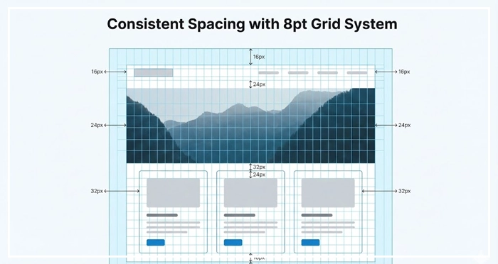
When interfaces feel “off,” it is often because the spacing is inconsistent. A standardized system fixes this.
Strategies for Clutter Reduction
Clutter reduction is about subtraction. Review your interface and ask: “Is this element necessary?”
If an element cannot be removed, can it be separated? Often, designers add lines or borders to separate content. This adds visual noise.
Instead of a grey border, use whitespace. Space separates elements just as effectively as lines but keeps the interface cleaner.
[Internal Link: Minimalist Design Guide]
This approach is central to modern mobile design. Screen real estate is limited, so using space effectively is paramount.
[Internal Link: Mobile UI Patterns]
How White space Impacts Conversion Rates
Does space actually sell? Yes.
Active whitespace surrounding a Call to Action (CTA) makes the button pop. It isolates the conversion element, removing distractions.
[Internal Link: Conversion Rate Optimization]
Authority Signal: Research by Crazy Egg demonstrates that padding text with whitespace and using bullet points can increase user attention on specific page areas by up to 30%.
If a user is distracted by a sidebar or a banner, they are less likely to click your primary button. Space focuses intent.

- White space is not empty: It is an active design asset that guides the eye and defines structure.
- Cognitive Load: Proper spacing reduces mental effort, improving comprehension by up to 20%.
- Macro vs. Micro: Use macro space for layout structure and micro space for legibility and text flow.
- Proximity Principle: Use space to group related items logically; things close together are perceived as related.
- Systematize Spacing: Use an 8pt grid or similar system to ensure consistency and rhythm across the design.
- Remove Borders: Replace visual dividers (lines) with whitespace to reduce clutter and noise.
1. What is the difference between negative space and white space?
There is no difference. “Whitespace” and “negative space” are interchangeable terms in design. “Negative space” is often used in art and photography, while “whitespace” is common in UI/UX, though the space does not have to be white (it can be any background color).
2. Why is whitespace important in web design?
Whitespace improves readability, creates balance, and highlights critical elements like CTAs. It prevents the user from feeling overwhelmed by information, which reduces bounce rates and increases time on site.
3. Can you have too much white space in a design?
Yes, excessive whitespace can disconnect related elements. If the spacing is too wide, the user loses the context of the proximity principle, and the layout may feel disjointed or require excessive scrolling.
4. How does white space affect mobile UI design?
On mobile, whitespace is crucial for touch targets. Adequate spacing ensures users don’t accidentally click the wrong button. It also improves readability on smaller screens where clutter is more damaging to the experience.
5. What is active white space?
Active whitespace is space intentionally left empty to draw attention to a specific element. Unlike passive whitespace (which occurs naturally between paragraphs), active whitespace is a strategic choice to guide the user‘s focus.
6. How does whitespace improve text legibility?
Increasing line height (micro whitespace) prevents lines of text from blurring together. This makes long-form content easier to scan and read, reducing eye strain for the user.
7. What is the best spacing system for UI design?
The 8-point grid system is the industry standard. It uses multiples of 8 (8, 16, 24, 32px) for margins and padding. This ensures visual consistency and scales well across different screen sizes.
8. Does whitespace help with SEO?
Indirectly, yes. Whitespace improves User Experience (UX), leading to longer dwell times and lower bounce rates. These are positive signals to search engines like Google that your page provides value.
9. How do I convince clients to use more whitespace?
Explain that whitespace is a functional element, not “wasted space.” Show them data regarding cognitive load and comprehension. Frame it as a way to spotlight their most important message or product.
10. What is the difference between padding and margin?
Padding is the space inside an element (between the content and the border). Margin is the space outside the element (separating it from other elements). Both contribute to the total whitespace.
11. How does whitespace influence brand perception?
Generous whitespace is often associated with luxury, sophistication, and modernity (think Apple’s design). Crowded, dense layouts are often associated with discount brands or low-quality content.
12. What is visual breathing room?
Visual breathing room describes the feeling of a layout that isn’t cramped. It allows the user’s eyes to rest between absorbing information, preventing fatigue and frustration.
13. How does whitespace affect visual hierarchy?
Whitespace creates separation between different levels of importance. More space around a heading indicates it is a new section, differentiating it clearly from the body text below it.
14. Should I use whitespace or lines to separate content?
Whitespace is generally preferred over lines (borders) in modern design. Lines add visual weight and cognitive noise. Whitespace achieves separation without adding clutter.
15. Is whitespace effective for eCommerce sites?
Absolutely. eCommerce sites use whitespace to isolate product images and “Add to Cart” buttons. This focus eliminates distractions and streamlines the path to purchase.
External Resources
Here are 3 credible sources to further explore this topic:


