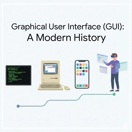
- Introduction
- The Pre-GUI Era: The Command Line (1960s)
- The Birth of the Paradigm: Xerox PARC (1970s)
- The Mainstream Explosion (1980s)
- The Battle for Dominance (1990s)
- The Aesthetic Revolution (2000s)
- The Touchscreen Revolution (2007 – Present)
- The Modern Era: Accessibility and Spatial Computing
- Technical Considerations for Modern Designers
- Summary Table: The Evolution of GUI Paradigms
- Frequently Asked Questions (FAQ)
- 1. Who invented the Graphical User Interface (GUI)?
- 2. What was the first commercially successful GUI?
- 3. What does WIMP stand for in UI design?
- 4. How is a GUI different from a CLI?
- 5. Why is the GUI important for accessibility?
- 6. What role did the Apple Lisa play in GUI history?
- 7. When did Microsoft introduce the Start Menu?
- 8. What is Skeuomorphism?
- 9. What is Flat Design?
- 10. How did the iPhone change GUI design?
- 11. What is Material Design?
- 12. What is the future of GUI?
- 13. What is the difference between UI and UX?
- 14. Is the Command Line still used today?
- 15. What is a "Natural User Interface" (NUI)?
Introduction
Imagine navigating the digital world without icons, windows, or a mouse. For the vast majority of modern users, this is inconceivable. We live in an era defined by visual interaction, where the barrier between human thought and machine execution is bridged by pixels, metaphors, and gestures. This bridge is the Graphical User Interface (GUI).
In the realm of User Interface Design, the GUI is the most significant development in computing history. It democratized technology, taking it from the hands of command-line scientists and placing it into the palms of billions. But the GUI didn’t appear overnight. It is the result of decades of cognitive psychology research, engineering breakthroughs, and fierce corporate battles.
What is a Graphical User Interface (GUI)?
A Graphical User Interface (GUI) is a type of user interface that allows users to interact with electronic devices through graphical icons and visual indicators, as opposed to text-based interfaces, typed command labels, or text navigation.
The Business and Ethical Impact of GUI
From a business perspective, the GUI unlocked the global software market. By lowering the cognitive load required to operate a computer, companies could sell software to non-technical users. Ethically, the evolution of the GUI has been a march toward accessibility, striving to make information available to people of all ages, languages, and abilities.
In this comprehensive guide, we will explore the timeline of the GUI, the titans who built it, and the design principles that continue to govern our screens today.
The Pre-GUI Era: The Command Line (1960s)
Before we can appreciate the graphical interface, we must understand what preceded it. Computing in the 1960s and early 70s was dominated by the Command Line Interface (CLI).

In a CLI environment, the screen is a dark void populated only by text. Interaction requires memorization. To move a file, one must know the exact syntax (e.g., mv source.txt destination/). There are no visual cues, no folders to click, and no “undo” buttons.
Note on Usability: The CLI provides zero “affordance.” It does not suggest how it should be used; the user must bring all the knowledge to the interaction.
While efficient for experts, the CLI was a massive barrier to entry. This friction sparked the desire for a “WIMP” interface (Windows, Icons, Menus, Pointer), a concept that would soon revolutionize the world.
- [Link to: GUI vs. CLI: Key Differences Explained]
The Birth of the Paradigm: Xerox PARC (1970s)
The history of the modern GUI begins in Palo Alto, California. In the early 1970s, Xerox founded the Palo Alto Research Center (PARC). They gathered the brightest minds in computer science with a vague mandate to create “the office of the future.”

The Xerox Alto (1973)
The Xerox Alto was the first computer to integrate the fundamental elements of the modern GUI. It introduced:
- The Desktop Metaphor: Treating the screen like a physical desk with papers and folders.
- The Mouse: A pointing device to navigate the X and Y coordinates of the screen.
- Bitmapping: The ability to address every individual pixel on the screen, allowing for rendering distinct graphics rather than just predefined characters.
- WYSIWYG: “What You See Is What You Get,” meaning the document on the screen looked exactly like the printed output.
Despite its revolutionary status, the Alto was never a commercial product. It was a research tool. However, its influence was solidified during a legendary visit by Steve Jobs and the Apple team in 1979. They saw the potential Xerox executives had missed: the GUI was the future of personal computing.
The Mainstream Explosion (1980s)
If the 70s were about invention, the 80s were about implementation and commercialization. This decade saw the GUI move from research labs to living rooms.

The Apple Lisa and Macintosh
Apple launched the Lisa in 1983. It was an advanced GUI system featuring overlapping windows, drag-and-drop functionality, and a menu bar. However, at $10,000, it was a commercial failure.
Learning from the Lisa, Apple released the Macintosh in 1984. It was cheaper, faster, and marketed brilliantly. The Macintosh popularized the WIMP paradigm:
- Windows
- Icons
- Menus
- Pointer
This defined the mental model for User Interface Design for the next 40 years.
- [Link to: The Role of Icons in Graphical Interfaces]
Microsoft enters the arena
While Apple favored a closed hardware-software ecosystem, Microsoft took a different approach. They released Windows 1.0 in 1985 as a graphical shell that ran on top of MS-DOS.
Early Windows versions were crude compared to the Mac. Windows 1.0 didn’t even allow overlapping windows (they were “tiled”). However, Microsoft’s licensing strategy meant Windows could run on any IBM-compatible PC. This ubiquity eventually allowed Microsoft to dominate the market.
The Amiga and Atari ST
It is important to acknowledge the Commodore Amiga (1985). It offered advanced graphics and multitasking capabilities that far exceeded both Mac and Windows at the time, particularly in creative industries. Though it eventually faded, its “Workbench” UI was highly influential in multimedia design.
The Battle for Dominance (1990s)
The 1990s saw the refinement of the desktop metaphor and the standardization of UI controls.

Windows 95: The Game Changer
In August 1995, Microsoft released Windows 95. This is arguably the most successful software launch in history. From a UX perspective, it introduced two elements that define desktop computing to this day:
- The Start Button/Menu: A central hub for launching applications.
- The Taskbar: A persistent visual indicator of currently running applications.
Windows 95 cemented the “Task-based” workflow. It moved away from the Program Manager (a collection of icons) to a document-centric approach.
- [Link to: Window Management Patterns in GUI Design]
The Rise of Linux Desktops
While Microsoft and Apple battled, the open-source community began developing GUIs for Linux. The K Desktop Environment (KDE) and GNOME offered customizable, free alternatives. These environments pushed the boundaries of virtual desktops (workspaces), a feature Apple and Microsoft would only adopt years later.
The Web Influences the Desktop
By the late 90s, the World Wide Web began to influence native application design. The “Single Click” vs. “Double Click” debate emerged. Interface designs began to incorporate navigation bars, breadcrumbs, and back buttons—borrowing heavily from browser UX.
The Aesthetic Revolution (2000s)
As hardware acceleration (GPUs) became standard, GUIs became prettier. We moved from flat gray rectangles to water, glass, and plastic textures.

Mac OS X and “Aqua”
In 2001, Apple replaced the “Classic” Mac OS with OS X. The interface, dubbed “Aqua,” featured gummy buttons, translucent menus, and photorealistic icons. Steve Jobs famously said, “We made the buttons on the screen look so good you’ll want to lick them.”
This era relied heavily on Skeuomorphism—the design concept of making digital items resemble their real-world counterparts (e.g., a calendar app looking like leather, a notepad looking like yellow paper).
- [Link to: Skeuomorphism vs. Flat Design in Modern GUI]
Windows XP and “Luna”
Microsoft responded with Windows XP. Its “Luna” theme was colorful, approachable, and designed to hide the complexity of the file system from casual users. It prioritized task-oriented sidebars (“Make a new folder,” “Publish this folder to the web”) over raw file manipulation.
The Touchscreen Revolution (2007 – Present)
The most seismic shift in GUI history occurred in 2007 with the launch of the iPhone.

Until this point, GUIs were indirect. You moved a mouse here to move a cursor there. Multi-touch technology removed the intermediary. The finger became the pointer.
Defining Mobile UX
Mobile GUIs forced designers to rethink everything:
- Hit Targets: A mouse pixel is precise; a fingertip is not. Buttons had to become larger (minimum 44×44 points).
- Gestures: Pinch-to-zoom, swipe-to-delete, and pull-to-refresh became the new syntax of interaction.
- Simplification: The lack of screen real estate forced a “Mobile First” philosophy, stripping away non-essential elements.
The Shift to Flat Design
By 2013, the tech world had grown tired of faux-leather textures. Apple released iOS 7, championing Flat Design. This style removed shadows, gradients, and textures, focusing on typography, color, and whitespace.
Google evolved this further with Material Design in 2014. Material Design used “flat” colors but reintroduced physics and lighting (using shadows to indicate depth/hierarchy) to create a consistent metaphor of paper stacking and sliding.
The Modern Era: Accessibility and Spatial Computing

Today, User Interface Design is moving beyond the screen.
Dark Mode and Adaptive UI
Modern GUIs are context-aware. “Dark Mode” is no longer a hacker novelty but a standard accessibility feature to reduce eye strain. Interfaces now adapt dynamically to screen size (Responsive Design) and user preferences.
- [Link to: 5 Best Examples of Intuitive Desktop GUIs]
Spatial Computing (AR/VR)
With the advent of devices like the Apple Vision Pro and Meta Quest, we are entering the era of Spatial UI.
- Eye Tracking: Your eyes are the mouse.
- Hand Tracking: Your fingers are the click mechanism.
- Z-Axis: The interface is no longer trapped on a 2D plane; windows can exist at varying depths in 3D space.
Technical Considerations for Modern Designers
To create effective GUIs in the modern landscape, designers must adhere to strict technical guidelines.
1. Consistent Feedback Loops
Every interaction must have a reaction. If a user clicks a button, the GUI must visually acknowledge the press (state change).
- Hover State
- Active/Pressed State
- Disabled State
- Loading State
2. Typographic Hierarchy
Modern GUIs rely less on heavy borders and container boxes and more on typography to define structure.
- H1/Headlines: Orient the user.
- Body Copy: Provide the detail.
- Micro-copy: Guide the interaction (labels, error messages).
3. Accessible Color Contrast
Following WCAG 2.1 standards, modern GUIs must ensure sufficient contrast between text and background.
- Normal Text: 4.5:1 ratio.
- Large Text: 3:1 ratio.
- UI Components: 3:1 ratio against adjacent colors.
Summary Table: The Evolution of GUI Paradigms
For quick reference, here is how the core paradigms of User Interface Design have shifted over the decades.
| Era | Primary Input | Visual Style | key Metaphor | Representative OS |
| 1970s | Keyboard | Text/Monochrome | Command Syntax | MS-DOS, UNIX |
| 1980s | Mouse (1 button) | 1-bit Graphics | Desktop (Papers) | Macintosh System 1 |
| 1990s | Mouse (2 button) | Bevelled Gray (3D) | Desktop (Office) | Windows 95 |
| 2000s | Mouse/Trackpad | Aqua/Glass/Skeuomorphic | Real World Materials | Mac OS X, Windows Vista |
| 2010s | Touch | Flat/Material | Digital Paper | iOS 7, Android Lollipop |
| 2020s+ | Voice/Eyes/Hand | Glass/Spatial | Augmented Reality | visionOS |
Conclusion
The history of the Graphical User Interface is a history of removing barriers. It is a journey from memorizing obscure codes to simply looking at an icon and tapping your fingers together.
As we look toward a future dominated by AI and Spatial Computing, the fundamental lesson of the GUI remains the same: Technology works best when the interface disappears, leaving only the task at hand.
For designers, understanding this history is not just about nostalgia; it is about understanding the “Why” behind the buttons, windows, and icons we use every day. The best interfaces of tomorrow will be built on the lessons learned from the Alto, the Mac, and the iPhone.
Frequently Asked Questions (FAQ)
1. Who invented the Graphical User Interface (GUI)?
While no single person “invented” it, the researchers at Xerox PARC (Palo Alto Research Center) in the 1970s are credited with developing the first functional GUI, including the mouse, windows, and bitmapped screens.
2. What was the first commercially successful GUI?
The Apple Macintosh, released in 1984, is widely considered the first commercially successful computer to feature a GUI, bringing the technology to the mass market.
3. What does WIMP stand for in UI design?
WIMP stands for Windows, Icons, Menus, and Pointer. It is the standard paradigm for interacting with graphical user interfaces on desktop computers.
4. How is a GUI different from a CLI?
A GUI (Graphical User Interface) uses visual elements like icons and windows for interaction, whereas a CLI (Command Line Interface) relies on text-based commands typed by the user.
5. Why is the GUI important for accessibility?
GUIs allow users with different abilities to interact with computers using assistive technologies (like screen readers) and visual cues, rather than requiring the memorization of complex text commands.
6. What role did the Apple Lisa play in GUI history?
The Apple Lisa (1983) was the precursor to the Macintosh. It was one of the first personal computers with a GUI, but its high price tag led to commercial failure.
7. When did Microsoft introduce the Start Menu?
Microsoft introduced the Start Menu and the Taskbar with the release of Windows 95 in August 1995.
8. What is Skeuomorphism?
Skeuomorphism is a design style where digital elements mimic their real-world counterparts (e.g., a recycling bin icon looking like a physical trash can) to make interfaces feel familiar.
9. What is Flat Design?
Flat Design is a minimalist UI style that eschews stylistic elements like shadows, bevels, and textures in favor of simple shapes, solid colors, and typography. It was popularized by Microsoft’s Metro UI and Apple’s iOS 7.
10. How did the iPhone change GUI design?
The iPhone (2007) popularized the multi-touch interface, replacing the precise mouse cursor with the imprecise human finger, leading to larger touch targets and gesture-based navigation (swiping, pinching).
11. What is Material Design?
Material Design is a design language developed by Google in 2014. It combines the clean aesthetic of flat design with visual cues for depth (shadows) and motion to mimic the physics of paper and ink.
12. What is the future of GUI?
The future of GUI lies in Spatial Computing (AR/VR) and Voice User Interfaces (VUI), where interaction moves away from 2D screens into 3D space and natural language processing.
13. What is the difference between UI and UX?
UI (User Interface) refers to the visual screens, icons, and buttons a user interacts with. UX (User Experience) encompasses the entire journey, feeling, and usability of the product.
14. Is the Command Line still used today?
Yes. Developers and system administrators still prefer CLI for its speed, precision, and ability to automate complex tasks through scripting, which is often slower or impossible in a GUI.
15. What is a “Natural User Interface” (NUI)?
NUI refers to an interface that is effectively invisible, where the user interacts through natural behaviors like gestures, voice, or gaze, without the need for an artificial control device like a mouse or keyboard.


