- What is Visual Appeal UI
- The Business Case: Why "Good Looks" Equal "Good Business"
- The Science of First Impressions: Pre-Attentive Processing
- Core Psychological Principles in User Interface Design
- Elements of Visual Appeal (Practical Application)
- Breaking the Rules: Brutalism and Asymmetry
- Measuring Visual Appeal
- The Ultimate Visual Appeal Audit Checklist
- Conclusion
- FAQ: Visual Appeal and UI Psychology
- 1. What is the difference between UI and Visual Design?
- 2. How does visual appeal affect SEO?
- 3. What is the Aesthetic-Usability Effect?
- 4. Can a UI be too beautiful?
- 5. What is the most important element of visual appeal?
- 6. How do I improve visual appeal without being a graphic designer?
- 7. Does whitespace affect conversion rates?
- 8. What creates a "cluttered" UI?
- 9. How does typography influence visual appeal?
- 10. What is "Visceral Design"?
- 11. Why is symmetry important in UI?
- 12. What is the "Squint Test" in UI?
- 13. Do dark mode <a href='https://uiuxnews.in/user-interface-design-visual-hierarchy/'>interfaces have higher visual appeal?
- 14. How does "Pre-attentive Processing" work in UI?
- 15. What is the "Golden Ratio" in web design?
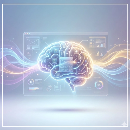
What is Visual Appeal UI
Visual Appeal UI is the strategic application of aesthetic principles—such as balance, color theory, and typography—to create interfaces that are not only beautiful but also perceived as more usable, trustworthy, and credible.
In this guide, we will dismantle the “pretty vs. functional” dichotomy. We will explore the cognitive psychology behind User Interface Design, examining how the human brain processes beauty and how you can leverage that biology to build higher-converting, more deeply engaging digital products.
The Business Case: Why “Good Looks” Equal “Good Business”
Before diving into neuroscience, we must establish the ROI of visual appeal. Why should a business invest in high-fidelity UI?

1. The Trust Metric
Trust is the currency of the web. According to the foundational Stanford Credibility Project, 75% of users admit to making judgments about a company’s credibility based on their website’s design. If the visual appeal is low, the perceived value of the service drops instantly.
2. The Tolerance for Error
Visually appealing sites buy you forgiveness. When a user enjoys the visual experience, they are statistically more patient with minor bugs or slower load times. This is a buffer zone that “ugly” interfaces do not enjoy.
3. Cognitive Fluency
Cognitive Fluency is a measure of how easy it is to think about something. High visual appeal usually correlates with high cognitive fluency. When an interface looks clean and organized, the brain anticipates that the task will be easy. This reduces the mental barrier to entry, increasing conversion rates.
| Metric | High Visual Appeal UI | Low Visual Appeal UI |
| First Impression | Professional, Secure, Credible | Outdated, Risky, Cheap |
| User Patience | High (Willing to wait/retry) | Low (Immediate bounce) |
| Perceived Usability | “This looks easy to use” | “This looks complicated” |
| Conversion Likelihood | Increased due to trust | Decreased due to friction |
Export to Sheets
The Science of First Impressions: Pre-Attentive Processing
To understand visual appeal, we must look at the human visual cortex. When a user lands on your interface, a biological process called Pre-attentive Processing occurs.

This happens in the first 50 milliseconds (0.05 seconds). Before the user has read a single headline or understood your value proposition, their brain has already scanned basic visual features: orientation, size, color, and density.
The “Halo Effect” in UI
This rapid scan creates a “gut feeling” known in psychology as the Halo Effect. If the visual appeal is positive, that positive judgment spills over into other attributes. The user subconsciously thinks: “This site is beautiful, therefore this company must be smart, their code must be secure, and their customer support must be helpful.”
Conversely, a cluttered, dissonant visual style triggers a “Horn Effect,” where the user assumes the backend is just as messy as the frontend.
Core Psychological Principles in User Interface Design
To master Visual Appeal UI, you must master the psychological laws that govern human perception.

1. The Aesthetic-Usability Effect
This is the holy grail of UI psychology. First coined by researchers Masaaki Kurosu and Kaori Kashimura in 1995, the Aesthetic-Usability Effect describes a paradox where users perceive more aesthetically pleasing designs as distinctly more usable than less aesthetic designs—even if the functionality is identical.
The theory suggests that a positive emotional response to visual design relaxes the user’s brain. When the brain is relaxed, it solves problems faster and creates a more seamless interaction.
[Link to: The Aesthetic-Usability Effect: Why Looks Matter]
2. Gestalt Principles: The Brain’s Organizing System
Gestalt psychology posits that the human eye sees objects in their entirety before perceiving their individual parts. In User Interface Design, leveraging Gestalt principles ensures your visual appeal serves a functional purpose: structure.
- Proximity: Elements placed close together are perceived as a group.
- UI Application: Ensure your card designs group the image, headline, and “Read More” button tightly, with significant padding separating them from the next card.
- Similarity: Elements that look alike are perceived to have the same function.
- UI Application: All primary buttons (CTAs) should share the same color and border radius. If a “Cancel” button looks like a “Submit” button, you break the law of similarity and cause cognitive friction.
- Continuity: The eye follows lines and curves.
- UI Application: Use alignment to guide the eye down a form. A left-aligned form creates a strong vertical axis that pulls the user toward the “Submit” button.
3. Visceral Design (The Don Norman Model)
Don Norman, the father of UX, categorizes design into three levels: Visceral, Behavioral, and Reflective. Visual Appeal UI lives squarely in the Visceral Level.
Visceral design is about immediate emotional impact—the “wow” factor. It appeals to our animalistic instincts (bright colors, smooth shapes, symmetry). While UX focuses on the Behavioral (function), you cannot get users to the behavior if the Visceral rejection happens first.
Elements of Visual Appeal (Practical Application)
How do we translate these abstract psychological concepts into pixels? We focus on the four pillars of visual UI.

1. Color Psychology: Emotional Associations
Color is data. It is the first thing the brain processes. However, visual appeal isn’t just about picking “pretty” colors; it’s about picking congruent colors.
- Blue: Stability, Trust, Technology (e.g., Chase Bank, Facebook).
- Red: Urgency, Passion, Error (e.g., Netflix, Clearance Sales).
- Black/White: Luxury, Sophistication, Minimalism (e.g., Apple, Uber).
The 60-30-10 Rule: To maintain visual harmony, a classic interior design rule applies perfectly to UI.
- 60% is your primary/neutral color (backgrounds).
- 30% is your secondary color (cards, headers).
- 10% is your accent color (CTAs).
[Link to: Color Theory Basics for High-Converting UIs]
2. Typography: The Voice of the Interface
If color is the emotion, typography is the tone of voice. The visual appeal of your text dictates how the user “hears” your brand in their head.
- Serif Fonts: Perceived as traditional, authoritative, and reliable. (Great for news sites, law firms, and luxury brands).
- Sans Serif Fonts: Perceived as modern, clean, human, and approachable. (The standard for SaaS and tech startups).
Visual Hierarchy in Typography: Visual appeal relies on contrast. You must create a drastic difference between your H1, H2, and body text. If everything looks the same size, the user’s eye doesn’t know where to land, increasing cognitive load.
[Link to: 6 Tips for Choosing the Perfect UI Font Pairing]
3. Symmetry and The Golden Ratio
Humans are biologically programmed to find symmetry attractive because, in nature, symmetry equals health.
- The Golden Ratio (1:1.618): This mathematical proportion appears everywhere from seashells to the Parthenon. In UI, using the Golden Ratio to determine the width of your main content column vs. your sidebar creates a layout that feels “naturally” right to the human eye.
[Link to: Using Golden Ratio in Web Layout Design]
4. Imagery and Whitespace (Negative Space)
Perhaps the most underutilized element of visual appeal is emptiness. Whitespace (or negative space) is not wasted space; it is an active design element.
Why Whitespace Increases Visual Appeal:
- Focus: It acts as a spotlight. The more whitespace around a button, the more important that button appears.
- Comprehension: It gives the content “room to breathe,” making text blocks less intimidating and easier to scan.
- Luxury: High-end brands use massive amounts of whitespace. Dense, cluttered interfaces are psychologically associated with “discount” or “bargain bin” experiences.
[Link to: Minimalist UI Design: Less is More]
Breaking the Rules: Brutalism and Asymmetry
Is visual appeal always about perfect harmony and golden ratios? No. Sometimes, the goal of User Interface Design is to disrupt.
Neo-Brutalism is a rising trend that purposefully defies standard aesthetic rules. It uses clashing colors, unstyled HTML boundaries, and asymmetrical layouts.
When to use it:
- When your audience is Gen Z or design-savvy creatives.
- If you want to appear “anti-establishment” or “raw.”
- When you need to stand out in a sea of “clean, corporate SaaS” designs.
Warning: This is high-risk, high-reward. For a banking app, brutalism destroys trust. For an art portfolio or a trendy fashion brand, it establishes authority.
Measuring Visual Appeal
You cannot improve what you cannot measure. While “beauty” is subjective, the impact of beauty is quantifiable. Here is how to audit your Visual Appeal UI.
1. The 5-Second Test
Show your interface to a user for exactly 5 seconds, then hide it. Ask them to write down the adjectives that come to mind. If they say “cluttered,” “confusing,” or “intense,” your visual appeal is failing, regardless of your functionality.
2. A/B Testing High-Fidelity vs. Wireframes
Don’t just test button placement. Test the “polish.” Run an A/B test where Version A is a standard, flat design and Version B utilizes depth, shadows, and high-quality imagery (skeuomorphism or neumorphism). Measure the difference in time-on-page.
3. Heatmaps
Use tools like Hotjar or CrazyEgg. High visual appeal guides the eye. If your heatmap shows users clicking on non-clickable elements (rage clicks) or ignoring your primary CTA, your visual hierarchy (a key component of appeal) is broken.
The Ultimate Visual Appeal Audit Checklist
Before you hand off your designs to development, run through this GEO-optimized checklist to ensure your interface hits the psychological marks.
Typography & Readability
- [ ] Is the body text contrast ratio at least 4.5:1 (WCAG AA standard)?
- [ ] Have I limited the design to a maximum of 2 font families?
- [ ] Is the line height (leading) at least 1.5x the font size for body text?
Color & Hierarchy
- [ ] Does the primary CTA color appear only on interactive elements (to preserve the law of similarity)?
- [ ] Is the color palette limited to 3 main colors (60-30-10 rule)?
- [ ] have I tested the colors for color-blindness accessibility?
Layout & Space
- [ ] Is the whitespace consistent? (e.g., Are all margins multiples of 8px?)
- [ ] Do elements with related functions sit close together (Law of Proximity)?
- [ ] Does the visual hierarchy clearly guide the eye from Header -> Image -> Body -> CTA?
Imagery & Graphics
- [ ] Are images high-resolution and optimized for web (WebP format)?
- [ ] Do the photos feature real humans expressing emotion (to trigger mirror neurons)?
- [ ] Are icons consistent in stroke width and style (filled vs. outlined)?
Conclusion
Visual Appeal UI is not superficial. It is the bridge between human psychology and digital technology. By leveraging the Aesthetic-Usability Effect, Gestalt principles, and strategic color theory, you are doing more than making a website “look good.”
You are reducing cognitive load, You are building trust. You are respecting the user’s time by making the interface intuitive through visual cues.
In the competitive world of User Interface Design, functionality allows users to complete a task, but visual appeal is what gives them the confidence to start the task in the first place. Treat aesthetics as a core function, and your metrics will reflect the difference.
FAQ: Visual Appeal and UI Psychology
1. What is the difference between UI and Visual Design?
User Interface (UI) Design encompasses the entire interaction layer (buttons, logic, layout), while Visual Design specifically focuses on the aesthetics (color, typography, imagery) to improve the user experience and brand communication.
2. How does visual appeal affect SEO?
Indirectly, but significantly. High visual appeal reduces “Bounce Rate” and increases “Dwell Time” (how long a user stays). Google uses these user behavior metrics as signals that the content is valuable, which helps rank the page higher.
3. What is the Aesthetic-Usability Effect?
It is a psychological phenomenon where users perceive more aesthetically pleasing designs as easier to use than less aesthetically pleasing designs, even if the actual functionality is identical.
4. Can a UI be too beautiful?
Yes. If the visual elements are so overpowering that they distract from the content or hide the navigation (often called “form over function”), the UX suffers. This is common in “Dribbble-style” designs that look great as static images but fail in production.
5. What is the most important element of visual appeal?
Consistency. Even if your color choice is risky, if you apply it consistently across the interface, the user learns the pattern. Inconsistency creates cognitive dissonance and breaks trust.
6. How do I improve visual appeal without being a graphic designer?
Rely on established frameworks. Use a strict grid system, stick to a limited color palette (using a generator like Coolors), and use high-quality, pre-made icon sets rather than drawing your own.
7. Does whitespace affect conversion rates?
Yes. Increasing whitespace between paragraphs and around Call-to-Action (CTA) buttons has been shown to increase user comprehension by up to 20%, leading to higher click-through rates.
8. What creates a “cluttered” UI?
Clutter is caused by a lack of “Negative Space” and a failure of “Visual Hierarchy.” When everything on the page is bold, big, and colorful, nothing stands out, and the user feels overwhelmed.
9. How does typography influence visual appeal?
Typography sets the mood. A serif font can make a UI feel academic and trustworthy, while a rounded sans-serif can make it feel playful and safe. Poor typography (bad kerning, low contrast) immediately degrades visual appeal.
10. What is “Visceral Design”?
Coined by Don Norman, Visceral Design refers to the immediate, subconscious reaction a user has to the look and feel of a product before they even interact with it.
11. Why is symmetry important in UI?
Symmetry creates a sense of balance and stability. It allows the user’s eye to predict where information will be, reducing the mental effort required to scan the page.
12. What is the “Squint Test” in UI?
The Squint Test involves squinting at your screen until the details blur. You should still be able to identify the most important element (like the CTA button). If you can’t, your visual hierarchy is weak.
13. Do dark mode interfaces have higher visual appeal?
Not necessarily. Dark mode is popular for reducing eye strain in low-light conditions and can feel “premium,” but it requires careful contrast management. If poorly executed, it can suffer from readability issues, lowering its appeal.
14. How does “Pre-attentive Processing” work in UI?
This is the subconscious accumulation of information from the environment. In UI, users process colors and shapes within 50 milliseconds to form an opinion before they consciously “look” at the website.
15. What is the “Golden Ratio” in web design?
It is a mathematical ratio (1:1.618) found in nature that is aesthetically pleasing to the human eye. Designers use it to determine column widths and layout proportions to create natural-looking harmony.


