- Designing for the Full Spectrum of Humanity
- The Core Principles (POUR)
- Visual Design Guidelines
- Interaction Design Guidelines
- Technical Considerations for Designers
- The Ultimate UI Accessibility Checklist
- Conclusion: Accessibility is Innovation
- 1. What is the difference between WCAG A, AA, and AAA?
- 2. Is accessibility only for blind people?
- 3. Do accessibility overlays work?
- 4. What is the minimum font size for accessibility?
- 5. Can I use gray text in my UI?
- 6. What tools can I use to test accessibility in Figma?
- 7. How do I handle accessibility for data visualization?
- 8. Why is "Click Here" bad link text?
- 9. Does accessibility affect SEO?
- 10. What is ARIA?
- 11. How do I make a carousel accessible?
- 12. What is the difference between Alt Text and Captions?
- 13. How often should I audit my site for accessibility?
- 14. Is dark mode better for accessibility?
- 15. What is the "curb cut effect"?
Designing for the Full Spectrum of Humanity
Imagine walking into a library where the books are shelved on the ceiling. Or trying to enter a bank where the door handle is polished so smoothly your hand slips off every time you try to turn it. Frustrating, right? In the physical world, we call this bad architecture. In the digital world, we call it inaccessible design.
As designers, we often obsess over the “Happy Path”—the ideal journey a user takes through our product. But when we treat UI Accessibility as an afterthought or a compliance checkbox, we effectively lock the doors on nearly 15% of the global population. That is over 1 billion people living with some form of disability.
What is UI Accessibility?
UI Accessibility (often abbreviated as a11y) is the practice of designing and coding websites and applications so that people with disabilities can perceive, understand, navigate, and interact with them effectively. It is a fundamental pillar of ethical User Interface Design.
The Business and Ethical Case
Why should you, as a senior designer or stakeholder, prioritize accessibility?
- The Ethical Case: The web is now an essential utility. Denying access to digital services is akin to denying access to electricity or water. Inclusive design is a human right.
- The Business Case (The “Curb Cut Effect”): When you design for disabilities, you improve the experience for everyone. A “curb cut” in a sidewalk helps a wheelchair user, but it also helps a parent with a stroller, a traveler with luggage, or a skateboarder. Similarly, high-contrast text helps a visually impaired user, but it also helps a user looking at their phone in bright sunlight.
- Legal Mitigation: Digital accessibility lawsuits are rising year over year. Adhering to standards mitigates legal risk.
In this guide, we will move beyond basic theory and dive into actionable, high-level strategies to integrate accessibility into your design system today.
The Core Principles (POUR)
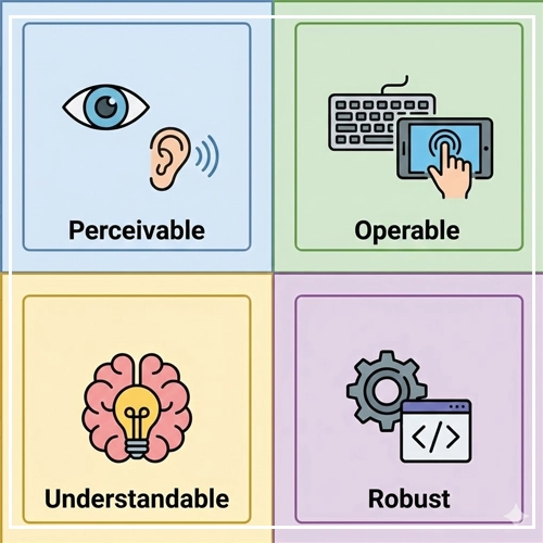
To understand UI Accessibility, you must understand the framework it is built upon: The Web Content Accessibility Guidelines (WCAG). These guidelines are organized under four distinct principles, known by the acronym POUR.
1. Perceivable
Information and user interface components must be presentable to users in ways they can perceive. This means if a user is blind, the content must be available via screen reader (audio). If a user is deaf, audio content must have captions (visual).
- Design Implication: You cannot rely on a single sense (like sight) to convey information.
2. Operable
User interface components and navigation must be operable. The interface cannot require interaction that a user cannot perform.
- Design Implication: Users must be able to navigate your User Interface Design using a keyboard alone, voice commands, or adaptive switches—not just a mouse or touchscreen.
3. Understandable
Information and the operation of the user interface must be understandable. Users must be able to comprehend the information as well as how to use the interface.
- Design Implication: Avoid jargon, keep navigation consistent, and ensure error messages explain how to fix the problem, not just that a problem occurred.
4. Robust
Content must be robust enough that it can be interpreted reliably by a wide variety of user agents, including assistive technologies.
- Design Implication: This is largely code-related (using proper HTML semantics), but designers dictate the structure that developers implement.
Note: For a deeper dive into the specific success criteria of these principles, check out our guide:
[Link to: What is WCAG 2.2? A Simple Guide for Designers]
Visual Design Guidelines
Visual accessibility is often where designers have the most immediate impact. It is about more than just checking contrast ratios; it is about creating clarity.
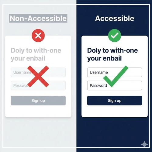
Color Contrast: Rules and Ratios
Color contrast is the difference in light between the foreground (text/icons) and the background. Low contrast causes eye strain for everyone and makes content invisible for users with low vision or color blindness.
The WCAG Standards:
- Level AA (Minimum): Requires a contrast ratio of at least 4.5:1 for normal text and 3:1 for large text (bold 18.66px or larger).
- Level AAA (Enhanced): Requires a contrast ratio of 7:1 for normal text and 4.5:1 for large text.
UI Component Contrast:
It is not just about text. Buttons, input borders, and icons (non-text contrast) must have a ratio of 3:1 against the adjacent color.
Table: Accessible vs. Non-Accessible Color Combinations
(Based on white background #FFFFFF)
| Text Color | Hex Code | Contrast Ratio | Accessibility Status (AA) |
| Pure Black | #000000 | 21:1 | ✅ Pass (Excellent) |
| Dark Gray | #595959 | 7:1 | ✅ Pass (AAA) |
| Medium Blue | #0044CC | 4.9:1 | ✅ Pass (AA) |
| Slate Grey | #949494 | 2.8:1 | ❌ Fail (Too Light) |
| Bright Cyan | #00FFFF | 1.2:1 | ❌ Fail (Invisible) |
Pro Tip: Never rely on your eyes alone. Monitors vary in calibration. Always use a tool.
[Link to: Top 7 Color Contrast Checkers for UI Design]
Typography: Hierarchy and Readability
Typography in User Interface Design isn’t just about choosing a “pretty” font; it’s about legibility.
- Font Size: The standard base font size for web is 16px. Anything smaller than 12px is generally inaccessible for body text.
- Line Height (Leading): Crowded text is hard to track. Set your line height to at least 1.5 times the font size (150%) for paragraph text.
- Paragraph Spacing: Ensure distinct separation between paragraphs (usually 2x the font size).
- Font Selection: Avoid overly decorative scripts for body text. Sans-serif fonts (like Inter, Roboto, or Arial) are generally more legible on screens than serifs.
Dyslexia Considerations: Avoid justified text (which creates “rivers of white space”). Left-aligned text is easiest to read.
[Link to: Designing for Dyslexia: Key Font Choices]
Icons and Visual Indicators (Don’t Rely on Color)
A golden rule of UI Accessibility: Never use color as the only visual means of conveying information.
The Problem:
If you mark an error field with a red border, a color-blind user (specifically those with Protanopia or Deuteranopia) might not see the red. To them, the border looks gray—just like the normal state.
The Solution:
- Errors: Use a red border AND a text label explaining the error AND an icon (like an exclamation mark).
- Charts: When designing graphs, use different patterns (dashed lines, dots) in addition to different colors to separate data sets.
- Links: Links within blocks of text should have an underline, not just a color change.
Interaction Design Guidelines
Interaction design defines how a user communicates with the interface. This is where accessibility moves from “static” to “dynamic.”

Focus States and Keyboard Navigation
For “Power Users” and users with motor disabilities, the mouse is optional. They navigate using the Tab key on a keyboard.
What is a Focus State?
The focus state is the visual indicator (usually a ring or outline) that highlights which element is currently active.
The Designer’s Responsibility:
- Never remove the default focus ring without replacing it with something better.
outline: none;is a cardinal sin in CSS if no alternative is provided. - Design a custom focus state: Ensure it matches your brand but is highly visible. It needs high contrast against the background.
- Logical Order: Design the flow of the page so that tabbing moves logically (Left to Right, Top to Bottom).
Touch Targets: The Fat Finger Rule
Have you ever tried to tap a tiny “X” to close a pop-up and missed it three times? That is a touch target failure. This is crucial for users with tremors or reduced fine motor control.
The Standards:
- WCAG 2.2 (Target Size): The target size for pointer inputs should be at least 24×24 CSS pixels.
- Apple (HIG): Recommends 44×44 points.
- Android (Material Design): Recommends 48×48 dp.
Best Practice: Even if a visual icon is small (e.g., a 16px kebab menu icon), the clickable padding around it should expand to meet the 44px threshold.
Forms and Error Handling
Forms are the primary way users interact with your business (Sign up, Checkout, Contact). If your form is not accessible, you are losing money.
- Permanent Labels: Never use “placeholder text” as a replacement for a label. Placeholders disappear when the user starts typing, straining short-term memory.
- Explicit Instructions: If a password requires a special character, state that upfront—do not wait for the user to fail.
- Error Identification: As mentioned in visual design, errors must be text-based and located near the input field.
Deep Dive: Forms are complex. Ensure you aren’t making critical mistakes.
[Link to: How to Design Accessible Forms: 5 Best Practices]
Technical Considerations for Designers
You might think, “I’m a designer, not a developer. Is this my job?” Yes. The way you annotate your files and structure your layers dictates the code.
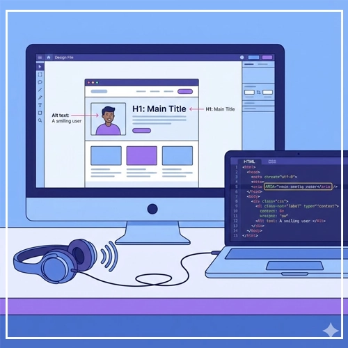
Designing for Screen Readers
Screen readers (like JAWS, NVDA, and VoiceOver) turn visual content into synthesized speech.
- Alt Text (Alternative Text):
- Images: Every image needs
alttext. If the image conveys info (e.g., a chart), describe the data. If the image is purely decorative (e.g., a background swoosh), mark it as “decorative” so the screen reader skips it.
- Images: Every image needs
- Headings (H1-H6): Screen reader users “scan” pages by jumping from heading to heading. Do not use an H3 just because you like the font size. Use headings to define the document outline/hierarchy.
Checklist: Are your designs compatible with audio navigation?
[Link to: Screen Reader Compatibility: A UI Checklist]
Responsive Design and Reflow
UI Accessibility overlaps heavily with mobile responsiveness.
- Zoom Capabilities: Users with low vision may zoom their browser up to 200% or 400%. Your layout must “reflow” (stack vertically) rather than forcing the user to scroll horizontally to read a sentence.
- Design Implication: Avoid fixed-width containers. Use relative units (like percentages or
rem) in your design specifications.
The Ultimate UI Accessibility Checklist
Before you hand off your designs to the development team, run your User Interface Design through this summary checklist.
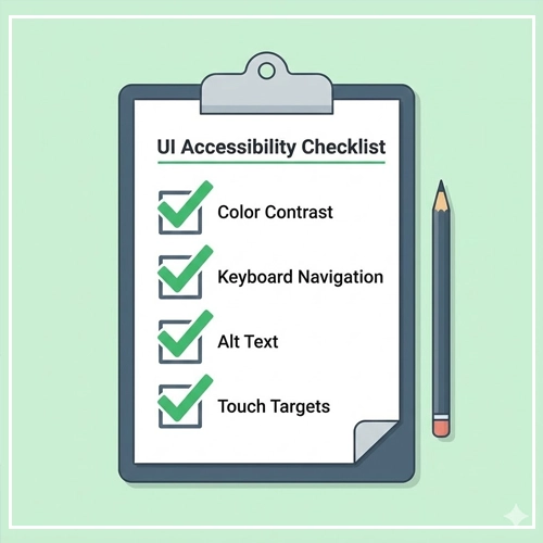
Visuals
- [ ] Color Contrast: All text meets AA (4.5:1) standards.
- [ ] Color Independence: Color is not the only way information is conveyed.
- [ ] Typography: Base font is at least 16px; line height is adequate.
- [ ] Motion: Avoid flashing animations (can trigger seizures) or provide a way to pause them.
Interaction
- [ ] Focus States: Every interactive element has a visible focus state.
- [ ] Touch Targets: All buttons and links have a clickable area of at least 44x44px.
- [ ] Keyboard Access: All interactions can be completed using only a keyboard.
- [ ] Link Text: Link text describes the destination (Avoid “Click Here”).
Structure & Code Handoff
- [ ] Headings: Hierarchy is logical (H1 -> H2 -> H3).
- [ ] Forms: Inputs have permanent, visible labels.
- [ ] Alt Text: All images have alt text definitions provided in the design file.
- [ ] Tab Order: The reading order is defined for developers.
Conclusion: Accessibility is Innovation

UI Accessibility is not a constraint on your creativity; it is a challenge to your empathy and problem-solving skills. By embracing these guidelines, you aren’t just complying with the law—you are building a digital world that welcomes everyone.
When we design for the margins, we design better products for the masses. Start implementing these changes in your next project. Your users (all of them) will thank you.
Ready to take the next step? Audit your current design system using the tools and strategies linked above.
Here are concise answers to the most common questions regarding UI Accessibility and User Interface Design.
1. What is the difference between WCAG A, AA, and AAA?
Level A is the minimum compliance (essential for some users). Level AA is the industry standard (usable for most people) and is legally required for many entities. Level AAA is the gold standard (highest accessibility) but is often difficult to satisfy for all content types.
2. Is accessibility only for blind people?
No. Accessibility serves users with visual, auditory, motor, and cognitive disabilities. It also helps users with temporary disabilities (like a broken arm) or situational limitations (like bright sunlight).
3. Do accessibility overlays work?
Generally, no. Most experts and users advise against automated “accessibility overlays” or widgets. They often interfere with screen readers and do not fix the underlying code issues.
4. What is the minimum font size for accessibility?
While there is no strict WCAG “pass/fail” number, 16px is widely accepted as the minimum for body text to ensure readability.
5. Can I use gray text in my UI?
Yes, but it must pass contrast ratios. Light gray text on a white background often fails. Dark gray (#595959 or darker on white) usually passes.
6. What tools can I use to test accessibility in Figma?
Popular plugins include Stark, A11y – Focus Order, and Color Blind. These allow you to simulate vision loss and check contrast directly in the canvas.
7. How do I handle accessibility for data visualization?
Use high-contrast colors, patterns (stripes/dots) to differentiate segments, and provide a text-based alternative (like a data table) for screen readers.
8. Why is “Click Here” bad link text?
Screen reader users often pull up a list of links to scan a page. A list containing ten “Click Here” links provides no context. Use descriptive text like “Read our Accessibility Guide.”
9. Does accessibility affect SEO?
Yes, positively. Google rewards semantic HTML, clear headings, video captions, and alt text—all of which are core accessibility practices.
10. What is ARIA?
ARIA (Accessible Rich Internet Applications) is a set of code attributes that help screen readers understand complex dynamic content (like pop-ups or tabs). It should only be used when standard HTML cannot do the job.
11. How do I make a carousel accessible?
Carousels are notoriously difficult. Ensure they have “Pause” buttons, are keyboard navigatable, and do not auto-advance too quickly.
12. What is the difference between Alt Text and Captions?
Alt text describes images for screen readers (it is not visible on the page). Captions provide a text version of spoken audio in videos (visible on the video).
13. How often should I audit my site for accessibility?
You should run automated scans weekly and perform manual audits with every major design release or feature update.
14. Is dark mode better for accessibility?
It depends on the user. Dark mode can reduce eye strain for some, but can cause “halation” (blurriness) for users with astigmatism. The best approach is to offer both a Light and Dark mode.
15. What is the “curb cut effect”?
The phenomenon where features designed for people with disabilities end up benefiting everyone. Examples include sidewalk ramps, closed captions, and voice control.
