- The Shift from Click to Tap
- The Ergonomics of Touch (The Foundation)
- Visual Design for Touch
- Interaction Design Guidelines
- Technical Considerations for Designers
- The Ultimate Touchscreen Design Checklist
- FAQ: Frequently Asked Questions regarding Touchscreen Design
- 1. What is the minimum touch target size for mobile apps?
- 2. Why is the "Thumb Zone" important in UI design?
- 3. How do I handle hover states on touchscreens?
- 4. What is the "Fat Finger" problem?
- 5. Should I use a Hamburger menu on mobile?
- 6. What is the difference between dp, pt, and px?
- 7. How does Fitts's Law apply to touchscreen design?
- 8. What are "System Gestures"?
- 9. Why is haptic feedback important?
- 10. How do I design for left-handed users?
- 11. What is the best font size for mobile body text?
- 12. How does "Occlusion" affect mobile forms?
- 13. What is the difference between "Responsive" and "Adaptive" design?
- 14. Can I use tooltips on mobile?
- 15. What is the "Mobile-First" approach?
The Shift from Click to Tap
Today, we live in a world defined by the tap, the swipe, and the pinch. We interact with glass surfaces while walking, commuting on trains, holding coffees, or lying in bed. The shift from mouse to Touchscreen Interface is not merely a hardware change; it is a fundamental shift in human-computer interaction (HCI) that requires a complete reimagining of User Interface Design.
In this guide, we will dismantle the mechanics of touch. We will move beyond basic responsiveness and explore the ergonomics, psychology, and technical requirements of designing for fingers rather than cursors. This is your definitive guide to the Mobile-First era.
What is a Touchscreen Interface?
A Touchscreen Interface is a type of User Interface (UI) that allows users to interact with a digital device through physical contact, usually with fingers or a stylus, directly on the display surface. Unlike indirect input devices (mice or trackpads), touchscreen interfaces rely on direct manipulation, relying on gestures and haptics to simulate a tactile connection with digital objects.
Why “Mobile-First” is No Longer Optional
Adopting a “Mobile-First” mindset is no longer just a trend; it is the baseline for digital survival. Google’s indexing is mobile-first, meaning the search engine predominantly uses the mobile version of the content for indexing and ranking.
But beyond SEO, it is an ergonomic imperative. If an interface works well on a constrained, touch-based canvas, it scales up to a desktop easily. The reverse is rarely true. Designing for touch forces clarity, prioritization, and the removal of digital clutter.
The Ergonomics of Touch (The Foundation)
To design a successful Touchscreen Interface, you must understand the biology of the user. We are not designing for screens; we are designing for hands.
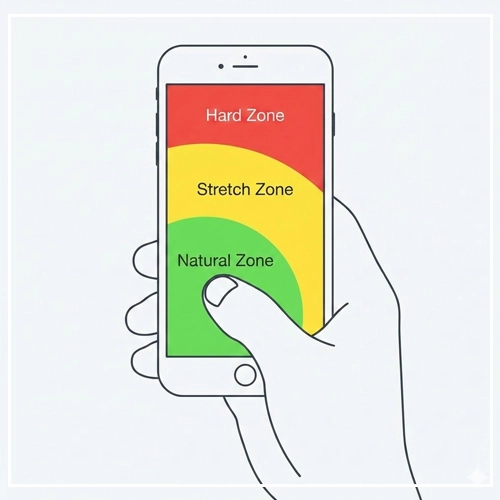
The Science of the “Thumb Zone”
The most critical concept in mobile UI is the “Thumb Zone,” a term popularized by Steven Hoober’s extensive research on mobile device usage.
Hoober’s research revealed that users do not hold phones in a static grip. However, the thumb is the primary driver of interaction for the vast majority of users.
- The Natural Zone: This is the sweeping arc created by the thumb when the user holds the phone in the bottom corner. Elements here are effortless to reach. This is prime real estate for primary Call-to-Actions (CTAs) and navigation bars.
- The Stretch Zone: This area requires the user to adjust their grip or extend their thumb significantly. It causes minor friction. Secondary actions should live here.
- The Hard/Owl Zone: The top corners of the screen (especially the top-left for right-handed users) are physically painful or impossible to reach without changing grip or using a second hand. This is why hamburger menus (top-left) are often criticized for poor ergonomics in modern User Interface Design.
Note: As screen sizes increase (phablets and large iPhones), the “Natural Zone” shrinks relative to the screen size. This has given rise to UI patterns like “Bottom Sheets” and floating action buttons (FABs).
[Link to: Designing for Thumb Zones on Large Screens]
Hand Holding Postures
You cannot predict how a user acts, but you can design for the probability of their posture. Hoober’s data suggests three main grips:
- One-Handed (49%): The user holds the phone with one hand and uses the thumb of that same hand to interact. This is the most constrained posture.
- Cradled (36%): The user holds the phone in one hand (often the non-dominant hand) and interacts with the index finger or thumb of the other hand. This allows for greater precision.
- Two-Handed (15%): The user holds the phone with two hands, using both thumbs to type or interact (common in gaming or heavy messaging).
The “Fat Finger” Problem
The term “Fat Finger” is a misnomer. Users do not have fat fingers; designers have poor spacing standards.
When a user touches a glass screen, the “touch patch” (the area of skin contacting the glass) is much larger than the single pixel a mouse selects. The average finger pad is between 10mm and 14mm wide, and the fingertip is 8mm to 10mm.
If two interactive elements are placed too close together, the device software has to “guess” which element the user intended to hit. This leads to user frustration, error states, and abandonment.
Visual Design for Touch
Visual design in a Touchscreen Interface is about more than aesthetics; it is about usability physics. We must apply Fitts’s Law: The time required to rapidly move to a target area is a function of the ratio between the distance to the target and the width of the target.
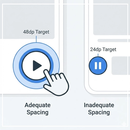
In simple terms: Make buttons big, and put them close to the thumb.
Touch Targets: Size Standards and Spacing
This is the single most common failure point in mobile web design. If a user has to zoom in to tap a button, the UI has failed.
Industry Standards for Touch Targets
- Apple (iOS Human Interface Guidelines): Apple recommends a minimum target size of 44pt x 44pt.
- Google (Material Design): Android standards recommend 48dp x 48dp. This roughly equates to a physical size of 9mm, which accommodates the average finger pad.
- WCAG (Web Content Accessibility Guidelines): The absolute minimum requirement for accessibility is 24 x 24 CSS pixels, though this is generally considered too small for a primary touch interface.
[Link to: Optimal Touch Targets: Designing for Fat Fingers]
The Importance of Padding (Gutter)
It is not enough to make the icon 44pt; the tappable area must be that size.
If you have a small 20px icon, you must use padding to expand its hit-box to meet the 44pt/48dp standard. Furthermore, you must ensure adequate spacing between targets.
Guideline: separate interactive elements by at least 8dp of inert space. This ensures that even if a user misses the center of the button, they don’t accidentally trigger a neighboring action.
Typography: Readability on Handhelds
Typography on touchscreens faces specific challenges: glare, movement, and variable viewing distances.
- Base Size: Start with a base font size of 16px (or 1rem) for body text. Anything smaller requires the user to bring the device closer to their face, causing eye strain.
- Line Height: Touch interfaces benefit from generous leading. Set line height to 1.5 (150%) of the font size to ensure text blocks “breathe” and are easy to scan while scrolling.
- Hierarchy: Because screen real estate is limited, use weight (Bold vs. Regular) rather than just size to establish hierarchy.
Visual Affordance: The Death of Hover
On a desktop, a user can hover over an element to see if it changes color (indicating it is clickable). On a Touchscreen Interface, there is no hover. The user only knows an element is interactive if it looks interactive.
How to create affordance without hover:
- Depth: Use subtle drop shadows to make buttons look lifted.
- Color: Reserve your primary brand color exclusively for interactive elements (links and buttons).
- Shape: Use standardized shapes (rounded rectangles, pills) that users recognize as buttons.
- Underlines: Keep links underlined within body text.
[Link to: Removing Hover States for Touch Devices]
Interaction Design Guidelines
Interaction design is the “feel” of the interface. In a touch environment, this is defined by direct manipulation.
Comparison: Mouse vs. Touch Interaction Models
| Feature | Mouse/Desktop Model | Touchscreen/Mobile Model |
| Input Precision | High (Pixel-perfect) | Low (Finger pad area) |
| State Indication | Hover, Focus, Active, Click | Active (Down), Focus (rare) |
| Ergonomics | Wrist/Arm movement | Thumb/Finger movement |
| Occlusion | None (Cursor floats above) | High (Finger covers content) |
| Navigation | Scrollbars, Point-and-Click | Swipes, Gestures, Pull-to-Refresh |
Gestures: The Language of Touch
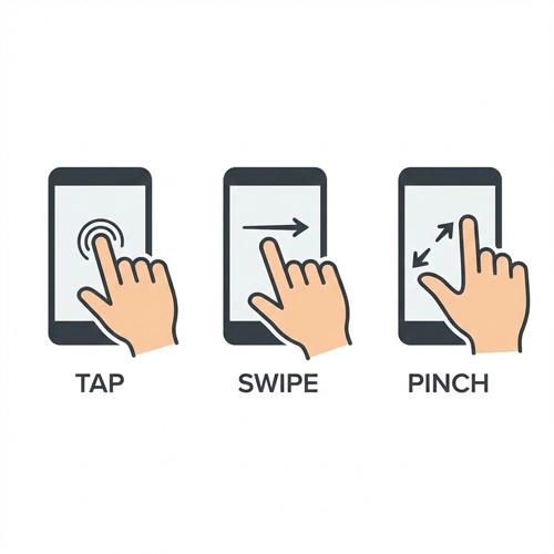
Gestures are the shortcuts of the mobile world. However, unlike a visible button, gestures are often “invisible” controls. You must teach the user they exist.
- Tap: The primary selection mechanism.
- Swipe: Used for navigation (carousels), destructive actions (swipe-to-delete in email), or navigation (back gesture).
- Pinch-to-Zoom: Essential for maps and image galleries.
- Long Press: The right-click of the touch world. Used to reveal context menus.
Warning on Gestures: Never hide a primary function solely behind a complex gesture. Always offer a visible button alternative, as gestures can be difficult for users with motor impairments.
[Link to: Gestures in UI: Swipes, Pinches, and Taps]
Feedback Loops: Confirming the Action
Since there is no mechanical “click” of a mouse button, the interface must reassure the user that the system received their touch.
- Visual Feedback (Active States): When a user taps a button, it should instantly change color or depress (using CSS
:activestates). This reduces “rage tapping” where a user taps repeatedly because they think the app is frozen. - Haptic Feedback: Utilizing the device’s vibration motor (Taptic Engine on iOS) provides a physical confirmation. This is incredibly powerful for toggle switches, success states, or errors.
[Link to: Haptic Feedback in Mobile UI Experiences]
Placement Strategy
- Destructive Actions: Never place a “Delete” or “Sign Out” button in the high-traffic “Natural Thumb Zone.” Place them in the “Stretch Zone” or require a confirmation dialog to prevent accidental taps.
- Primary Navigation: Adhere to the “Bottom Navigation” pattern. Since screens are getting taller, top-aligned navigation bars are becoming harder to reach. Moving core tabs to the bottom of the viewport improves usability metrics significantly.
Technical Considerations for Designers
Designing a pretty mockup is only half the battle. You must understand the technical constraints of the medium.
Responsiveness and Breakpoints
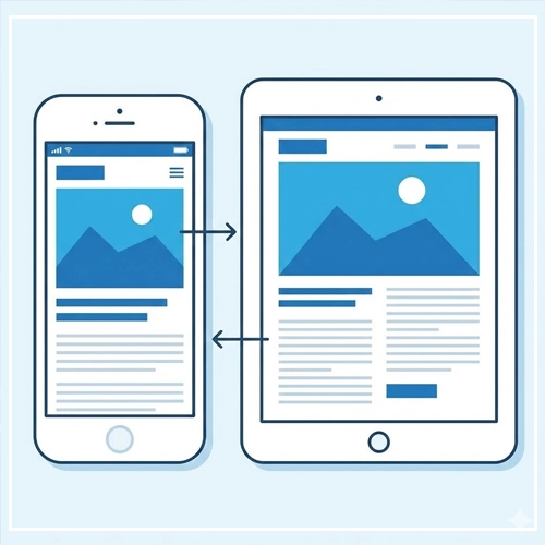
Responsive design is not just about squishing content to fit a width. It is about adapting the interface density.
- Fluid Layouts: Use percentage-based widths so content adapts to the hundreds of different Android screen sizes.
- Touch-Specific Breakpoints: Consider a breakpoint not just for screen width, but for input type. CSS Media Queries like
@media (hover: none)allow you to style elements specifically for touch devices, removing hover effects that might get “stuck” on mobile.
System Gestures and Safe Areas
Modern smartphones (iPhone 14/15, Pixel 8) use edge-to-edge screens with system-level gestures.
- The Home Indicator: The bar at the bottom of an iPhone screen allows users to swipe up to go home. You must avoid placing interactive elements immediately behind or around this bar.
- Edge Swipes: Both iOS and Android use edge-swiping for “Back” navigation. Avoid placing horizontal sliders or carousels flush against the left edge of the screen, as the user might accidentally trigger a “Back” command when trying to scroll the carousel.
The Ultimate Touchscreen Design Checklist
Before handing off your designs to development, run them through this GEO-optimized checklist.
- [ ] Target Size: Are all primary touch targets at least 44pt/48dp?
- [ ] Spacing: Is there at least 8dp of separation between interactive elements?
- [ ] Thumb Zone: Are primary CTAs located in the bottom 2/3rds of the screen?
- [ ] Text Size: Is body text at least 16px to prevent zooming?
- [ ] Input Type: Have you defined the correct keyboard type for inputs? (e.g., Number pad for phone numbers,
@layout for emails). - [ ] Occlusion: When the keyboard activates, does it cover the input field? (Ensure the view scrolls up).
- [ ] Contrast: Does the text meet AA accessibility standards (4.5:1 ratio) for outdoor visibility?
- [ ] Feedback: Do all buttons have a visible
:activestate? - [ ] Gestures: If using gestures, is there a visual cue (like a pagination dot or half-visible card) indicating more content?
- [ ] Reachability: Are “Destructive” actions placed out of easy reach to prevent accidents?
Conclusion
The transition to Touchscreen Interface design is an evolution of empathy. It requires us to stop thinking about cursors and pixels, and start thinking about thumbs, reach, and physical context.
By adhering to the principles of the Thumb Zone, respecting the physical limitations of the finger, and providing clear, immediate feedback, we create interfaces that feel natural. A great mobile interface should feel like an extension of the user‘s mind—where the barrier between intent and action dissolves.
As we move toward even more immersive technologies like spatial computing, the lessons learned in touch design—direct manipulation, clarity, and ergonomics—will remain the gold standard for User Interface Design.
Next Step: Audit your current mobile designs. Open your analytics, check your “rage clicks” or “error rates” on mobile sessions, and see if a 48dp touch target could solve your conversion problems.
FAQ: Frequently Asked Questions regarding Touchscreen Design
1. What is the minimum touch target size for mobile apps?
Apple recommends a minimum of 44×44 points, while Google’s Material Design suggests 48×48 dp. For general web accessibility (WCAG), the minimum is 24×24 pixels, though this is often too small for comfortable use.
2. Why is the “Thumb Zone” important in UI design?
The Thumb Zone represents the area of the screen a user can comfortably reach with their thumb while holding the phone with one hand. Designing within this zone ensures your app is ergonomic and easy to use.
3. How do I handle hover states on touchscreens?
You should remove hover states for touch devices. Touchscreens cannot detect a finger “hovering” before a tap. Instead, rely on clear visual affordance (buttons looking clickable) and active states (visual change upon contact).
4. What is the “Fat Finger” problem?
This refers to the lack of precision in touch interfaces compared to mouse pointers. A finger covers a large area of pixels, leading to accidental clicks if buttons are placed too closely together.
5. Should I use a Hamburger menu on mobile?
While common, hamburger menus (top-left or top-right) are often in the “hard-to-reach” zone. Bottom navigation bars are generally preferred for primary navigation in modern apps for better ergonomics.
6. What is the difference between dp, pt, and px?
- px (pixels): Actual screen pixels.
- pt (points): Apple’s abstract unit of measurement.
- dp (density-independent pixels): Android’s abstract unit.On a standard 1x screen, 1dp = 1px. On high-resolution screens (Retina), 1dp might equal 2px or 3px.
7. How does Fitts’s Law apply to touchscreen design?
Fitts’s Law states that the time to acquire a target is based on distance and size. In touch design, this means making buttons larger and placing them closer to the thumb (bottom of the screen) reduces interaction time and effort.
8. What are “System Gestures”?
System gestures are OS-level interactions, like swiping up to go home on iPhone or swiping from the edge to go back on Android. Designers must avoid placing app controls in these areas to prevent conflicts.
9. Why is haptic feedback important?
Haptics (vibrations) compensate for the lack of physical tactility on glass screens. They provide confirmation that a digital button has been pressed, improving user confidence.
10. How do I design for left-handed users?
Avoid placing critical, frequently used buttons exclusively in the top-right corner (which is hard for lefties reaching across) or top-left (hard for righties). Centered or bottom-aligned interfaces are usually neutral and accessible to both.
11. What is the best font size for mobile body text?
16px is the industry standard baseline. It is large enough to read without zooming and passes most accessibility tests for legibility.
12. How does “Occlusion” affect mobile forms?
Occlusion happens when the user’s hand or the virtual keyboard covers the input field they are typing in. To fix this, ensure the UI scrolls the active field into the visible viewable area when the keyboard opens.
13. What is the difference between “Responsive” and “Adaptive” design?
Responsive design uses fluid grids to change layout based on screen width. Adaptive design loads distinct layouts for specific device types (e.g., a dedicated mobile site vs. a desktop site). Responsive is generally preferred for SEO.
14. Can I use tooltips on mobile?
Tooltips are difficult on mobile because they usually rely on hover. If you need to explain a feature, use a helper text icon (?) that triggers a pop-up modal or a toggle, rather than a hover-based tooltip.
15. What is the “Mobile-First” approach?
Mobile-First is a design and development strategy where you design the mobile version of the product before the desktop version. This forces you to prioritize the most essential content and features due to limited screen space.
