- Mastering UI Forms: Design Strategies for High-Converting Data
- Why is the structural layout critical for Forms?
- How do you choose the right Input Controls?
- Why are Input Validation and Feedback loops necessary?
- When should you use the Wizard Pattern?
- How do you ensure Forms are Accessible?
- Best Practices for Call-to-Action (CTA)
- 1. What is the optimal number of fields for a contact form?
- 2. Should I use placeholders instead of labels?
- 3. How do I reduce form abandonment rates?
- 4. When should I use a dropdown versus a radio button?
- 5. Is reCAPTCHA bad for user experience?
- 6. What is the best button alignment for forms?
- 7. How do I handle optional fields?
- 8. Why is inline validation better than after-submit validation?
- 9. What font size is best for form inputs?
- 10. How do I make forms mobile-friendly?
- 11. What is the "Wizard Pattern" in UI design?
- 12. How does color contrast affect form accessibility?
- 13. Should I split Name into First and Last Name fields?
- 14. What are dark patterns in form design?
- 15. How can I track form performance?
- External Resources
Mastering UI Forms: Design Strategies for High-Converting Data
The humble form is the gatekeeper of digital interaction. Whether it’s a signup flow or a checkout process, Forms are the critical bridge between a user’s intent and a product’s database. Yet, poor form design remains the primary reason for user drop-off.
What makes a high-converting UI form?
A high-converting UI form minimizes cognitive load through single-column layouts, clear labels, and logical grouping. It utilizes input validation to prevent errors before submission and leverages auto-fill to reduce effort. The best forms are accessible, mobile-responsive, and provide immediate feedback via inline error messages.
To optimize Forms, designers must master the nuance of checkbox vs radio button selection and effective floating labels. Complex data requires the wizard pattern to prevent overwhelm, while accessibility labels ensure inclusivity. This guide dissects the anatomy of perfect Web Forms.
[Internal Link: UX Audit Checklist]
Why is the structural layout critical for Forms?
Structure dictates the path of least resistance. Users should be able to scan a form vertically without erratic eye movement.
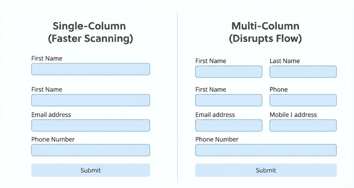
Single-Column vs. Multi-Column
The single-column layout is superior for most data entry tasks. According to the Baymard Institute, single-column forms are filled out significantly faster than multi-column variations. Multi-column layouts disrupt the vertical momentum of the user’s scan path.
Logical Grouping
Lengthy forms cause fatigue. Group related fields (e.g., “Personal Info” vs. “Billing Details”) to create manageable chunks. This separation reduces perceived effort and organizes data mentally for the user.
[Internal Link: Reducing Cognitive Load]
How do you choose the right Input Controls?
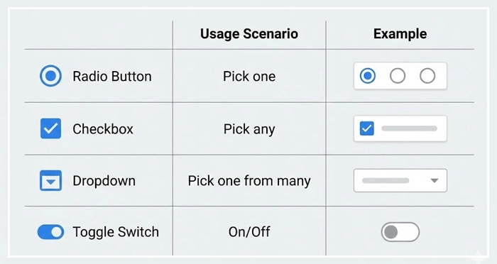
Selecting the correct component—checkbox vs radio button or toggle—is vital for data accuracy. Using the wrong control forces users to pause and think, which increases friction.
The Selection Control Matrix. Below is a comparison of common selection controls to guide your UI decisions.
| Control Type | Usage Scenario | User Expectation | Number of Options |
| Radio Button | Mutually exclusive options (pick one). | I can only select one option. | 2–5 options |
| Checkbox | Multiple choice options (pick any). | I can select zero, one, or many. | 1 or more options |
| Dropdown | Mutually exclusive options (pick one). | I need to click to see choices. | 5+ options |
| Toggle Switch | Binary state (On/Off). | Immediate action/state change. | 2 (Yes/No) |
Floating Labels
Floating labels start inside the field as a placeholder and move upward when the user focuses on the input. This saves vertical space while ensuring the context (the label) remains visible during typing.
[Internal Link: Mobile UI Best Practices]
Why are Input Validation and Feedback loops necessary?
Users should never wonder if they made a mistake. Input validation is the technical process of checking data against set rules (e.g., is this a valid email format?).
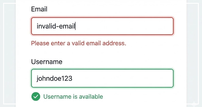
Inline Error Messages
Do not wait for the “Submit” button to trigger errors. Use inline error messages that appear immediately after a user leaves a field (on-blur). This allows users to correct mistakes in real-time, known as the “success spiral.”
Positive Validation
Don’t just flag errors; confirm success. A green checkmark next to a valid username provides psychological reinforcement. Google UX research suggests that positive reinforcement significantly reduces abandonment rates during complex tasks.
[Internal Link: Micro-interactions Guide]
When should you use the Wizard Pattern?
Not all Forms should be displayed at once.
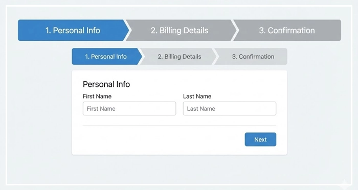
The Wizard Pattern
The wizard pattern breaks a complex process into distinct, sequential steps (steppers). This is ideal for checkout flows or detailed onboardings. It focuses the user on one task at a time, lowering the barrier to entry.
Auto-Fill and Smart Defaults
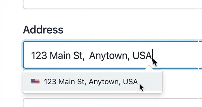
Leverage auto-fill capabilities. If a browser knows the user’s address, let it populate the fields. Smart defaults (pre-selecting the most common option) also save users clicks and cognitive energy.
[Internal Link: User Research Methods]
How do you ensure Forms are Accessible?
Accessibility is not a feature; it is a requirement.
Accessibility Labels
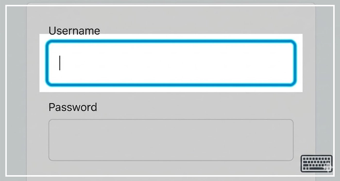
Screen readers rely on code to explain the UI. Use semantic HTML and accessibility labels (like aria-label or aria-labelledby) to ensure visually impaired users understand what data is required.
Keyboard Navigation
Users must be able to navigate the entire form using only the Tab key. Ensure the focus state is clearly visible (usually a colored border) so keyboard users know where they are.
[Internal Link: Web Accessibility (WCAG) Checklist]
Best Practices for Call-to-Action (CTA)
The final step of any form is the submission button.
Label Clarity
Avoid generic labels like “Submit.” Use action-oriented text that describes the outcome, such as “Create Account” or “Pay Now.”
Disabled States
Be cautious with disabled buttons. While they indicate a form isn’t ready, they can confuse users if it’s unclear why the button is disabled. It is often better to keep the button active and trigger an error message upon a click if fields are missing.
[Internal Link: CTA Button Design]
- Structure Matters: Stick to single-column layouts for faster scanning and completion.
- Validation is Key: Use inline error messages to provide real-time feedback and prevent submission errors.
- Select Wisely: adhere to the checkbox vs radio button standards to match user mental models.
- Simplify Complexity: Use the wizard pattern for long forms to reduce cognitive load.
- Automate: Implement auto-fill wherever possible to respect the user’s time.
- Prioritize Accessibility: Ensure proper accessibility labels and keyboard navigation support.
1. What is the optimal number of fields for a contact form?
Research indicates that reducing form fields to between 3 and 5 creates the highest conversion rate. Only ask for essential information.
2. Should I use placeholders instead of labels?
No, placeholders disappear when the user starts typing, straining short-term memory. Always use visible labels or floating labels.
3. How do I reduce form abandonment rates?
Remove optional fields, use auto-fill, provide clear progress indicators, and ensure the form loads quickly on mobile devices.
4. When should I use a dropdown versus a radio button?
Use radio buttons when you have fewer than 5 options so users can see them all at once. Use dropdowns for 5 or more options to save space.
5. Is reCAPTCHA bad for user experience?
Traditional CAPTCHAs hurt UX. Use invisible reCAPTCHA or honeypot techniques to filter spam without interrupting the user.
6. What is the best button alignment for forms?
Left-aligned buttons (aligned with the input fields) generally perform best as they follow the user’s eye-scanning path.
7. How do I handle optional fields?
Clearly mark optional fields with the text “(optional)” rather than using asterisks for required fields. Ideally, remove optional fields entirely.
8. Why is inline validation better than after-submit validation?
Inline validation fixes errors in context immediately, preventing the frustration of scrolling back up to find mistakes after clicking submit.
9. What font size is best for form inputs?
Use a minimum of 16px for input text to prevent iOS devices from auto-zooming, which disrupts the layout.
10. How do I make forms mobile-friendly?
Use large touch targets (44px+), appropriate keyboard types (numeric keypad for phone numbers), and vertical layouts.
11. What is the “Wizard Pattern” in UI design?
The wizard pattern splits large tasks into smaller, sequential steps (like “Shipping,” “Billing,” “Review”) to make the process feel less overwhelming.
12. How does color contrast affect form accessibility?
Input borders and placeholder text must meet WCAG AA standards (at least 4.5:1 contrast ratio) to be visible to visually impaired users.
13. Should I split Name into First and Last Name fields?
Ideally, use a single “Full Name” field. This accommodates cultural variations in naming conventions and reduces cognitive load.
14. What are dark patterns in form design?
Dark patterns are deceptive designs, such as pre-checked “Subscribe to newsletter” boxes or confusing language intended to trick users. Avoid these strictly.
15. How can I track form performance?
Use analytics tools to track field-level drop-off, total completion time, and conversion rates to identify friction points.
External Resources
Here are 3 credible sources to further explore this topic:
- Baymard Institute: 13 Design Patterns for High-Performing Forms
- WebAIM: Creating Accessible Forms


