- Modals vs Popups: Focus in User Interface Design
- H2: What distinguishes the architecture of Modals vs Popups?
- H2: How does a Scrim affect user attention?
- H2: What are the critical Accessibility Standards for focus management?
- Comparison: Modal Dialogs vs. Modeless Dialogs vs. Standard Popups
- When should you use a Dialog Box vs. a Toast?
- Why is the aria-modal attribute essential for developers?
- How do Mobile UI Patterns differ for Modals?
- How do Popups impact Conversion and SEO?
- What is the role of the HTML element?
- 1. What is the main difference between a modal and a popup?
- 2. Are modals bad for SEO?
- 3. How do I make a modal accessible?
- 4. What is a focus trap in UX?
- 5. Should I use a modal for form submissions?
- 6. What is a scrim in UI design?
- 7. Can I use a modal on mobile devices?
- 8. What is the dialog element in HTML?
- 9. How do I close a modal properly?
- 10. What is a modeless dialog?
- 11. Why is z-index important for modals?
- 12. What is an interstitial?
- 13. When should I use an alert box?
- 14. How does aria-hidden work with modals?
- 15. Is a lightbox the same as a modal?
- External Resources
Modals vs Popups: Focus in User Interface Design
User interfaces rely heavily on how we manage attention. The frustration users feel when interrupted by a poorly implemented overlay often stems from a designer confusing Modals vs Popups.
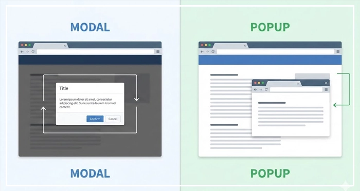
While these terms are often used interchangeably in casual conversation, technically, they represent vastly different interaction models. A modal dialog demands immediate attention, enforcing a lightbox overlay that disables the main content.
Conversely, a popup often behaves as an intrusive interstitial or a separate browser window.
What is the difference between a modal and a popup?
The core difference lies in interaction scope. A Modal is an in-page element that locks the user’s workflow by placing a scrim over the main content, creating a keyboard trap until the user takes action. A Popup is typically a new browser window or tab that exists independently of the parent page’s DOM.
Understanding this distinction is vital for accessibility focus management. Failing to distinguish between a dialog box and a non-blocking alert can ruin dismissibility for screen reader users.
In this guide, we will dissect the architecture of Modals vs Popups, ensuring your designs meet rigorous UX standards.
H2: What distinguishes the architecture of Modals vs Popups?
To build robust interfaces, we must define our entities clearly.
Modals (Modal Dialogs):
These are child windows within the same application window. They require users to interact with them before they can return to the parent application. This is essential for critical confirmations, such as “Delete Account.”
Popups:
Traditionally, these refer to window.open() events that spawn a new browser context. However, in modern vernacular, “popup” often refers to marketing overlays. For the sake of technical precision, we will treat standard popups as separate browser contexts or non-standardized interstitials.
Modeless Dialogs:
These allow interaction with the main content while the dialog remains visible. Think of a “Find and Replace” tool in a text editor or a Gmail compose window.
[Internal Link: Understanding User Flow]
H2: How does a Scrim affect user attention?
The scrim—often called a backdrop or overlay—is the visual layer that sits between the modal and the main content.
Its primary function is to obscure the background, reducing visual noise. This creates a lightbox overlay effect, psychologically signaling to the user that the background is currently inert.
Design Best Practice:
The scrim should generally be black with 50-80% opacity. If the scrim is too light, users may mistakenly attempt to click the background content. If it is opaque, users lose context of where they are in the application.
Proper use of a scrim reduces cognitive load by isolating the task at hand. It visually enforces the modal nature of the interaction.
[Internal Link: Cognitive Load in Design]
H2: What are the critical Accessibility Standards for focus management?
Accessibility is not an “add-on”; it is a requirement. When discussing Modals vs Popups, the Web Content Accessibility Guidelines (WCAG) are strict regarding focus management.
The Keyboard Trap
A keyboard trap occurs when a user navigates into a component (like a modal) using the Tab key but cannot exit it.
For a modal to be accessible, it must trap focus intentionally, but only within the modal itself. Focus should not drift to the background content.
WCAG 2.1 Compliance Checklist:
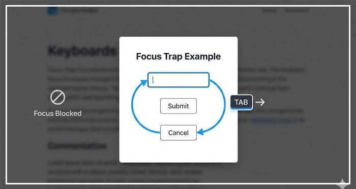
- Focus containment: When the modal opens, focus must move to the first interactive element inside the modal.
- Looping: Tabbing past the last element in the modal should return focus to the first element in the modal.
- Restoration: When the modal closes, focus must return to the element that triggered the modal.
- Escape: The
Esckey must close the modal.
Authority Signal:
According to the Nielsen Norman Group, modal dialogs interrupt the user’s workflow. Therefore, they should be used sparingly and only when the interruption is justified by the importance of the task.
[Internal Link: Web Accessibility Guidelines (WCAG)]
Comparison: Modal Dialogs vs. Modeless Dialogs vs. Standard Popups
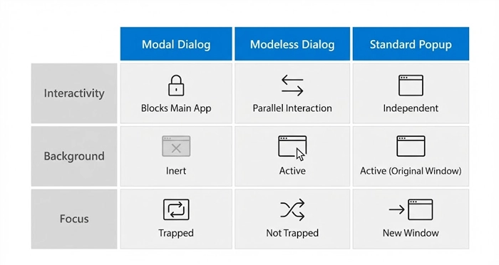
Below is a technical breakdown of interaction behaviors.
| Feature | Modal Dialog | Modeless Dialog | Standard Popup (Window) |
| Interactivity | Blocks main app until dismissed. | Allows parallel interaction. | Independent of main app. |
| Background Interaction | Disabled (Inert). | Active / Clickable. | Active (in original window). |
| Focus Management | Traps focus (Loop). | No trap required. | Focus is on new window. |
| Primary Use Case | Critical errors, confirmations. | Reference info, multitasking. | External links, legacy tools. |
| DOM Position | Inside parent DOM. | Inside parent DOM. | Separate Window Object. |
| Mobile Behavior | Often takes full screen. | Difficult to manage (avoid). | Opens new tab. |
When should you use a Dialog Box vs. a Toast?
Designers often default to modals for everything, which leads to “alert fatigue.”
Use a Modal Dialog When:
- The action is critical and cannot be undone (e.g., Deleting data).
- You require distinct user input to proceed (e.g., Login forms).
- The information is vital to the user’s current workflow.
Use a Toast/Snackbar When:
- The system is providing feedback (e.g., “File Saved”).
- No user action is required.
- The message is temporary and non-critical.
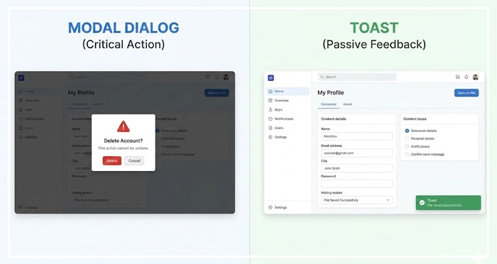
Toast UX:
Toasts should never interrupt the user. They should appear peripherally and vanish automatically. Using a modal to say “Message Sent” forces an unnecessary click to dismiss, increasing friction.
[Internal Link: Micro-interactions in UX]
Why is the aria-modal attribute essential for developers?
For frontend developers, semantic HTML is the backbone of the Modals vs Popups distinction.
When building a custom modal, the container must have the attribute aria-modal="true" and role="dialog" (or role="alertdialog" for urgent errors).
Code Implementation Note:
Setting aria-modal=”true” tells assistive technology that everything outside this element is inert. This prevents screen readers from reading the background content, which would otherwise confuse a blind user.
If you do not use native <dialog> elements, you must manually set aria-hidden="true" on the main content container when the modal is open.
[Internal Link: Web Accessibility Guidelines (WCAG)]
How do Mobile UI Patterns differ for Modals?
On desktop, a modal is a box in the center of the screen. On mobile, screen real estate is premium.
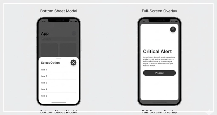
Responsive Adaptation:
On mobile devices, modals should often adapt to become bottom sheets or full-screen overlays. A centered box on a small phone screen creates touch target issues and often pushes content “below the fold” of the modal itself.
Touch Targets:
Ensure the “Close” (X) button is large enough (min 44×44 pixels) for thumb interaction. The “click outside to dismiss” pattern is intuitive on desktop but can be finicky on mobile touchscreens.
[Internal Link: Mobile UI Patterns]
How do Popups impact Conversion and SEO?
Marketing teams love popups; users hate them.
The Google Interstitial Penalty:
Google penalizes mobile pages that show intrusive interstitials immediately upon landing. This blocks the user from the content they searched for.
Better Conversion Strategies:
Instead of an immediate popup, use exit-intent technology or scroll-triggered slide-ins. These are less aggressive forms of Modals vs Popups that respect the user‘s initial reading time.
If you must use a modal for lead generation (e.g., newsletter signup), ensure it is easily dismissible. If the close button is hidden or delayed, users will bounce, signaling poor engagement to search engines.
[Internal Link: Conversion Rate Optimization]
What is the role of the <dialog> HTML element?
Historically, creating accessible modals required complex JavaScript libraries. Today, the native HTML <dialog> element solves many of these issues.
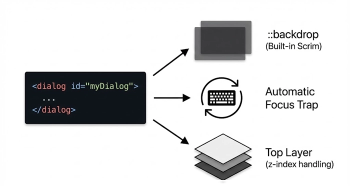
Native Features:
.showModal(): This method automatically puts the browser into a modal state.- Top Layer: It places the element in the top layer of the stack context, solving
z-indexwars. - Focus Management: It handles the focus trap automatically in most modern browsers.
- Backdrop: It provides a
::backdroppseudo-element for easy styling of the scrim.
Using native elements improves performance and reduces the code weight required to manage Modals vs Popups.
[Internal Link: Form Design Best Practices]
- Distinguish Clearly: Modals block interaction; Popups are separate windows; Modeless dialogs allow parallel work.
- Prioritize Accessibility: Always implement focus trapping inside modals. Use
aria-modal="true"and ensure theEsckey works. - Manage the Scrim: Use a darkened background to reduce cognitive load and focus attention on the dialog box.
- Respect the User: Do not use modals for passive information. Use Toasts or Snackbars for status updates.
- Watch SEO: Avoid intrusive interstitials on mobile landing pages to prevent search ranking penalties.
- Go Native: Utilize the HTML
<dialog>element for better performance and built-in accessibility features.
1. What is the main difference between a modal and a popup?
A modal is an overlay within the same webpage that blocks interaction with the background content. A popup is typically a new browser window or a marketing overlay that may or may not block interaction.
2. Are modals bad for SEO?
Modals themselves are not bad for SEO if used for functionality (like login). However, intrusive marketing modals (interstitials) that cover the main content on mobile entry can lead to Google penalties.
3. How do I make a modal accessible?
You must ensure focus is trapped within the modal, the Esc key closes it, and it has the correct ARIA roles (role="dialog" and aria-modal="true").
4. What is a focus trap in UX?
A focus trap is a cycle where the keyboard user’s focus is constrained to a specific area (like a modal). They cannot Tab out of it until they dismiss the modal.
5. Should I use a modal for form submissions?
Yes, modals are excellent for short forms like “Login” or “Edit Profile.” However, for long, complex forms, a dedicated page is often better to reduce cognitive load.
6. What is a scrim in UI design?
A scrim is the semi-transparent overlay (usually black) behind a modal. It obscures the background content to indicate that it is inactive.
7. Can I use a modal on mobile devices?
Yes, but it is often better to style them as “Bottom Sheets” or full-screen overlays on mobile to maximize screen space and touch accessibility.
8. What is the dialog element in HTML?
The <dialog> element is a native HTML tag that simplifies creating modals. It includes built-in methods like .showModal() that handle backdrop and focus management automatically.
9. How do I close a modal properly?
Users should be able to close a modal by clicking a designated “X” button, clicking the scrim (background), or pressing the Esc key.
10. What is a modeless dialog?
A modeless dialog is a floating window that allows the user to interact with the main content while the dialog remains open (e.g., a chat window or a toolbar).
11. Why is z-index important for modals?
z-index determines the stack order of elements. Modals must have a high z-index to ensure they appear on top of all other content, including navigation bars and footers.
12. What is an interstitial?
An interstitial is a full-screen ad or overlay that appears between page views or before the expected content loads. They are often confused with modals.
13. When should I use an alert box?
System alert boxes (the browser default) block all browser execution. They are disruptive and should only be used for critical security warnings or debugging, not standard UX.
14. How does aria-hidden work with modals?
When a modal is open, aria-hidden="true" should be applied to the main content wrapper. This hides the background content from screen readers so they only “see” the modal.
15. Is a lightbox the same as a modal?
“Lightbox” usually refers to a specific type of modal used for viewing images. It dims the background and centers the image. So, a lightbox is a modal, but not all modals are lightboxes.
External Resources
Here are 3 credible sources to further explore this topic:


