- What is Interactive UI Design?
- The Psychology of Engagement
- The Foundations of Interaction Design
- Core Elements of Engaging Interfaces
- Visual Dynamics & Motion
- Gamification & Engagement Mechanics
- Technical & Usability Considerations
- The Ultimate Interactive UI Checklist
- FAQ: Interactive UI Design
- 1. What is the difference between UI and UX design?
- 2. Why is feedback important in interactive design?
- 3. What are micro-interactions?
- 4. How does interactive design impact SEO?
- 5. What is the "Hover" state?
- 6. Do hover effects work on mobile?
- 7. What is 'Affordance' in UI design?
- 8. What is the best speed for UI animations?
- 9. What is 'Easing' in animation?
- 10. How can I make my interactive UI accessible?
- 11. What is 'Gamification' in UI?
- 12. Does heavy interaction design slow down a website?
- 13. What is the 'Zeigarnik Effect' in design?
- 14. What tools are best for designing interactive UI?
- 15. What is 'Haptic Feedback'?
What is Interactive UI Design?
Definition: Interactive UI Design is the discipline of defining the behavior of interface elements in response to user input. It bridges the gap between static visuals and the user‘s action, creating a dialogue where every click, scroll, and gesture receives immediate, meaningful feedback.
In the modern landscape of User Interface Design, static pixels are no longer enough. We must design for conversation.
While visual design focuses on how things look, interactive design focuses on how things behave. It turns a passive viewing experience into an active engagement.
The Psychology of Engagement
Why do users crave responsiveness? It is rooted in our psychological need for agency and control. When we interact with the physical world, physics responds instantly. If you drop a pen, it falls. If you touch a hot stove, you feel heat.
When digital interfaces mimic this cause-and-effect relationship, they feel intuitive. Responsiveness builds trust. It tells the user, “I hear you, I am processing your request, and here is the result.” Without this feedback loop, the user feels disconnected, leading to high bounce rates and low retention.
In this guide, we will move beyond basic aesthetics to explore the mechanics, psychology, and technical implementation of truly engaging interactive design.
The Foundations of Interaction Design
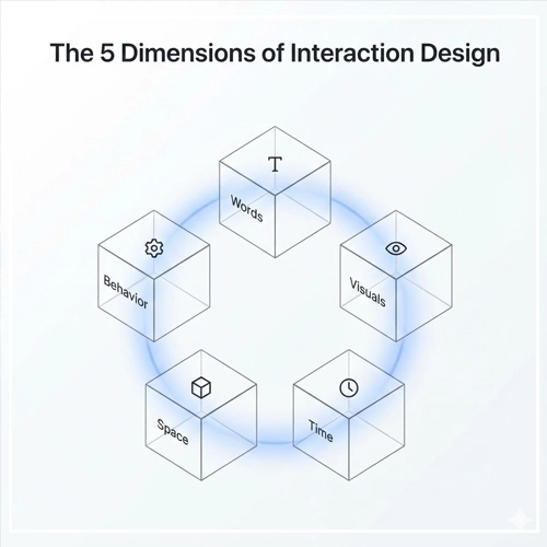
To build effective Interactive UI Design, we must look beyond current trends and understand the academic foundations of the discipline. We rely heavily on the framework established by Gillian Crampton Smith and later expanded by Kevin Silver: The 5 Dimensions of Interaction Design.
1. Words (1D)
Words are the interactions’ instructions. In UI, this includes button labels, menu items, and tooltip text.
- Role: They must be meaningful and simple. A button labeled “Submit” is functional, but a button labeled “Get My Free Guide” is interactive because it promises a specific result.
- Best Practice: Avoid “computer-speak.” Use verbs that align with user intent.
2. Visual Representations (2D)
These are the graphical elements users interact with—images, typography, and icons.
- Role: Visuals usually supplement words. A trash can icon conveys “Delete” faster than the word itself.
- Best Practice: Ensure interactive elements look interactive (affordance). A button should look pressable (via shadow or border), not flat like a text box.
3. Physical Objects or Space (3D)
This dimension refers to the physical hardware the user interacts with.
- Role: Are they using a mouse? A touchscreen? A trackpad? A stylus?
- Context: A hover effect works beautifully for a mouse user (3D space) but is non-existent for a mobile user. You must design interactions that adapt to the physical constraints of the device.
4. Time (4D)
Time is the dimension that separates static UI from interactive UI. It refers to media that changes over time (animation, video, sound).
- Role: Time helps users understand changes in the interface.
- Example: When a user deletes an item, it shouldn’t just vanish. It should slide off-screen (taking 300ms of time), helping the user track the change.
5. Behavior (5D)
This is the “how” of the interaction. It defines the mechanism.
- Role: How do users perform actions? Do they swipe, pinch, click, or drag?
- Action: Behavior also covers the “rules” of the system. If I swipe left, does it archive or delete?
Interaction vs. UI Animation: The Distinction
It is crucial to differentiate between these two terms.
| Feature | UI Animation | Interaction Design |
| Trigger | System-initiated (e.g., a loading spinner). | User-initiated (e.g., clicking a toggle). |
| Purpose | To entertain or distract. | To provide feedback or navigation. |
| Agency | Passive (The user watches). | Active (The user controls). |
Expert Insight: Animation should strictly support interaction. If an animation plays without a user asking for it, it is decoration. If it plays because the user did something, it is interaction.
Core Elements of Engaging Interfaces
Once the foundations are set, we move to the building blocks. How do we apply User Interface Design principles to specific components?
1. Input Controls: The Texture of the Web
Input controls are the hands and feet of your interface. They include buttons, toggles, text fields, checkboxes, and radio buttons.
To make these engaging, they must possess Tactile Intelligence.
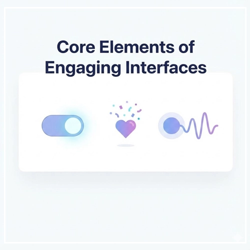
- The Toggle Switch: When a user taps a toggle, it shouldn’t just change color. The knob should slide physically from left to right. This movement mimics a real-world switch, providing satisfaction.
- Text Fields: When a user clicks into a field, the border should highlight, and the label should float up (the Floating Label pattern). This keeps context visible and assures the user the field is active.
2. Micro-interactions
Micro-interactions are the secret sauce of great products. They are single-task engagements that make devices feel human.
Note: A micro-interaction has four parts: Trigger, Rules, Feedback, and Loops/Modes.
Examples include:
- The “Like” heart popping with confetti when clicked.
- The vibration when you pull to refresh a feed.
- The password strength meter changing color as you type.
For a deeper dive into structuring these moments, read our guide on:
[Link to: Micro-interactions: What They Are & Why They Matter]
3. Feedback Loops
In physics, every action has a reaction. In UI, every interaction needs feedback. If a user acts and the system is silent, the user creates their own (negative) narrative.
Feedback comes in three forms:
- Visual: A button changes color when pressed; a loader appears when data is fetched.
- Audio: A subtle “whoosh” when an email is sent confirms the action without requiring the user to look.
- Haptic: On mobile devices, a tiny vibration when a task is completed creates a physical connection to the software.
Strategic Tip: Use feedback loops to guide behavior. If a user enters an invalid email, don’t just show an error message after they hit submit. Use real-time validation to turn the border red immediately, guiding them to correct it instantly.
[Link to: Designing Feedback Loops in User Interfaces]
Visual Dynamics & Motion
Motion is not just about making things look “cool.” In Interactive UI Design, motion conveys hierarchy, spatial relationships, and status.
State Changes
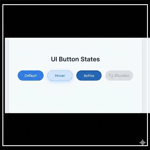
Every interactive element must have defined states. If you only design the “Default” state, you have only done 25% of the work.
- Default: The element at rest.
- Hover: The cursor is over the element. This indicates “I am clickable.”
- Focus: The element is selected via keyboard or voice. Crucial for accessibility.
- Active: The moment the element is being pressed.
- Disabled: The element exists but cannot be used yet.
[Link to: Best Hover Effects for Button States in 2025]
Transition Timing and Easing
Nothing in nature moves in a perfectly straight line at a constant speed. When a car starts, it accelerates. When it stops, it decelerates.
- Linear Motion: Feels robotic and unnatural. Avoid this for UI elements.
- Easing (Ease-In / Ease-Out): This makes motion feel organic.
- Ease-Out: Start fast, end slow. Great for elements entering the screen (modals, toasts).
- Ease-In: Start slow, end fast. Great for elements leaving the screen.
Rule of Thumb: Transitions should be between 200ms and 500ms.
- < 100ms: Too fast to perceive.
- 500ms: Users will feel like the interface is lagging.
Cognitive Load and Attention
Motion attracts the eye more than anything else. This is a biological survival trait. In UI, we must use this responsibly.
Do not animate everything. If the logo is spinning, the banner is sliding, and the button is pulsing, the user will be overwhelmed. This is “Banner Blindness” induced by motion sickness.
[Link to: How to Use Animation Without Hurting Usability]
Gamification & Engagement Mechanics
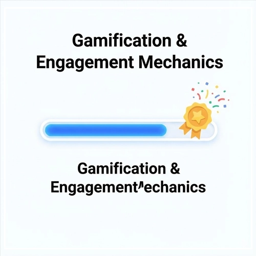
Gamification is the application of game-design elements in non-game contexts. It is a powerful tool in Interactive UI Design to boost retention and make mundane tasks enjoyable.
Progress Indicators
Humans hate unfinished business. This is known as the Zeigarnik Effect.
- Application: Instead of a long, boring form, break it into steps. Use a progress bar at the top.
- Interaction: Animate the bar filling up as they complete fields.
- Result: Users are statistically more likely to finish a signup flow if they can see how close they are to the end.
Reward Systems
Positive reinforcement strengthens user habits.
- Confetti: When a user completes a major task (like finishing a course or clearing their inbox), trigger a celebration animation.
- Badges: Unlock visual tokens for milestones.
- Counters: Watching a number tick up (like savings in a banking app) creates a dopamine hit.
However, be careful not to “gamify” serious tasks where friction is actually helpful (like deleting an account or transferring large sums of money).
[Link to: Gamification Elements to Boost App Engagement]
Technical & Usability Considerations
As a Senior Designer, you must ensure your interactions are feasible, performant, and inclusive. A beautiful animation that crashes the browser is a failed design.
Performance: Interaction to Next Paint (INP)
Google’s Core Web Vitals now measure INP (Interaction to Next Paint). This metric measures the latency of responsiveness.
- If a user clicks a dropdown and the main thread is blocked by heavy JavaScript animations, the menu delays opening.
- Target: Interactions should respond visually in under 200ms.
- Solution: Use CSS transitions (Hardware Accelerated) rather than JavaScript animations whenever possible. CSS runs on the Compositor thread, leaving the Main thread free for logic.
Accessibility in Interaction
Interactive UI Design must be for everyone.
- Prefers-Reduced-Motion: Some users suffer from vestibular disorders (motion sickness). Operating systems have a “Reduce Motion” setting. Your CSS should respect this:
CSS@media (prefers-reduced-motion: reduce) { * { animation-duration: 0.01ms !important; transition-duration: 0.01ms !important; } }- Keyboard Accessibility: Never rely solely on “Hover.” Keyboard users interact via “Focus.” Ensure your
:focusstates are as visible as your:hoverstates. - Touch Targets: According to WCAG guidelines, interactive targets must be at least 44×44 CSS pixels to accommodate different finger sizes.
Mobile vs. Desktop Interactions
Do not assume one design fits all.
- Desktop: Precise cursor. Hovers are available. Complex tooltips work well.
- Mobile: Coarse touch (finger). No hovers.
- Challenge: How do you show secondary information without hover?
- Solution: Use a long-press (Haptic Touch) or an explicit “info” icon toggle.
- Gestures: Mobile allows for swiping. Tinder’s “Swipe Right” is a prime example of mobile-native interaction design that doesn’t translate perfectly to a mouse click.
The Ultimate Interactive UI Checklist
Before you hand off your designs to development, run your interface through this checklist to ensure maximum engagement and usability.
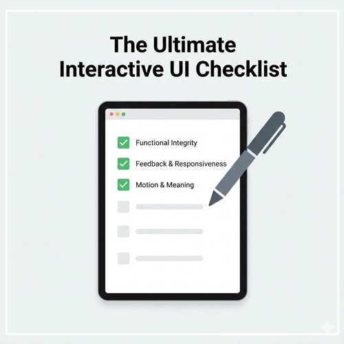
1. Functional Integrity
- [ ] Does the interactive element actually work?
- [ ] Is the click target large enough (min 44px)?
- [ ] Is the active area separated from other elements to prevent mis-clicks?
2. Feedback & Responsiveness
- [ ] Does the element have a
:hoverstate? - [ ] Does the element have a
:focusstate for keyboard users? - [ ] Does the element have an
:activestate (pressed)? - [ ] Does the system provide visual/audio feedback within 100ms of the trigger?
3. Motion & Meaning
- [ ] Is the animation essential, or just decoration?
- [ ] is the duration appropriate (200-500ms)?
- [ ] Is the easing curve natural (not linear)?
- [ ] Does the motion originate from the trigger point (spatial continuity)?
4. Accessibility & Performance
- [ ] Have you included a
prefers-reduced-motionquery? - [ ] Are labels and instructions clear for screen readers?
- [ ] Is the color contrast on states (especially disabled states) legible?
Conclusion
Interactive UI Design is the difference between a digital brochure and a digital product. It is about respecting the user’s time and effort by providing an interface that listens, understands, and responds.
By mastering the 5 dimensions of interaction, prioritizing meaningful micro-interactions, and adhering to strict performance and accessibility standards, you elevate your work from “usable” to “delightful.”
Remember, the goal is not to keep the user on the screen longer through flashy tricks, but to help them achieve their goals with a sense of flow and mastery. Start small—fix your button states, smooth out your modal transitions—and watch your engagement metrics soar.
Ready to take your skills further? Explore our deep dive on [Link to: Micro-interactions: What They Are & Why They Matter].
FAQ: Interactive UI Design
1. What is the difference between UI and UX design?
UI (User Interface) focuses on the visual and interactive elements (buttons, screens), while UX (User Experience) focuses on the overall journey and how the user feels throughout the process.
2. Why is feedback important in interactive design?
Feedback confirms that the system has received the user‘s input. Without it, users feel uncertain and may abandon the task or click repeatedly, causing errors.
3. What are micro-interactions?
Micro-interactions are small, functional animations that serve a single purpose, such as a “Like” button animation, a toggle switch movement, or a pull-to-refresh gesture.
4. How does interactive design impact SEO?
While Google doesn’t rank “animations,” it does rank User Experience (Core Web Vitals). Good interaction design improves time-on-page and lowers bounce rates, which are positive signals for SEO.
5. What is the “Hover” state?
The Hover state occurs when a cursor is positioned over an element but hasn’t clicked yet. It helps users identify which elements are interactive.
6. Do hover effects work on mobile?
No. Mobile devices use touch screens, which do not have a cursor. Therefore, hover effects do not trigger. You must design alternative indicators for touch devices.
7. What is ‘Affordance’ in UI design?
Affordance refers to the visual clues that tell a user how to use an object. For example, a button with a drop shadow affords “pressing,” while a blue underlined text affords “clicking.”
8. What is the best speed for UI animations?
Generally, UI transitions should last between 200ms and 500ms. Anything faster is unnoticeable; anything slower feels sluggish.
9. What is ‘Easing’ in animation?
Easing determines how an animation speeds up or slows down. “Ease-out” (starting fast, ending slow) is most common in UI as it feels more natural and responsive.
10. How can I make my interactive UI accessible?
Ensure all interactive elements are navigable via keyboard (using Tab), have visible focus states, and respect the user’s prefers-reduced-motion settings in their OS.
11. What is ‘Gamification’ in UI?
Gamification uses game mechanics (points, badges, progress bars) in non-game apps to encourage user engagement and task completion.
12. Does heavy interaction design slow down a website?
It can if not optimized. Using heavy JavaScript for animations can block the main thread. Using CSS transitions and hardware acceleration is preferred for performance.
13. What is the ‘Zeigarnik Effect’ in design?
It is a psychological principle stating that people remember uncompleted or interrupted tasks better than completed ones. It is used in progress bars to encourage users to finish a sequence.
14. What tools are best for designing interactive UI?
Popular tools include Figma (for prototyping), Protopie (for advanced interaction), and Adobe After Effects (for complex motion graphics).
15. What is ‘Haptic Feedback’?
Haptic feedback is the use of touch sensations (vibrations) to communicate with the user. It is commonly used in mobile UI to confirm actions like long-presses or errors.
