- What is iconography in UI design?
- The Semiotics of UI: Why Does Iconography Matter?
- Technical Execution: The Science of The Grid
- Stylistic Choices: Filled vs. Outlined Styles
- Usability & Accessibility Standards
- Expanding Your Toolkit
- Where can you find resources?
- 1. What is the difference between iconography and illustration in UI?
- 2. Why is SVG better than PNG for UI icons?
- 3. How do I choose between filled and outlined icons?
- 4. What is the standard size for UI icons?
- 5. Does icon stroke weight affect usability?
- 6. Do icons always need text labels?
- 7. What is optical alignment in icon design?
- 8. How do I improve icon accessibility?
- 9. What are universal symbols in UI?
- 10. Can I mix icon styles in the same app?
- 11. What tools are best for designing icon sets?
- 12. How does iconography impact SEO?
- 13. What is a pixel-perfect icon?
- 14. Should icons be colored or monochrome?
- 15. How do I export icons for development?
- External Resources
- Where can you find resources?
What is iconography in UI design?
Iconography in User Interface design is the visual language of symbols used to represent features, functionality, or content. It relies on semiotics and visual metaphors to communicate meaning instantly, bypassing language barriers and reducing cognitive load. Effective iconography prioritizes clarity, consistency, and distinctiveness over artistic expression.
Nothing frustrates a user faster than ambiguous navigation. When a user hesitates to decipher a symbol, the flow of interaction breaks. Iconography is not merely decoration; it is the fundamental functional language of your interface.
To achieve this level of clarity, designers must master the technical nuance of SVG icons. You must strictly adhere to icon consistency across your system. Elements like stroke weight and optical alignment separate amateur interfaces from professional ones. We will explore how universal symbols, the debate of filled vs outlined style, and appropriate touch target size dictate icon usability.
The Semiotics of UI: Why Does Iconography Matter?
How do symbols influence cognitive load?
Users process visual information 60,000 times faster than text. However, this speed relies on immediate recognition. Iconography serves as a cognitive shortcut.

When an icon is unrecognizable, it becomes a “speed bump” in the user journey. This increases the mental effort required to navigate.
[Internal Link: Cognitive Load in UX]
To minimize this effort, leverage universal symbols. A magnifying glass always means “search.” A house always means “home.” Deviating from these established metaphors for the sake of “creativity” usually results in user confusion.
According to the Nielsen Norman Group, icons accompanied by text labels are recognized significantly faster than icons alone. However, if space creates constraints, the icon must be a universal standard to function without a label.
What is the role of semantic consistency?
Icon consistency builds trust. If your “edit” icon is a pencil in one view, it cannot be a pen in another.
Consistency extends beyond the metaphor to the visual treatment. Mixing filled vs outlined style icons arbitrarily creates visual noise. A strictly defined set of rules helps users predict interaction outcomes.
[Internal Link: Design Systems Guide]
Technical Execution: The Science of The Grid
Why is Optical Alignment superior to Mathematical Alignment?
Mathematical centering often looks “off” to the human eye. Optical alignment corrects this by balancing the visual weight of the icon rather than its bounding box.
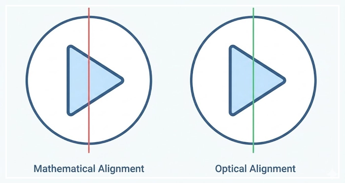
For example, a “Play” triangle mathematically centered in a circle will appear too far to the left. You must nudge it to the right to achieve visual equilibrium. This nuance is critical for professional iconography.
How do you manage Stroke Weight and Scale?
Stroke weight must remain consistent regardless of the icon’s size.
If you scale an icon down without adjusting the stroke, it becomes a muddy blob. If you scale it up, it looks spindly and weak.
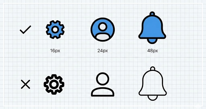
Best Practices for Stroke Management:
- Use a base grid (e.g., 24px) for all icon creation.
- Stick to a standard stroke width (e.g., 2px) for the primary set.
- Outline strokes before exporting if the icon won’t be animated.
Why are SVG Icons the industry standard?
SVG icons (Scalable Vector Graphics) are resolution-independent. They remain crisp on a 4K monitor and a mobile screen alike.
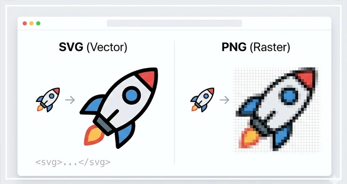
Unlike PNGs, SVGs are code. This allows developers to manipulate properties like color and size via CSS. This creates a more flexible and lightweight system.
[Internal Link: SVG Optimization Techniques]
Stylistic Choices: Filled vs. Outlined Styles
When should you use Filled vs. Outlined icons?
The debate between filled vs outlined style affects recognition speed and hierarchy.
Generally, filled icons carry more visual weight. They draw the eye. Outlined icons feel lighter and more delicate.
Active States:
Use filled icons to denote an “active” or “selected” state (like a highlighted tab bar item).
Resting States:
Use outlined icons for inactive or secondary options. This contrast provides immediate feedback to the user about their current location in the app.
Markdown Table: Visual Clarity Comparison

| Icon Style | Recognition Speed | Visual Weight | Best Use Case |
| Filled Icons | High (Faster processing) | Heavy | Active states, Primary actions, Tab bars. |
| Outlined Icons | Medium (Slower detail processing) | Light | Resting states, Secondary actions, Decorative. |
| Universal Symbols | Instant (Semantic memory) | Variable | Global navigation, Common utilities (Search, Home). |
Usability & Accessibility Standards
What is the ideal Touch Target Size?
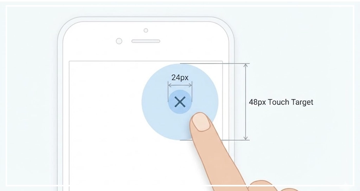
Visual size and target size are different. An icon might be 24px visually, but the touch target size must meet accessibility standards.
Apple’s Human Interface Guidelines recommend a minimum target of 44×44 points.
Google’s Material Design recommends a minimum of 48x48dp.
Failing to provide adequate padding results in “fat finger” errors. This frustrates users and leads to high bounce rates on mobile.
[Internal Link: Mobile UI Best Practices]
How do you test Icon Usability?
Don’t guess; test. Icon usability testing involves asking users to predict what an icon does without a label.
If users cannot correctly identify the function within 5 seconds, the icon has failed. In these cases, text labels are mandatory for clarity.
[Internal Link: Accessibility and WCAG Standards]
Expanding Your Toolkit
Where can you find resources?
While custom iconography is ideal for branding, high-quality libraries can speed up workflow. Using established kits ensures you start with a solid foundation of consistency and universal symbols.
[Internal Link: UI Kit Resources]
- Clarity First: Iconography is functional, not just decorative. Use labels whenever possible.
- Trust the Eye: Use optical alignment rather than mathematical centering to ensure icons look balanced.
- Format Matters: Always use SVG icons for web and mobile to ensure crisp rendering at any scale.
- Respect the Finger: Maintain a minimum touch target size of 44px-48px for mobile usability.
- Be Consistent: Stick to one style (filled vs outlined style) and stroke weight throughout the interface.
1. What is the difference between iconography and illustration in UI?
Iconography focuses on functional symbols that represent actions or navigation (like a “save” disk). Illustrations are complex visuals used for storytelling, onboarding, or decoration and are generally not interactive.
2. Why is SVG better than PNG for UI icons?
SVGs are vector-based code, meaning they scale infinitely without losing quality and have smaller file sizes. PNGs are raster images that pixelate when resized and are generally heavier to load.
3. How do I choose between filled and outlined icons?
Use filled icons for “active” states or high-emphasis actions because they are recognized faster. Use outlined icons for “inactive” states or secondary actions to reduce visual clutter.
4. What is the standard size for UI icons?
The industry standard base size for icons is a 24×24 pixel grid. Smaller utility icons often use 16x16px, while larger display icons may use 32x32px or 48x48px.
5. Does icon stroke weight affect usability?
Yes. Thin strokes can be hard to see on low-contrast screens or by visually impaired users. A minimum stroke weight of 1.5px to 2px is recommended for accessibility.
6. Do icons always need text labels?
For clarity, yes. While universal symbols (search, home) can stand alone, most icons benefit from text labels to reduce ambiguity and improve accessibility for screen readers.
7. What is optical alignment in icon design?
Optical alignment is the process of positioning an icon based on how it appears to the human eye, rather than its mathematical center. This compensates for visual weight distribution.
8. How do I improve icon accessibility?
Ensure high color contrast (minimum 3:1 ratio), provide descriptive “alt” text for screen readers, and ensure the touch target area is at least 44×44 pixels.
9. What are universal symbols in UI?
Universal symbols are icons that have a globally recognized meaning, such as a hamburger menu for navigation, a gear for settings, or a trash can for delete.
10. Can I mix icon styles in the same app?
Generally, no. Mixing styles (like using hand-drawn icons next to geometric icons) breaks consistency and looks unprofessional. Stick to one cohesive icon family.
11. What tools are best for designing icon sets?
Vector-based tools like Figma, Adobe Illustrator, and Sketch are the industry standards for designing precise, grid-based icon sets.
12. How does iconography impact SEO?
Directly, it doesn’t. However, using optimized SVGs improves page load speed (a ranking factor), and clear navigation reduces bounce rates, which signals quality to search engines.
13. What is a pixel-perfect icon?
A pixel-perfect icon creates sharp edges by aligning vector paths strictly to the pixel grid. This prevents the blurry “anti-aliasing” effect seen on low-resolution screens.
14. Should icons be colored or monochrome?
Monochrome (often grey or black) is best for navigation to avoid distracting the user. Color is reserved for active states, warnings, or brand moments.
15. How do I export icons for development?
Export icons as optimized SVGs. Ensure the code is clean (remove unnecessary metadata) and that the viewBox is consistent across all icons in the set.
External Resources
Here are 3 credible sources to further explore this topic:

