- Card UI Components: Mastering Modular Design
- What is a Card UI component?
- What Constitutes the Anatomy of a Perfect Card?
- How Do Elevation and Shadows Create Hierarchy?
- Which Layout Strategy Fits Your Data?
- How Should Users Interact with Card UI?
- Why is the Card UI Pattern Essential for Mobile?
- How to Handle Varying Content Lengths?
- 1. What is the difference between a card and a tile in UI design?
- 2. How do you make a Card UI accessible?
- 3. Should I use borders or shadows for Card UI?
- 4. What is the ideal width for a UI card?
- 5. Can a card contain another card?
- 6. How do I handle long titles in a fixed-height card?
- 7. Is the Card UI pattern bad for information density?
- 8. What is the "Masonry Layout" regarding cards?
- 9. How do I implement card actions on mobile?
- 10. When should I NOT use Card UI?
- 11. How does "elevation" affect card interaction?
- 12. What image aspect ratio is best for Card UI?
- 13. Should cards have rounded corners?
- 14. How do I organize content within a card?
- 15. Can I use Card UI for a navigation menu?
- External Resources
Card UI Components: Mastering Modular Design
Modern interface design faces a consistent challenge: organizing heterogeneous content into digestible chunks. The Card UI serves as the definitive solution to this problem. By utilizing the Card UI pattern, designers can encapsulate information within a flexible container layout, ensuring consistency across devices. Whether you are managing content grouping via a media object or establishing hierarchy through elevation and shadows, cards are the building blocks of modular design. They facilitate complex layouts, such as the masonry grid, and clarify user intent through distinct card actions.
What is a Card UI component?
A Card UI is a container-based user interface component that groups related information—such as text, images, and actions—into a single distinguishable unit. Resembling a physical playing card, it acts as an entry point to more detailed content, prioritizing scannability, modularity, and responsive flexibility across digital screens.
What Constitutes the Anatomy of a Perfect Card?
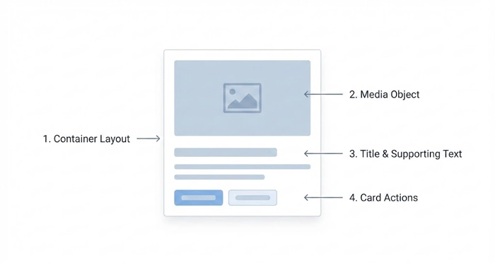
To build a robust design system, you must understand the constituent parts of a Card UI. A card is not merely a box; it is a composite of distinct elements working in harmony.
1. The Container Layout
The container is the fundamental background area that houses all content. It provides the boundaries for the card. The container must have a distinct background color (usually white or light grey) to separate it from the main canvas. This separation is crucial for content grouping.
2. The Media Object
Visuals drive engagement. The media object—usually a thumbnail, hero image, or icon—typically occupies the top or left side of the card. According to the Nielsen Norman Group, users rely heavily on images to orient themselves within a grid of content.
3. Title and Supporting Text
The hierarchy within the card is vital. The title provides the primary hook, while supporting text (metadata or summary) offers context. Keep supporting text truncated to maintain uniform card heights in a standard grid.
[Internal Link: Typography in UI]
4. Card Actions
These are the interactive elements. They can be explicit buttons (e.g., “Read More,” “Add to Cart”) or icon-based triggers (e.g., “Like,” “Share”).
How Do Elevation and Shadows Create Hierarchy?
In digital design, “Z-index” refers to the depth of an element. Card UI relies heavily on visual physics to suggest interactivity.
Understanding Elevation
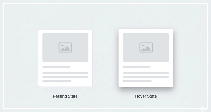
Material Design Guidelines emphasize that elevation determines the priority of an element. A card sitting “higher” (visually closer to the user) perceives greater importance. We achieve this illusion through elevation and shadows.
Best Practices for Shadows:
- Resting State: Use a subtle shadow to distinguish the card from the background.
- Hover State: Increase the shadow spread and blur to simulate the card “lifting” up to meet the user’s cursor.
- Borders vs. Shadows: While shadows provide depth, flat design often utilizes a 1px border. However, shadows are generally superior for suggesting that an item is clickable.
[Internal Link: Shadows and Elevation Guide]
Which Layout Strategy Fits Your Data?
The power of the Card UI lies in its aggregate behavior. How cards stack and flow defines the user experience.
Grid View vs. List View
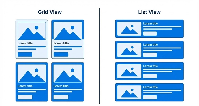
A standard grid aligns cards in rows and columns. This works best for visually heavy content (like Pinterest or Dribbble). A list view aligns cards vertically, which is preferable for text-heavy content or mobile interfaces.
[Internal Link: Mobile-First Strategy]
The Masonry Grid
When content heights vary significantly (e.g., images with different aspect ratios), a fixed grid creates awkward whitespace. A masonry grid acts like a stone wall, placing elements in optimal positions based on available vertical space, reducing gaps.
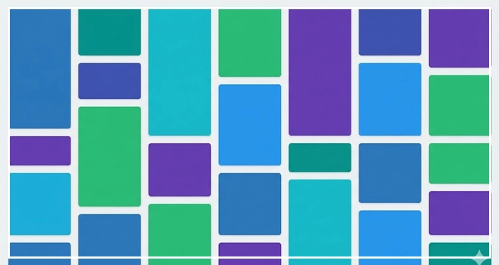
Comparison: Layout Strategies
| Feature | List View | Standard Grid | Masonry Layout |
| Scan Pattern | F-Pattern (Top to Bottom) | Z-Pattern (Zig-Zag) | Exploratory / Pinball |
| Content Type | Text-heavy, Metadata | Image-heavy, Uniform | Mixed Media, Varied Ratios |
| Screen Use | Efficient (High density) | Moderate | Aesthetic (Low density) |
| Cognitive Load | Low | Medium | High |
| Best For | Feeds, Inboxes | E-commerce, Galleries | Portfolios, Image Boards |
[Internal Link: Responsive Design Principles]
How Should Users Interact with Card UI?
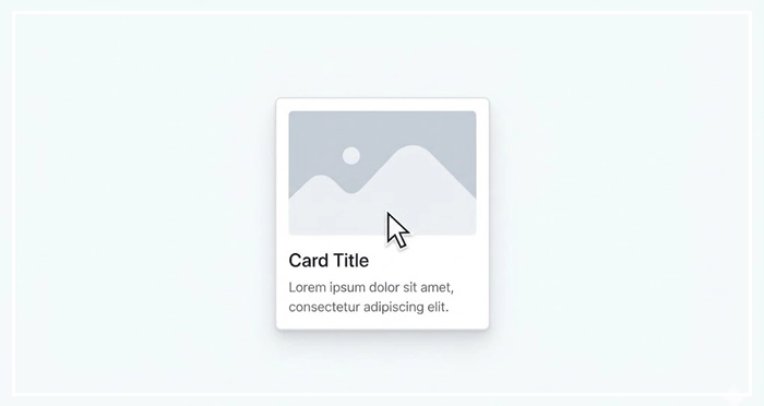
Interaction design dictates how a user manipulates the card. This is where “The Container Law” comes into play.
The Entire Card as a Link
For maximum usability (Fitts’s Law), the entire container should be clickable. This facilitates easier tapping on mobile devices.
Exceptions to the Rule
If a card contains secondary actions (like a “Save” icon or “Profile” link), you must manage event propagation carefully. The main container takes the user to the detail view, while the specific buttons trigger isolated actions.
[Internal Link: Micro-Interactions]
Hover Effects
On desktop, the card should react to the cursor.
- Scale: A slight zoom (e.g., 1.02x).
- Brightness: A subtle dim or lighten effect.
- Shadow: As mentioned, increasing shadow depth.
Why is the Card UI Pattern Essential for Mobile?
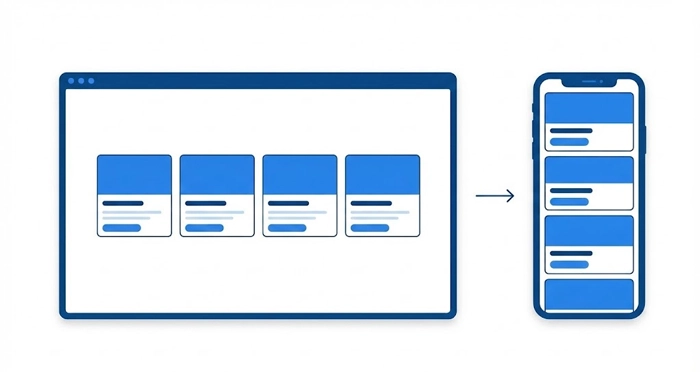
Mobile screens are vertically oriented infinite scrolls. Card UI is natively responsive.
The Chunking Principle
Cognitive psychology tells us that humans process information better in “chunks.” Cards naturally chunk content. On a desktop, a row might contain four cards. in a tablet, two. On a mobile device, they stack naturally into a single column without requiring a code overhaul.
Thumb Zone Optimization
Cards usually span the width of a mobile screen, providing a massive hit area for the user’s thumb. This reduces interaction cost and error rates.
[Internal Link: Information Architecture]
How to Handle Varying Content Lengths?
A common failure in Card UI design is the “ragged bottom” effect, where cards in the same row have different heights due to varying text lengths.
Solutions for Alignment:
- Truncation: Use CSS ellipsis (
...) after a set number of lines. - Min-Height: Enforce a minimum height for title and body areas.
- Flexbox: Use Flexbox to force the footer/action area to the bottom of the card, regardless of content length.
[Internal Link: Design System Checklist]
- Modularity: Cards are self-contained units that can be dropped into any layout without breaking the design.
- Digestibility: They break large datasets into manageable chunks, reducing cognitive load.
- Responsiveness: Cards scale effortlessly from masonry grids on desktop to vertical stacks on mobile.
- Flexibility: They support various content types, from media objects to simple text summaries.
1. What is the difference between a card and a tile in UI design?
A card generally contains heterogeneous content (image + text + link + actions) and flexible interactions. A tile is typically more homogeneous, often just an image or an icon with a label, used primarily for navigation rather than content consumption.
2. How do you make a Card UI accessible?
Ensure the semantic HTML structure uses valid heading tags inside the card. If the whole card is clickable, use aria-label to describe the destination. Ensure high contrast between text and the card background.
3. Should I use borders or shadows for Card UI?
Use shadows if you want to create depth and a layered, “material” feel. Use borders for flatter, cleaner, or high-density designs where depth might add too much visual noise.
4. What is the ideal width for a UI card?
There is no single ideal width, but for readability, the text inside the card should stay between 45 and 75 characters per line. On desktop, widths between 300px and 400px are common standard breakpoints.
5. Can a card contain another card?
Generally, no. Nesting cards (Inception style) creates visual clutter and confusing hierarchy. If you need to group content inside a card, use dividers, background fills, or typography instead of a nested container.
6. How do I handle long titles in a fixed-height card?
Use CSS line-clamping. Limit the title to two or three lines and end with an ellipsis. Provide a tooltip on hover to show the full title if absolutely necessary.
7. Is the Card UI pattern bad for information density?
It can be. Cards require padding and margins (gutters), which eats up screen real estate. If you are designing a data-heavy dashboard for power users, a Data Table is often a better choice than a Card UI.
8. What is the “Masonry Layout” regarding cards?
Masonry layout is a grid style that doesn’t force rows to be equal height. It places elements in the next available vertical space, minimizing gaps, similar to bricks in a wall. It is ideal for cards with varying image heights.
9. How do I implement card actions on mobile?
On mobile, the primary action should be tapping the card itself. Secondary actions (like “Like” or “Menu”) should be large enough (44x44px minimum) and placed in the corners or the footer of the card to avoid accidental clicks.
10. When should I NOT use Card UI?
Avoid cards when users need to compare data row-by-row (use a table), when scanning huge lists of homogeneous text (use a simple list), or when screen real estate is at a premium.
11. How does “elevation” affect card interaction?
Elevation signals to the user that an object is distinct from the background and capable of being moved or clicked. Higher elevation (larger shadow) usually implies a dragged or active state.
12. What image aspect ratio is best for Card UI?
16:9 is standard for video-related content. 4:3 or 3:2 is common for photography. The key is consistency; ensure all images in a grid row adhere to the same aspect ratio to maintain alignment.
13. Should cards have rounded corners?
Rounded corners (border-radius) help draw the eye toward the center of the card and make the UI feel friendlier and more modern. A radius of 4px to 8px is standard; fully square corners can feel harsh in modern UI.
14. How do I organize content within a card?
Follow the “Gutenberg Diagram” or standard hierarchy: Visual (top) > Headline (strongest text) > Summary (smaller text) > Actions (bottom/footer).
15. Can I use Card UI for a navigation menu?
Yes, this is often called a “Dashboard Navigation” pattern. Large cards with icons serve as navigation entry points, which is particularly effective on touch devices and kiosks.
External Resources
Here are 3 credible sources to further explore this topic:
- Material Design (Google): Cards
- Nielsen Norman Group: Cards (Component Definition)
- Smashing Magazine: Designing Card-Based User Interfaces
