- The "Pretty" Trap in UI Usability
- The 5 Components of Usability
- Core Principles for Seamless Flows (The "How-To")
- Optimizing Cognitive Load in UI
- The Architecture of Interaction
- Measuring UI Usability
- The Ultimate UI Usability Checklist
- FAQ: Frequently Asked Questions about UI Usability
- 1. What is the difference between UI and UX regarding usability?
- 2. Why is Jakob Nielsen important to UI Usability?
- 3. What is the most common UI usability mistake?
- 4. How many users do I need for usability testing?
- 5. What is a "mental model" in UI design?
- 6. What is the "3-click rule" and is it valid?
- 7. How does accessibility relate to usability?
- 8. What is "Banner Blindness"?
- 9. What is the difference between a slip and a mistake in UI errors?
- 10. How does Fitts's Law apply to mobile design?
- 11. What is "Affordance" in UI?
- 12. Can I use AI to test UI usability?
- 13. What is a Heuristic Evaluation?
- 14. What is the ideal font size for usability?
- 15. How often should I conduct usability testing?
The “Pretty” Trap in UI Usability
In the world of [User Interface Design], aesthetics catch the eye, but UI Usability captures the customer. As a designer, your primary job is not just to make things beautiful; it is to make things work intuitively for the human on the other side of the screen. If a user has to stop and think about how to use your interface, you have already lost a fraction of their trust.
What is UI Usability?
[UI Usability] is a quality attribute that assesses how easy user interfaces are to use. It is distinct from User Experience (UX), though it is a foundational pillar of it. While UX encompasses the entire interaction a user has with a company/product, UI Usability specifically focuses on the effectiveness, efficiency, and satisfaction with which specified users achieve specified goals in a particular environment.
To understand where usability sits in the design hierarchy, consider this comparison:
| Attribute | Definition | Question it Answers |
| Utility | Does the system provide the features the user needs? | “Can it do what I need?” |
| Usability | Is the system easy and pleasant to use? | “Can I do it easily?” |
| Desirability | Is the experience engaging and emotionally positive? | “Do I want to use it?” |
[User Interface Design] that lacks usability is like a Ferrari without a steering wheel—it looks powerful, but it won’t get you anywhere.
The ROI of Usability
Why should stakeholders care about usability? Because friction costs money.
Research from the Nielsen Norman Group and other industry leaders suggests that for every dollar invested in UX and Usability, the return can be up to $100.
- Increased Conversion: Removing barriers in the checkout flow directly impacts revenue.
- Reduced Support Costs: When users don’t make errors, they don’t call the help desk.
- Customer Retention: Usable products build habits. Frustrating products drive churn.
In this guide, we will dismantle the complexities of usability and provide you with an actionable roadmap to creating seamless, intuitive flows.
The 5 Components of Usability
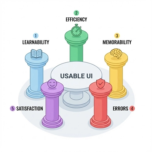
According to Jakob Nielsen, the “father of usability,” there are five quality components that define a usable interface. Understanding these is the first step toward mastering [UI Usability].
1. Learnability
How easy is it for users to accomplish basic tasks the first time they encounter the design?
Learnability is about the “first date” with your interface. If a user lands on your dashboard, can they figure out the primary action within seconds? High learnability is achieved through familiarity. By leveraging standard design patterns (like placing the logo in the top left or the search bar in the header), you allow users to rely on their existing knowledge of how the web works.
2. Efficiency
Once users have learned the design, how quickly can they perform tasks?
Efficiency is for the power user. It’s about speed and flow. For a novice, a wizard-style setup (step-by-step) is learnable. for an expert, that same wizard is tedious. Efficiency features include keyboard shortcuts, “accelerators,” and personalized dashboards that surface frequent actions.
3. Memorability
When users return to the design after a period of not using it, how easily can they re-establish proficiency?
Great [User Interface Design] is hard to forget. This doesn’t mean the user remembers the hex code of your buttons, but rather they remember the mental model of your navigation. If your interface relies on obscure icons without labels, memorability drops because the user has to re-learn the meaning of those symbols every time they log in.
4. Errors
How many errors do users make, how severe are these errors, and how easily can they recover from them?
We will dive deeper into error management later, but in the context of the five components, this measures the system’s forgiveness. A usable UI prevents errors from happening (constraints) and offers a helping hand when they do occur (clear error messages).
5. Satisfaction
How pleasant is it to use the design?
This is the subjective, emotional layer. While difficult to quantify, satisfaction correlates with the visual hierarchy, micro-interactions, and the absence of frustration. A satisfying UI feels “snappy” and responsive.
Core Principles for Seamless Flows (The “How-To”)
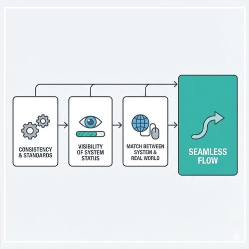
To achieve the five components above, we must apply specific design principles. These are the building blocks of seamless flows.
Consistency & Standards
Consistency is the bedrock of [UI Usability]. It eliminates confusion and reduces the learning curve. There are two types of consistency you must maintain:
- Internal Consistency: This refers to consistency within your specific product or family of products. If a “Submit” button is blue and rounded on the Login page, it should not be green and square on the Checkout page.
- External Consistency: This refers to conventions established outside your product—industry standards. For example, a shopping cart icon always represents “View Cart.” If you use a shopping cart icon to represent “Settings,” you are breaking external consistency and confusing the user.
Adhering to standards ensures that users don’t have to wonder whether different words, situations, or actions mean the same thing.
Visibility of System Status
The system should always keep users informed about what is going on, through appropriate feedback within a reasonable time. Imagine pressing an elevator button and the light doesn’t turn on. You would press it again, harder, or assume it’s broken.
In digital interfaces, this lack of feedback is a usability killer.
Examples of Visibility:
- Loaders and Progress Bars: Telling the user, “We are working on it, hang tight.”
- Active States: Changing the color of a navigation link to show, “You are here.”
- Toast Notifications: A small pop-up confirming, “Changes Saved.”
Match Between System and the Real World
The system should speak the users’ language, with words, phrases, and concepts familiar to the user, rather than system-oriented terms.
- Bad UI: “Error 404: Directory not found in server root.”
- Good UI: “We couldn’t find the page you’re looking for.”
This principle also applies to visual metaphors. A digital “Trash Can” works because it matches our real-world mental model of throwing things away. A “Potentiometer” slider works because it mimics a physical volume knob.
Audit Your Interface:
To ensure these standards (Consistency, Visibility, and Real-World Match) are effectively met, you cannot just guess. You need a structured review process. This is where you should perform a [Link to: Heuristic Evaluation: How to Audit Your Interface]. This audit allows you to systematically check your UI against established usability principles before you even touch a line of code.
Many of these principles align closely with [Link to: Nielsen’s 10 Usability Heuristics Simplified], which serves as the gold standard for interface audits. Reviewing these heuristics will give you a comprehensive vocabulary to defend your design decisions to stakeholders.
Optimizing Cognitive Load in UI
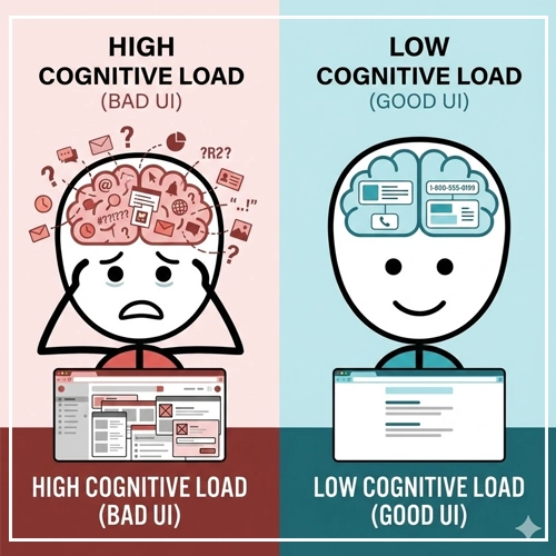
Cognitive load refers to the amount of working memory resources used. The human brain has limited processing power. If your [User Interface Design] demands too much brainpower, the user will feel overwhelmed and abandon the task.
High vs. Low Cognitive Load
| Low Cognitive Load (Good UI) | High Cognitive Load (Bad UI) |
| Familiar layouts and standard icons. | Unconventional layouts and abstract icons. |
| Minimal text, scannable content. | Walls of dense text. |
| One primary action per screen. | Multiple competing calls-to-action (CTA). |
| Clear visual hierarchy. | Cluttered interface with no focal point. |
Chunking Information
George Miller’s famous law (The Magical Number Seven, Plus or Minus Two) suggests that the average human can only hold about 7 items in their working memory.
To improve [UI Usability], we use “Chunking.” This involves breaking large blocks of content into smaller, distinct units.
- Phone Numbers: We don’t write 18005550199; we write 1-800-555-0199.
- Forms: Instead of one long checkout form with 20 fields, break it into steps: “Shipping,” “Billing,” and “Review.”
Simplifying Choices (Hick’s Law)
Hick’s Law states that the time it takes to make a decision increases with the number and complexity of choices. If you present a user with 10 navigation links of equal weight, they will take significantly longer to choose than if you presented 3.
Strategies for simplification:
- Hide advanced features under “More” or “Advanced Settings.”
- Use smart defaults (pre-selecting the most common option).
For a deeper dive into psychological strategies for simplification, read our guide on [Link to: Reducing Cognitive Load in User Interfaces].
The Architecture of Interaction
Seamless flows are not just about static screens; they are about the interaction between them. This brings us to the physics of the digital world.
Navigation Patterns: Wayfinding
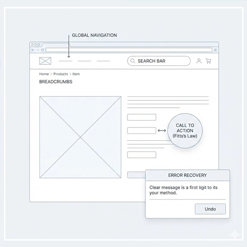
Navigation is the road sign of your application. If users get lost, the application fails.
- Global Navigation: Should be consistent on every page.
- Breadcrumbs: Essential for deep hierarchies (e.g., Home > Men’s Wear > Shoes > Running).
- Search: The escape hatch for users who can’t find what they need via browsing.
Fitts’s Law: The Physics of Touch
Fitts’s Law is a predictive model of human movement primarily used in human–computer interaction and ergonomics.
$$T = a + b \log_2 \left(1 + \frac{D}{W}\right)$$
While the math looks complex, the takeaway for [UI Usability] is simple: The time to acquire a target is a function of the distance to and size of the target.
- Make Clickable Elements Large: Small buttons are hard to click (and even harder to tap on mobile). A primary CTA should be big and bold.
- Reduce Distance: Place related elements close to each other. If a user fills out a text field, the “Save” button should be near that field, not on the other side of the screen.
Error Management: Designing for Failure
No matter how good your design is, users will make mistakes. These generally fall into two categories:
- Slips: The user intends to perform the correct action but fails due to motor issues (e.g., tapping the wrong button because it’s too small).
- Mistakes: The user intentionally performs an action, but the goal is wrong due to a misunderstanding of the system.
Prevention is better than cure.
Use constraints to prevent errors. For example, if a date field requires a specific format, use a date picker instead of a text input. This makes it impossible to enter the wrong format.
However, when errors do happen, your UI must handle them gracefully. Understanding the difference between [Link to: Error Prevention vs. Error Recovery in UI] is crucial for designing resilience. Effective recovery mechanisms (like “Undo” buttons or informative 404 pages) turn a frustrating moment into a minor hiccup.
Measuring UI Usability
You cannot manage what you cannot measure. While “looking good” is subjective, [UI Usability] is objective and measurable.
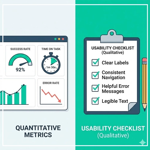
Quantitative Metrics
These give you the “What” and “How Many.”
- Success Rate: The percentage of users who successfully complete a task.
- Time on Task: How long it takes to complete the task.
- Error Rate: The number of errors made during the task.
Qualitative Metrics
These give you the “Why.”
- SUS (System Usability Scale): A standard 10-item questionnaire used to assess usability.
- SEQ (Single Ease Question): Asking the user, “Overall, how difficult or easy was this task?” immediately after completion.
Testing doesn’t need to be expensive or time-consuming. You don’t need a lab with two-way mirrors. If you are short on time and budget, you can learn [Link to: How to Conduct a Simple 5-Second Test]. This rapid testing method helps you validate if your users can understand the primary purpose of a page within the first 5 seconds of viewing it.
The Ultimate UI Usability Checklist
Before you hand off your designs to development, run through this checklist to ensure you are upholding the standards of excellent [User Interface Design].
Navigation & Architecture
- [ ] Is the current location clearly indicated (e.g., active states)?
- [ ] does the “Back” button behavior predictable?
- [ ] Is there a clear path to the Home screen from everywhere?
- [ ] Are external links clearly marked?
Forms & Interaction
- [ ] Do input fields have clear labels (not just placeholders)?
- [ ] Are primary actions visually distinct from secondary actions?
- [ ] Do interactive elements have hover and focus states?
- [ ] Are error messages specific and placed near the error?
- [ ] Is the tab order logical for keyboard users?
Visual Clarity
- [ ] Is the text contrast ratio at least 4.5:1 (WCAG AA standard)?
- [ ] Is the font size legible (minimum 16px for body text)?
- [ ] Are icons accompanied by text labels where space permits?
- [ ] Is white space used effectively to group related items?
Feedback
- [ ] Is there a loading state for actions taking longer than 1 second?
- [ ] Is there a success message after form submission?
- [ ] Do buttons provide visual feedback when clicked/tapped?
Conclusion
Creating a beautiful interface is art; creating a usable interface is engineering empathy.

[UI Usability] is not a “nice-to-have” add-on; it is the foundation of digital success. By mastering the components of learnability, efficiency, and satisfaction, and by rigorously applying principles like consistency and error prevention, you create products that respect the user’s time and intelligence.
Remember, the goal of [User Interface Design] is invisibility. When the design is perfectly usable, the user stops noticing the interface and focuses entirely on the value you provide.
Next Steps:
Take one key flow in your current project (e.g., the sign-up process) and run it through the checklist provided above. Fix the friction points. Your users will thank you with their loyalty.
FAQ: Frequently Asked Questions about UI Usability
1. What is the difference between UI and UX regarding usability?
UI (User Interface) Usability focuses on the ease of use of the specific interface elements (buttons, layout, text), while UX (User Experience) Usability encompasses the broader journey, including how the product fits into the user’s life and solves their overall problem.
2. Why is Jakob Nielsen important to UI Usability?
Jakob Nielsen is a pioneer in the field who established the “10 Usability Heuristics,” which act as the global standard for auditing and designing usable interfaces.
3. What is the most common UI usability mistake?
The most common mistake is prioritizing aesthetics over clarity—such as using low-contrast text that is hard to read or hiding navigation behind obscure icons to make the screen look “clean.”
4. How many users do I need for usability testing?
According to the Nielsen Norman Group, testing with just 5 users is often enough to uncover 85% of usability problems in a design.
5. What is a “mental model” in UI design?
A mental model is the user’s preconceived notion of how a system should work based on their past experiences with other websites and the real world. Good UI matches the user’s mental model.
6. What is the “3-click rule” and is it valid?
The 3-click rule suggests users should find information within three clicks. However, modern research shows that the number of clicks matters less than the clarity of the clicks. Users don’t mind clicking more if they feel they are getting closer to the answer (the scent of information).
7. How does accessibility relate to usability?
Accessibility is a subset of usability. An accessible site is usable by people with disabilities (vision, motor, cognitive). A truly usable site must be accessible, or it excludes a portion of the population.
8. What is “Banner Blindness”?
Banner Blindness is a phenomenon where users consciously or unconsciously ignore page elements that look like advertisements, even if they contain helpful information.
9. What is the difference between a slip and a mistake in UI errors?
A slip is an accidental error (typo, wrong click) made by a user who knows the right action. A mistake is a conscious error made because the user misunderstood how the system works.
10. How does Fitts’s Law apply to mobile design?
Fitts’s Law dictates that touch targets (buttons) on mobile must be large enough to tap easily and placed in reachable zones (like the bottom of the screen) to reduce the “distance” for the thumb.
11. What is “Affordance” in UI?
Affordance refers to visual clues that tell a user how to interact with an object. For example, a raised button with a drop shadow affords “pushing,” while a blue underlined text affords “clicking.”
12. Can I use AI to test UI usability?
Yes, AI tools can simulate eye-tracking and predict attention heatmaps, but they cannot replace human testing for understanding emotional response, confusion, or satisfaction.
13. What is a Heuristic Evaluation?
A Heuristic Evaluation is an inspection method where usability experts review a user interface and compare it against accepted usability principles (heuristics) to identify issues.
14. What is the ideal font size for usability?
For standard body text on the web, 16px is generally considered the minimum baseline for readability. Mobile text should rarely go below this size.
15. How often should I conduct usability testing?
Usability testing should be iterative. Test early with wireframes (low fidelity), test again with prototypes (high fidelity), and continue testing the live product periodically to catch new issues.

