- What is a Menu-Driven Interface?
- The Psychology of Navigation
- Core Menu Structures
- Desktop Menu Patterns
- Wayfinding: Breadcrumb Navigation
- Mobile Navigation Patterns
- Visual Design & Micro-Interactions
- Technical & Accessibility Considerations
- The Ultimate Menu Design Checklist
- Frequently Asked Questions (FAQ)
- 1. What is the difference between a command-line interface and a menu-driven interface?
- 2. Why is navigation important in User Interface Design?
- 3. What is the "Three-Click Rule" in menu design?
- 4. When should I use a Mega Menu?
- 5. What is the best menu structure for mobile devices?
- 6. How does Hick’s Law apply to navigation menus?
- 7. What is a "Sticky Header"?
- 8. Are Hamburger menus bad for UX?
- 9. How do I make my menu accessible for screen readers?
- 10. What is a "Breadcrumb" in web design?
- 11. What is the ideal font size for menu items?
- 12. What is the "Serial Position Effect" in menus?
- 13. Should menu links open in a new tab?
- 14. What is a "Fat Footer"?
- 15. How many items should be in a main navigation bar?
What is a Menu-Driven Interface?
A Menu-Driven Interface is a type of graphical user interface (GUI) where users interact with the system by selecting from a list of predefined options (menus) rather than typing commands manually.

In the vast landscape of User Interface Design, there is no component more critical than navigation. If content is the king, navigation is the castle walls, the drawbridge, and the hallways that allow users to access that king.
At the heart of navigation lies the Menu-Driven Interface.
These interfaces rely on recognition rather than recall. The user does not need to memorize complex syntax; they simply need to recognize the command they wish to execute within a visual list.
The Evolution: From CLI to GUI
To understand where we are, we must look at where we started.
- Command Line Interfaces (CLI): In the early days of computing (MS-DOS, UNIX), interaction was linear and linguistic. You saw a blinking cursor. To open a file, you had to know and type the command. This required high cognitive effort and memorization.
- The Graphical Revolution: With the advent of the Xerox Star and later the Apple Macintosh, the Menu-Driven Interface became the standard. By grouping commands into lists (File, Edit, View), computers shifted the burden from the user’s memory to the screen.
Today, menu-driven interfaces are the backbone of User Interface Design. Whether it is a global navigation bar on a marketing site, a context menu on a desktop app, or a hamburger drawer on a mobile device, the fundamental principle remains: Guided Selection.
The Psychology of Navigation
Great navigation is not about pixels; it is about how the human brain processes information. When designing menus, you are managing the user’s “Cognitive Load”—the amount of working memory resources used.
")
1. Cognitive Load and Decision Fatigue
Every option you add to a menu increases the cognitive load. When users are presented with too many options without clear categorization, they suffer from Decision Fatigue. They don’t just take longer to choose; often, they choose nothing at all and abandon the site.
2. Hick’s Law: The Paradox of Choice
Hick’s Law is the most cited psychological principle in navigation design. It states that the time it takes to make a decision increases logarithmically with the number and complexity of choices.
The formula is expressed as:
$$RT = a + b \log_2 (n)$$
Where:
- $RT$ is the reaction time.
- $n$ is the number of stimuli (choices).
UX Application: If you present a user with a menu of 20 unorganized links, their reaction time spikes. If you categorize those 20 links into 4 main categories, the reaction time drops significantly. This is why “Mega Menus” must be structured carefully—volume is fine, but unorganized volume is fatal.
3. The Serial Position Effect
The human brain has a bias toward the beginning and the end of a list.
- Primacy Effect: Items at the beginning are remembered best.
- Recency Effect: Items at the end are remembered second best.
- The Middle: Items in the middle are most likely to be forgotten or overlooked.
UX Application: This is why the “Home” link (or Logo) is universally on the far left (Primacy) and the primary “Call to Action” or “Contact” button is on the far right (Recency). Place your lowest-priority items in the middle of the navigation bar.
Core Menu Structures
Before designing the visual layer, you must determine the Information Architecture (IA). How are your menu items connected?

Linear vs. Tree vs. Network
| Structure Type | Definition | Best Use Case |
| Linear | Users move sequentially (Step 1 $\rightarrow$ Step 2 $\rightarrow$ Step 3). | Checkout flows, onboarding wizards, or simple storytelling sites. |
| Hierarchical (Tree) | The most common standard. A root (Home) branches into categories, which branch into sub-pages. | E-commerce, corporate websites, and news portals. |
| Network | Pages are interlinked associatively without a strict parent/child relationship. | Wikis, exploring related products, or tag-based navigation. |
Deep vs. Broad Hierarchies
One of the most common debates in User Interface Design is whether to make menus “Broad” (many top-level items, few clicks deep) or “Deep” (few top-level items, many clicks deep).
- Broad (Flat) Hierarchies: Generally preferred for SEO and discoverability. Users can see more of what is available immediately. However, if too broad, it clutters the interface.
- Deep Hierarchies: Keeps the interface clean but risks burying content. If a user has to click four times to find a product, you risk losing them.
The “Three-Click Rule” Myth:
For years, designers adhered to the rule that all content should be accessible in three clicks. Modern research suggests this is false. Users don’t mind clicking 5 or 6 times as long as the scent of information remains strong. If they feel they are getting closer to their goal, they will keep clicking.
Desktop Menu Patterns
On large screens, screen real estate allows for persistent visibility. However, the chosen pattern must match the content density.

1. Horizontal Headers (The Standard)
The top horizontal bar is the mental model for 90% of web users. It usually utilizes the “F-Pattern” of scanning.
- Pros: Familiar, highly visible, efficient use of vertical space.
- Cons: Limited space. You can usually fit only 5–7 top-level items comfortably before it looks cluttered.
2. Mega Menus
When you have an e-commerce site with thousands of SKUs, a standard dropdown isn’t enough. You need a Mega Menu—a two-dimensional panel that groups navigation options.
Mega menus allow for the inclusion of images, typography hierarchy, and promotional slots within the navigation itself. However, they are complex to build accessibly.
[Link to: Designing Mega Menus for eCommerce Sites]
3. Sticky Headers vs. Fixed Menus
Should the menu follow the user as they scroll?
- Static: The menu disappears as you scroll down. This maximizes screen space for reading but requires scrolling back up to navigate.
- Sticky: The menu remains pinned to the top. This increases conversion by keeping navigation accessible, but it consumes vertical pixel height.
Pro Tip: Use a “Smart Sticky” header that disappears when scrolling down (to focus on content) but reappears instantly when the user scrolls up slightly (anticipating navigation intent).
[Link to: Sticky Headers vs. Fixed Menus: A Comparison]
4. Vertical Sidebars (Dashboard UI)
For complex SaaS applications or admin dashboards, the vertical sidebar is superior.
- Scalability: You can scroll a vertical list infinitely; you cannot scroll a horizontal header.
- Scannability: Vertical lists are easier to scan alphabetically or categorically.
- Context: It clearly separates “Global Navigation” (the app tools) from the “Content Area” (the work).
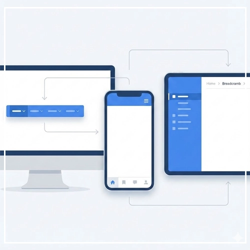
Wayfinding: Breadcrumb Navigation
While the primary menu gets the user to the destination, secondary navigation systems help them understand where they are. This is where breadcrumbs come in.
Breadcrumbs (e.g., Home > Men > Shoes > Running) reduce the bounce rate by allowing users to easily retreat one step up the hierarchy without using the “Back” button. They are essential for deep structures.
[Link to: Breadcrumb Navigation: When to Use It?]
Mobile Navigation Patterns
Mobile User Interface Design presents a unique challenge: providing access to the same depth of information as a desktop site on a screen the size of a playing card.

1. The “Thumb Zone” Considerations
Research by Steven Hoober suggests that 49% of people hold their phone with one hand, relying on the thumb for interaction.
- Safe Zone: The bottom center of the screen is the easiest to reach.
- Stretch Zone: The middle of the screen requires effort.
- Hard Zone: The top corners (where the Hamburger menu usually sits) are the hardest to reach.
2. Hamburger Menus
The three-line icon (the “Hamburger”) is the most ubiquitous solution for saving space. It hides the menu off-canvas until requested.
- The Problem: It suffers from low discoverability. “Out of sight, out of mind.”
- The Solution: Only use it for secondary navigation. Primary actions should be visible.[Link to: Hamburger Menus: Pros, Cons, and Alternatives]
3. Bottom Navigation Bars (Tab Bars)
To solve the “Thumb Zone” issue, modern apps and mobile sites are moving to Bottom Navigation Bars.
- Visibility: The core options are always visible.
- Ergonomics: They are located in the primary thumb zone.
- Constraint: You can effectively fit only 3 to 5 items. More than 5 requires a “More” menu, which reintroduces the hamburger problem.[Link to: Mobile Bottom Navigation Bars: A UX Guide]
Visual Design & Micro-Interactions
A menu is not just text; it is an interactive object. The visual feedback provided during interaction is crucial for perceived performance and usability.

1. Designing for States
In CSS and design systems, a menu item is never just “one thing.” It has multiple states that must be designed visually:
- Default: The resting state. Must look clickable (high contrast).
- Hover (Desktop): Indicates the cursor is in the right spot. Use background color shifts or underlines.
- Active (Pressed): The split-second state when the mouse is clicked. Gives tactile feedback.
- Focus: Crucial for Accessibility. The visual ring that appears when a user navigates via keyboard (Tab key). Never set
outline: nonewithout a replacement style. - visited: Often ignored in menus, but useful for sidebar links to show where the user has already been.
- Current/Selected: The most important state. You must visually indicate “You Are Here.” Use a bold font weight, a color change, or a thick border-bottom.
2. Typography and Iconography
- Labels: Keep them short, punchy, and predictive. Avoid “Services” (vague); use “Web Design Services” (specific).
- Caps vs. Sentence Case: Uppercase letters (ALL CAPS) are harder to read in long strings. Use them sparingly for top-level headers, but use Sentence Case for sub-menus.
- Icons: Icons can speed up recognition, but only if they are universal (e.g., a House for Home, a Gear for Settings). Ambiguous icons increase cognitive load. Always pair icons with text labels for clarity.
Technical & Accessibility Considerations
A Menu-Driven Interface that is not accessible is a failed interface. You must adhere to WCAG (Web Content Accessibility Guidelines) 2.1 or 2.2 standards.

1. Keyboard Navigation
Power users and users with motor disabilities rely on the keyboard.
- Tab Order: Users must be able to Tab through the menu items in a logical order (Left to Right, Top to Bottom).
- Skip Links: Provide a “Skip to Content” link at the very top of the DOM. This allows keyboard users to bypass the 20 links in your mega menu and get straight to the article.
2. ARIA Roles and Attributes
Screen readers (used by blind or low-vision users) need code to explain what the menu is doing. You cannot just use <div> tags.
Essential ARIA markup:
<nav>: Wrap your main menu in this semantic HTML5 tag.role="menubar"orrole="menu": Defines the widget.aria-expanded="true/false": Tells the screen reader if a dropdown is currently open or closed.aria-haspopup="true": Indicates that clicking this link will trigger a sub-menu.aria-current="page": Programmatically indicates which link represents the current page.
Example Code Snippet:
HTML
<nav aria-label="Main Navigation">
  <ul>
    <li><a href="/" aria-current="page">Home</a></li>
    <li>
      <button aria-expanded="false" aria-controls="menu-products">
        Products
      </button>
      <ul id="menu-products" hidden>
         <li><a href="/shoes">Shoes</a></li>
         <li><a href="/shirts">Shirts</a></li>
      </ul>
    </li>
  </ul>
</nav>
The Ultimate Menu Design Checklist
Before handing off your designs to the development team, run your Menu-Driven Interface through this checklist:
- [ ] Clarity: Do the labels clearly predict the destination?
- [ ] Simplicity: Have I applied Hick’s Law? Can I reduce the number of top-level items?
- [ ] Consistency: Is the navigation located in the same place on every page?
- [ ] Feedback: are “Hover,” “Focus,” and “Active” states clearly defined?
- [ ] Wayfinding: Is the “Current Page” state visually distinct?
- [ ] Responsiveness: Does the menu adapt gracefully from Desktop to Tablet to Mobile?
- [ ] Reachability: Are mobile tap targets at least 44×44 pixels (Apple Human Interface Guidelines) or 48x48dp (Android Material Design)?
- [ ] Accessibility: Is the contrast ratio at least 4.5:1? Can the menu be used without a mouse?
Conclusion
The Menu-Driven Interface is more than a list of links; it is the skeleton of your digital product. A well-structured menu reduces friction, improves SEO rankings through better crawlability, and ultimately drives conversion.
As interfaces evolve with voice assistants and gesture controls, the visual menu remains the anchor of User Interface Design. By balancing psychological principles with technical accessibility and aesthetic polish, you create an environment where users feel confident, in control, and ready to explore.
Next Steps: Audit your current website’s navigation. Are you breaking Hick’s Law? Is your focus state visible? Pick one area from this guide and optimize it today.
Frequently Asked Questions (FAQ)
1. What is the difference between a command-line interface and a menu-driven interface?
A command-line interface (CLI) requires users to type specific text commands to perform tasks, relying on memory. A menu-driven interface (GUI) presents a list of options for the user to select from, relying on visual recognition, which is generally easier for average users.
2. Why is navigation important in User Interface Design?
Navigation is the primary vehicle for content discovery. Without clear navigation, users cannot find information, leading to high bounce rates and poor user experience (UX). It provides context and structure to the application.
3. What is the “Three-Click Rule” in menu design?
The Three-Click Rule is a largely debunked UX theory suggesting users should be able to find any information within three clicks. Modern UX suggests that the number of clicks matters less than the ease of each click (the scent of information).
4. When should I use a Mega Menu?
Use a Mega Menu when your site has a large number of lower-level pages that need to be visible at a glance (e.g., large e-commerce sites like Amazon or Best Buy). Avoid them for simple sites with few pages.
5. What is the best menu structure for mobile devices?
For apps with 3–5 primary sections, a Bottom Navigation Bar is best because it sits in the “Thumb Zone.” For apps with many secondary sections, a Hamburger menu combined with a tab bar is a common pattern.
6. How does Hick’s Law apply to navigation menus?
Hick’s Law states that the time it takes to make a decision increases with the number and complexity of choices. In menus, this means you should limit the number of top-level items and categorize options logically to speed up user decision-making.
7. What is a “Sticky Header”?
A sticky header is a navigation bar that stays fixed to the top of the viewport while the user scrolls down the page. This keeps navigation accessible at all times but consumes screen space.
8. Are Hamburger menus bad for UX?
Hamburger menus can lower discoverability because they hide options “off-canvas.” They are effective for secondary navigation or cleaning up mobile interfaces but should be avoided for core actions that drive business goals.
9. How do I make my menu accessible for screen readers?
Use semantic HTML tags like <nav>, ensure keyboard focus indicators are visible, and use ARIA attributes like aria-expanded and aria-haspopup to communicate the menu’s state to assistive technology.
10. What is a “Breadcrumb” in web design?
A breadcrumb is a secondary navigation scheme that reveals the user’s location in a website or application (e.g., Home > Men > Shoes). It helps users understand the site hierarchy and navigate back to parent categories.
11. What is the ideal font size for menu items?
While it varies by font face, a standard guideline is 16px to 18px for desktop navigation headers to ensure readability. For mobile, ensure the text is large enough to be legible without zooming.
12. What is the “Serial Position Effect” in menus?
This psychological effect suggests users best remember the first and last items in a series. Therefore, the most important links (like Home or Services) should be first, and the Call to Action (like Contact or Buy) should be last.
13. Should menu links open in a new tab?
Generally, no. Main navigation links should open in the same tab to maintain the user’s “Back” button history. Opening new tabs can disorient users and break the navigation flow, unless it is an external link or a PDF.
14. What is a “Fat Footer”?
A “Fat Footer” is a large navigation section at the bottom of a webpage that exposes many site links (similar to a sitemap). It serves as a safety net for users who have scrolled to the end of the page and haven’t found what they need.
15. How many items should be in a main navigation bar?
Aim for 5 to 7 items. This aligns with Miller’s Law, which suggests the average person can only hold about 7 (plus or minus 2) items in their working memory. Exceeding this makes the menu look cluttered and overwhelming.


