- Introduction
- Part 1: The Core Principles of Scalable UI Architecture
- Part 2: The Visual Foundation: Design Tokens & Typography
- Part 3: Component Architecture and Atomic Design
- Part 4: Layout and Spatial Logic
- Part 5: Future-Proofing: Governance and Documentation
- Part 6: Technical Considerations for Designers
- The Ultimate Scalable UI Checklist
- Frequently Asked Questions (FAQ)
- 1. What is Scalable UI Design?
- 2. Why is Atomic Design important for scalability?
- 3. What is the difference between specific values and Design Tokens?
- 4. How does the 8pt grid help with scalability?
- 5. What are Container Queries?
- 6. How do I handle typography in a scalable UI?
- 7. Why should I use SVGs for scalable design?
- 8. Does scalable design kill creativity?
- 9. What is the "Happy Path" vs. "Stress Case"?
- 10. How often should a Design System be updated?
- 11. What is the difference between Responsive and Adaptive design?
- 12. How does accessibility relate to scalability?
- 13. What is UI Debt?
- 14. Should designers code?
- 15. How do I start making my existing UI scalable?
Introduction
Scalable UI Design is not just about handling high traffic; it is about architecture. It is the practice of building user interfaces that can expand, adapt, and evolve without requiring a complete teardown. bridges the gap between static design files and dynamic code, ensuring that as your content library grows or your feature set expands, your User Interface Design remains robust and consistent.
In the early stages of a digital product, speed is often the primary metric. Designers throw together screens to meet launch deadlines, often hard-coding values and creating bespoke components for every new feature. But as a product grows, this “move fast and break things” approach creates a massive accumulation of technical and design debt. Suddenly, changing a primary button color takes three days of QA, or a new feature breaks the layout on mobile devices.
This is the failure of scalability.
In this guide, we will move beyond basic component libraries to explore the architecture of scalable systems. We will cover the business value of scalability, atomic principles, tokenization, and the technical strategies required to future-proof your product.
Why Scalability is a Business Imperative
Designing for scale is often viewed as a “nice-to-have,” but it is a critical business investment.
- Speed to Market: A scalable system allows teams to prototype and ship new features using pre-validated blocks, reducing design time by up to 50%.
- Consistency: It eliminates the “Frankenstein UI” effect, where different parts of the app look like they were built by different companies.
- Reduced Maintenance: When design decisions are centralized (e.g., via tokens), updates propagate globally, reducing maintenance costs.
Part 1: The Core Principles of Scalable UI Architecture
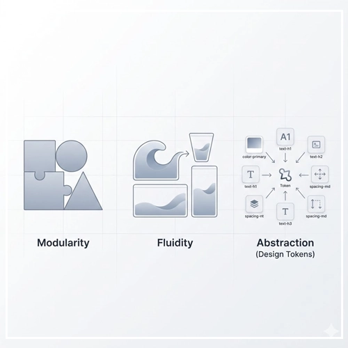
To build a truly flexible system, we must shift our mindset from designing “pages” to designing “systems.” This requires adherence to three core architectural principles.

1. Modularity (Component-Based Thinking)
Modularity is the practice of breaking an interface down into its smallest distinct parts. Just as LEGO bricks can be reassembled to create a castle or a spaceship, a modular UI allows you to construct infinite page variations from a finite set of components.
Key Concept: A component should be agnostic of its context. A “Card” component should function correctly whether it is placed in a sidebar, a main feed, or a modal window.
2. Fluidity (Responsive & Adaptive Nature)
Scalable design rejects fixed pixel perfection in favor of relative relationships. A scalable UI flows like water, filling the container it is poured into. This means avoiding fixed widths (e.g., width: 300px) and embracing percentages, flexbox, and grids that react to the viewport size.
3. Abstraction (Design Tokens)
Abstraction involves separating the design decision from the value. Instead of defining a button’s color as #007AFF, we define it as primary-action-color. If the brand rebrands to purple next year, we change the value in one place, and the system scales the update instantly across thousands of screens.
| Feature | Rigid UI Design | Scalable UI Design |
| Units | Fixed Pixels (px) | Relative Units (rem, %, vw) |
| Components | Bespoke / One-off | Reusable / Variant-based |
| Structure | Page-based | System-based (Atomic) |
| Maintenance | Manual updates per screen | Global updates via Tokens |
Part 2: The Visual Foundation: Design Tokens & Typography
Before drawing a single component, a scalable UI requires a strong foundation of “Design Tokens.” These are the sub-atomic particles of your design system.

Implementing Design Tokens
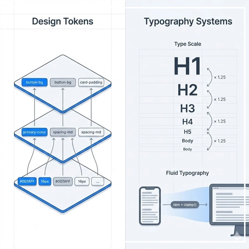
Design tokens are the visual design atoms of the design system — specifically, they are named entities that store visual design attributes. We use them in place of hard-coded values.
The Three Tiers of Tokens:
- Global Tokens (Primitive): The raw values. (e.g.,
blue-500: #1E90FF) - Semantic Tokens (Alias): Describes the intent. (e.g.,
color-primary: $blue-500) - Component Tokens (Specific): Contextual use. (e.g.,
button-bg-color: $color-primary)
By adhering to this hierarchy, you ensure that your User Interface Design can support theming (like Dark Mode) without code refactoring.
Scalable Typography Systems
Typography usually breaks in non-scalable systems when designers pick font sizes arbitrarily. A scalable system uses a Type Scale—a mathematical ratio (like Major Third or Perfect Fourth) to determine sizes.
- Use
remunits: Always define type inremso it respects the user’s browser accessibility settings. - Fluid Typography: Use strict rules for how type scales across viewports. A header might be 3rem on desktop but should automatically calculate to 2rem on mobile using clamp functions.
Pro Tip: Don’t just design for the “happy path” (perfect amount of text). Design for the “stress case.” What happens to your navigation when the label is translated into German and becomes 30% longer?
[Link to: Scalable Vector Graphics (SVG) in UI: A Guide]
Part 3: Component Architecture and Atomic Design
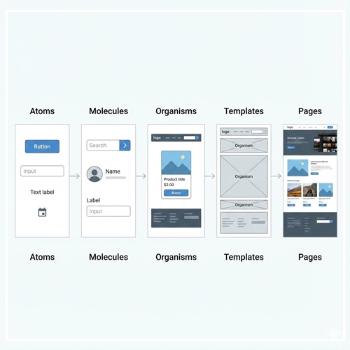
Brad Frost’s Atomic Design methodology is the industry standard for scalable UI. It provides a mental model for building hierarchies.

Atoms
These are the foundational building blocks that cannot be broken down further without ceasing to be functional.
- Examples: Buttons, Inputs, Labels, Icons.
- Scalability Rule: Atoms must have extremely strict variations (e.g., Primary, Secondary, Ghost) and must handle internal padding dynamically.
Molecules
Molecules are groups of atoms bonded together to take on a tangible form.
- Examples: A search form (Input + Button), A user row (Avatar + Name + Status).
- Scalability Rule: Molecules should be built to stretch. Do not hard-code the width of a search bar; let the parent container dictate it.
Organisms
Organisms are complex UI components composed of groups of molecules and/or atoms and/or other organisms.
- Examples: A Header, A Product Grid, A Footer.
- Scalability Rule: [Link to: How to Design Modular UI Components] — Read this guide to understand how to ensure organisms can handle varying data loads (e.g., a card grid that handles 1 item vs. 50 items).
Part 4: Layout and Spatial Logic
Designing for scale means you rarely know the exact screen size your user has. You must design rules, not screens.

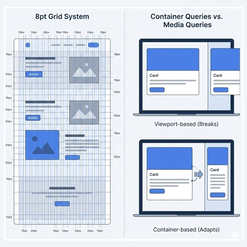
The 8pt Grid System
To ensure scalable consistency, use an 8pt (or 4pt) spatial grid.
- Why 8pt? Most popular screen resolutions are divisible by 8.
- Implementation: All margins, padding, and sizing should be multiples of 8 (8, 16, 24, 32, 64). This removes the guesswork for developers and ensures visual rhythm.
Container Queries vs. Media Queries
Traditionally, we used Media Queries (viewport-based) to adjust layouts. However, modern Scalable UI Design is moving toward Container Queries.
- The Problem: A “Card” component might look great on a mobile screen (taking up 100% width). But if you put that same card in a narrow sidebar on a desktop, a Media Query sees a “Desktop” width and might try to render the “Desktop” version of the card, which breaks the sidebar.
- The Solution: Container Queries allow the component to look at the container it is inside, not the screen size. This makes components truly portable.
[Link to: Responsive vs. Adaptive Design: Which is Better?]
Handling Layout Fluidity
You must define how layouts behave as space increases.
- Fixed: The container stays the same size regardless of the window (Bad for scale).
- Fluid: The container stretches as a percentage (Better).
- Hybrid: The container is fluid until a maximum width (breakpoint), then centers itself.
[Link to: What is Fluid Layout in Modern Web Design?]
Part 5: Future-Proofing: Governance and Documentation
A UI system is only scalable if the team knows how to use it. Entropy is the enemy of scale. Without governance, designers will introduce new colors and inconsistent patterns.

The Governance Model
- The Librarians: A dedicated team (or individual) responsible for maintaining the system.
- Contribution Model: How do product designers submit new components? There must be a review process to decide: “Is this a one-off snowflake, or does this become part of the system?”
- Deprecation Strategy: How do you retire old components? Scalability includes pruning dead wood.
Documentation as the Source of Truth
Documentation should not live in a PDF. It should live in a live environment (like Storybook or Zeroheight) where code and design coexist.
- Do’s and Don’ts: clearly illustrate correct usage.
- Props Table: List every variable a developer can tweak.
[Link to: Future-Proofing Your UI Design System]
Part 6: Technical Considerations for Designers
To truly design for scale, you must understand the technical constraints your developers face.
1. Vector Assets (SVGs)
Bitmaps (PNG/JPG) do not scale. They pixelate on high-res screens and increase file size.
- Strategy: Use SVGs for all icons and simple illustrations. SVGs are code-based, meaning they can be recolored via CSS tokens and scale infinitely without quality loss.
2. State Management
A scalable component isn’t just a static image. You must design every state:
- Default
- Hover
- Active/Pressed
- Disabled
- Loading (Skeleton screens)
- Error
3. Localization (L10n)
Scalable UIs must accommodate different languages.
- Text Expansion: German or French can take up to 30% more space than English.
- Right-to-Left (RTL): Languages like Arabic or Hebrew reverse the layout. Your logical properties (using
margin-inline-startinstead ofmargin-left) are vital here.
The Ultimate Scalable UI Checklist
Before handing off your designs, run them through this scalability audit:
- [ ] Tokenization: Are all colors, fonts, and spacing using named tokens, not raw values?
- [ ] Responsiveness: Does the layout break gracefully at 320px, 768px, and 1440px?
- [ ] Content Stress Test: Have you tested the component with 3 lines of text instead of 1? What if the image is missing?
- [ ] Accessibility: Does the color contrast meet WCAG AA standards? (Accessibility is a prerequisite for scale).
- [ ] Modularity: Can this component be moved to a different page and still function?
- [ ] States: Are hover, focus, error, and loading states defined?
- [ ] Export: Are icons exported as optimized SVGs?
Conclusion
Scalable UI Design is an investment in the future of your product. It requires shifting your focus from the immediate gratification of a “pretty screen” to the long-term robustness of a system. By embracing modularity, atomic design, and rigid token structures, you build a User Interface Design that grows with your business rather than holding it back.
The goal is not to restrict creativity, but to create a shared language that allows creativity to flourish at speed. When the foundation is solid, you spend less time fixing layout bugs and more time solving user problems.
Ready to start? Begin by auditing your current colors and type. Standardize them into tokens. That is step one of your journey toward scale.
Frequently Asked Questions (FAQ)
1. What is Scalable UI Design?
Scalable UI Design is an architectural approach to creating user interfaces that can expand, adapt to new features, and handle increased content loads without requiring a complete redesign or accumulating technical debt.
2. Why is Atomic Design important for scalability?
Atomic Design breaks interfaces down into their smallest parts (Atoms), which are combined to form larger components. This ensures consistency and reusability, which are essential for scaling a product efficiently.
3. What is the difference between specific values and Design Tokens?
A specific value is a hard-coded number (e.g., 16px). A Design Token is a semantic name representing that value (e.g., spacing-medium). Tokens allow you to change a value in one place and have it update everywhere.
4. How does the 8pt grid help with scalability?
The 8pt grid reduces decision fatigue and ensures visual consistency across different screen sizes. It provides a mathematical rhythm that ensures components align neatly, regardless of the viewport width.
5. What are Container Queries?
Container Queries allow a component to style itself based on the size of its parent container, rather than the entire browser viewport. This makes components truly modular and portable across different layouts.
6. How do I handle typography in a scalable UI?
Use relative units like rem instead of px to respect user browser settings. Implement a mathematical type scale (like a Major Third) to maintain hierarchy harmony as screen sizes change.
7. Why should I use SVGs for scalable design?
SVGs (Scalable Vector Graphics) are code-based images that look crisp at any resolution and file size. Unlike PNGs, they can be styled and recolored dynamically using CSS.
8. Does scalable design kill creativity?
No. It creates a “box” for creativity to live in. By standardizing repetitive elements (buttons, inputs), designers have more mental energy to focus on creative solutions for complex user flows and experiences.
9. What is the “Happy Path” vs. “Stress Case”?
The “Happy Path” is the ideal design scenario (perfect text length, perfect images). The “Stress Case” designs for reality: missing images, super-long names, or server errors. Scalable UI must prioritize the Stress Case.
10. How often should a Design System be updated?
A Design System is a living product. It should be updated continuously as new needs arise. However, core changes (like color palette shifts) should be versioned carefully to avoid breaking the UI.
11. What is the difference between Responsive and Adaptive design?
Responsive design uses fluid grids to stretch layouts continuously. Adaptive design uses static layouts that snap to specific breakpoints. Scalable UI typically blends both, favoring fluid responsiveness.
12. How does accessibility relate to scalability?
Accessibility is a form of scalability. It ensures your product scales to users with different abilities. If a UI isn’t accessible, it isn’t truly scalable because it excludes a portion of the user base.
13. What is UI Debt?
UI Debt is the accumulation of inconsistent design choices, hard-coded values, and one-off components. It slows down development and makes future changes difficult and expensive.
14. Should designers code?
While not required, designers who understand the basics of CSS (Flexbox, Grid, Box Model) can create significantly more scalable designs because they understand the medium’s constraints and capabilities.
15. How do I start making my existing UI scalable?
Start small. Don’t redesign everything. Begin by auditing your colors and fonts. Create a token sheet. Then, identify your top 5 most used components (usually buttons and inputs) and standardize them.

