- The Complete Designer’s Guide on UI-Consistency
- What is UI Consistency?
- The Four Core Principles of Consistency
- Visual Design Guidelines: Establishing the Foundation
- Interaction Design Guidelines: Predictability is Key
- The Role of Brand Consistency
- Technical Considerations: Tools for Consistency
- Why Consistency Improves User Trust (Data)
- Comparison: Consistent vs. Inconsistent UI
- The Ultimate UI Consistency Checklist
- Frequently Asked Questions (FAQ)
- 1. What is the difference between Visual and Functional consistency?
- 2. Can too much consistency be a bad thing?
- 3. What is External Consistency in UI?
- 4. How do Design Systems help with consistency?
- 5. What is Jakob’s Law in relation to consistency?
- 6. Why is consistency important for accessibility?
- 7. What tools are best for maintaining UI consistency?
- 8. How do I fix an inconsistent UI?
- 9. Does consistency kill creativity?
- 10. What is a "Design Token"?
- 11. How does consistency affect brand perception?
- 12. What is "Internal Consistency"?
- 13. How often should I update my Style Guide?
- 14. What are the most common consistency mistakes?
- 15. How do I measure the success of UI consistency?
The Complete Designer’s Guide on UI-Consistency
In the world of User Interface Design, creativity is often celebrated, but ui consistency is what actually makes a product usable. Imagine reading a book where the font size changes every three pages, or driving a car where the brake pedal occasionally acts as the gas. Chaos would ensue.
The same applies to digital products. When a user interacts with your application, they are building a mental map of how things work. Consistency is the glue that holds that map together.
This guide is not just about making things “match.” It is a deep dive into how UI Consistency drives business value, reduces cognitive load, and transforms a chaotic interface into a seamless experience.
What is UI Consistency?
UI Consistency is the practice of ensuring that distinct elements in a user interface are uniform in appearance and behavior. It ensures that similar components look the same and function the same way throughout the product, allowing users to transfer knowledge from one part of the interface to another.
The Business and Ethical Case for Consistency
Why should stakeholders care about pixel-perfect alignment or standardized button states?
- Reduced Cognitive Load (The Ethical Case): Every time a user encounters a new pattern, they must burn mental energy to learn it. Consistency respects the user’s time and mental capacity.
- Increased Speed of Delivery (The Business Case): When designers and developers utilize a consistent Design System, they stop reinventing the wheel. Features are shipped faster.
- Trust and Credibility: Inconsistent designs feel broken or unfinished. Uniformity signals professionalism and reliability.
Note on Jakob’s Law: Jakob Nielsen’s famous heuristic states that users spend most of their time on other sites. This means they prefer your site to work the same way as all the other sites they already know. This is the foundation of External Consistency.
The Four Core Principles of Consistency
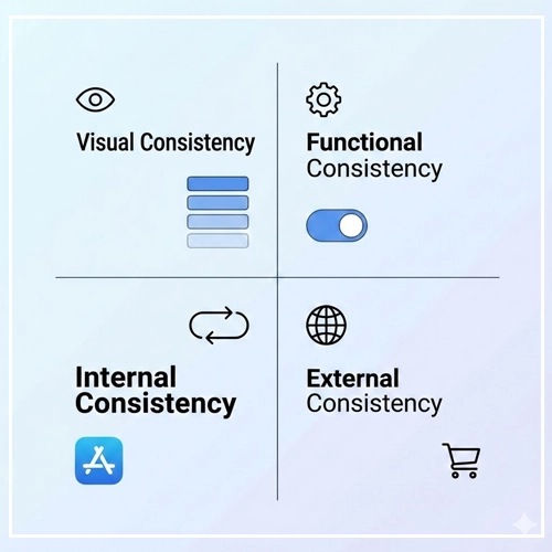
To master consistency, we must look beyond just “Visuals.” A robust UI strategy encompasses four distinct layers.

1. Visual Consistency
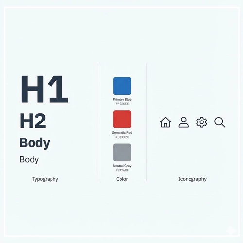
Visual Consistency refers to the uniformity of physical elements like fonts, colors, icons, and layout.
- Typography: Using the same H1 size for all main headers.
- Color: Ensuring the primary action button is always the same shade of blue.
- Spacing: Adhering to a strict grid system (e.g., 8pt grid).
2. Functional Consistency
Functional Consistency means that interactive elements work in a predictable way.
- If navigating to a new page creates a “slide-in” animation once, it should do so always.
- If a “trash can” icon deletes an item in the dashboard, it shouldn’t “archive” the item in the settings menu.
3. Internal Consistency
Internal Consistency refers to the logic within your specific product or family of products. Even if your design is unique, as long as it follows its own rules strictly, it is internally consistent.
- Recommended Reading: [Link to: Internal vs. External Consistency in UI: Explained]
4. External Consistency
External Consistency is adherence to industry standards and platform conventions (like iOS Human Interface Guidelines or Material Design).
- Example: Placing the “Cart” icon in the top right corner of an e-commerce site. Moving it to the bottom left would violate external consistency and confuse users.
Visual Design Guidelines: Establishing the Foundation
To achieve UI Consistency, you must systemize your visual language. Here is how to approach the core visual elements.

Typography Systems
Never choose font sizes arbitrarily. You need a Type Scale.
- Primary Font: Used for 90% of the interface (body text, standard headers).
- Secondary Font: Used strictly for emphasis or specific data displays (optional).
- Hierarchy: Establish a clear H1, H2, H3, Body, and Caption style.
| Element | Size (px) | Weight | Line Height | Usage |
| H1 | 32px | Bold | 1.2 | Main Page Titles |
| H2 | 24px | Semibold | 1.3 | Section Headers |
| Body | 16px | Regular | 1.5 | Standard Reading |
| Caption | 12px | Regular | 1.4 | Labels/Hints |
Color Usage and Semantics
Color consistency is not just about branding; it is about communication.
- Primary Brand Color: Used for main actions (CTAs).
- Semantic Colors:
- Red: Error / Destructive actions.
- Green: Success / Confirmation.
- Yellow: Warning / Attention.
- Neutrals: Text, backgrounds, and borders.
Pro Tip: Define your colors as “tokens” (e.g., color-action-primary rather than #0055FF). This ensures that if the brand blue changes, it changes everywhere instantly.
Iconography
Icons act as visual shorthand. If they are inconsistent, they become visual noise.
- Stroke Weight: If your icons use a 2px stroke, a 4px stroke icon will look alien.
- Corner Radius: Do you use sharp edges or rounded corners? Stick to one.
- Fill vs. Outline: Don’t mix filled icons and outlined icons arbitrarily. Use filled for active states and outlined for inactive states, for example.
- Recommended Reading: [Link to: How to Build a Consistent Icon Set for Apps]
Interaction Design Guidelines: Predictability is Key
Visuals attract, but interaction retains. Inconsistent interaction patterns are the primary cause of user frustration (Rage Clicks).

Navigation Patterns
Navigation is the roadmap of your application.
- Positioning: Keep the navigation bar in the same place on every page.
- Breadcrumbs: Use breadcrumbs consistently to show users where they are in the hierarchy.
- Mobile vs. Desktop: While the layout changes, the order of menu items should remain consistent between devices to maintain the user’s mental model.
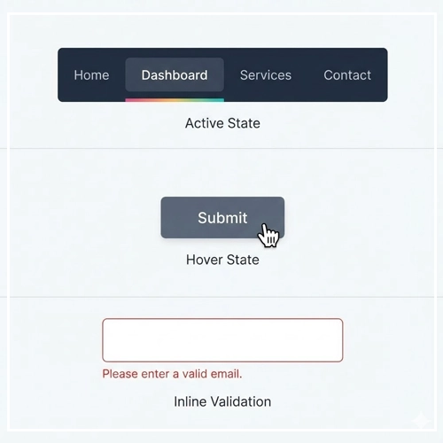
Feedback Loops
When a user interacts with the UI, the UI must respond.
- Hover States: All interactive elements must have a visible hover state.
- Active States: Visual feedback when a button is pressed (e.g., a slight shrink or color darkening).
- Loading States: Use consistent skeletons or spinners. Do not use a spinner on one page and a progress bar on another for the same type of wait time.
Form Design
Forms are high-friction areas. Inconsistency here leads to drop-offs.
- Label Placement: Always place labels above the input field (or always inside/left), never mix styles.
- Validation: Error messages should appear in the same location relative to the input field throughout the app.
The Role of Brand Consistency
Your UI is the digital face of the brand. If your website looks sleek and modern, but your mobile app looks dated and clunky, you erode brand trust.
Brand Consistency ensures that the “voice” of the design feels the same across all touchpoints.
- Imagery: Do you use photography or illustrations?
- Voice and Tone: Is your microcopy serious and technical, or playful and casual?
- Recommended Reading: [Link to: 5 Examples of Brand Consistency in Web Design]
Technical Considerations: Tools for Consistency
As a Senior Designer, you cannot rely on memory to maintain consistency. You need infrastructure.
Design Systems
A Design System is a collection of reusable components, guided by clear standards, that can be assembled together to build any number of applications. It is the single source of truth.
Design Tokens
Design Tokens are the atomic units of a design system. They are variables that store design decisions.
- Instead of hardcoding
16pxfor padding, you use a token$spacing-md. - This ensures that spacing is mathematically consistent across the entire product.
Style Guides
If a full Design System is too heavy for your project, a Style Guide is the minimum requirement.
- Recommended Reading: [Link to: Creating a Style Guide to Ensure UI Uniformity]
Why Consistency Improves User Trust (Data)
Consistency isn’t just an aesthetic choice; it’s a trust metric.
When an interface is predictable, users feel in control. When they feel in control, their anxiety decreases. High anxiety (caused by confusing UI) correlates directly with high bounce rates.
- Predictability: Users can predict the outcome of an interaction before they commit to it.
- Learnability: Users only have to learn your interface once.
- Recommended Reading: [Link to: Why Consistency Improve User Trust? (Data)]
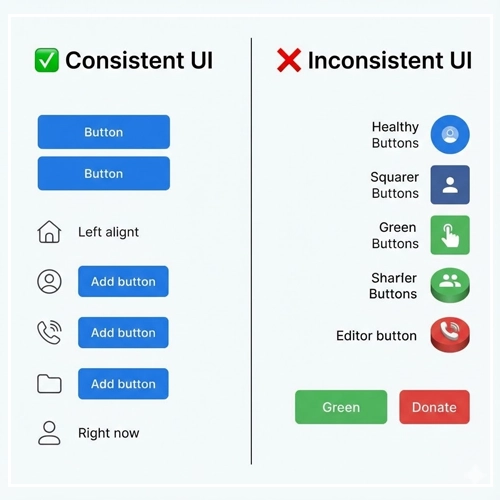
Comparison: Consistent vs. Inconsistent UI
To understand the impact, let’s look at a direct comparison of how design choices affect the user.
| Feature | Consistent UI (Good) | Inconsistent UI (Bad) |
| Buttons | All primary actions are Blue with 4px rounded corners. | “Submit” is Blue, “Save” is Green, “Send” is square. |
| Terminology | Always uses the word “Delete” to remove items. | Uses “Delete” on one page, “Remove” on another, “Trash” on a third. |
| Icons | All icons are 24x24px outline style. | Mix of flat icons, 3D icons, and different sizes. |
| Errors | Red text below the input field. | Sometimes an alert modal, sometimes red text, sometimes no feedback. |
| Date Format | DD/MM/YYYY everywhere. | Mix of MM/DD/YY and DD-Month-YYYY. |

The Ultimate UI Consistency Checklist
Before you hand off your designs to development, run through this checklist to ensure your User Interface Design is robust.
1. Visual Check
- [ ] Are all primary buttons using the defined primary color token?
- [ ] Is the type scale (H1, H2, Body) applied correctly without manual overrides?
- [ ] Do all icons share the same stroke weight and style?
- [ ] Are drop shadows and corner radii uniform across cards and modals?
2. Functional Check
- [ ] Do all links look like links (and non-links look like static text)?
- [ ] Does the “Back” button always appear in the same location?
- [ ] Is the behavior of modals/popups consistent (e.g., click outside to close)?
3. Copywriting Check
- [ ] Is the capitalization style consistent? (e.g., Title Case vs. Sentence case for headers).
- [ ] Are terms used consistently? (Don’t swap “Log in” with “Sign in”).
4. Responsive Check
- [ ] Does the padding scale down predictably on mobile devices?
- [ ] Is the navigation menu behavior consistent across different screen sizes?
Conclusion
Mastering UI Consistency is a journey, not a destination. It requires vigilance, a robust set of tools (like Design Systems), and a commitment to the user experience.
By adhering to internal and external standards, you lower the barrier to entry for your users. You make your product not just beautiful, but usable and trustworthy. Remember, in User Interface Design, boring is often better. If your users don’t notice your consistency, you have done your job perfectly.
Start auditing your current designs today using the checklist above, and watch your usability metrics improve.
Frequently Asked Questions (FAQ)
1. What is the difference between Visual and Functional consistency?
Visual consistency relates to the look of the product (colors, fonts, icons), ensuring elements appear uniform. Functional consistency relates to behavior, ensuring that interactive elements work in a predictable way across the interface.
2. Can too much consistency be a bad thing?
Yes. “Foolish consistency” can hurt usability. For example, making a “Delete Account” button look exactly the same as a “Next Page” button is consistent visually, but dangerous functionally. Context sometimes requires breaking consistency for safety or emphasis.
3. What is External Consistency in UI?
External consistency is adhering to established conventions outside of your product, such as standard platform guidelines (iOS/Android) or general web standards (e.g., underlining links, placing logos in the top left).
4. How do Design Systems help with consistency?
A Design System acts as a single source of truth. It provides reusable components and guidelines, ensuring that every designer and developer on the team uses the exact same elements, eliminating variations.
5. What is Jakob’s Law in relation to consistency?
Jakob’s Law states that users spend most of their time on other websites. Therefore, they expect your site to work similarly to the sites they already know. This is the primary argument for External Consistency.
6. Why is consistency important for accessibility?
Predictable layouts and behaviors are crucial for users with cognitive disabilities. Furthermore, screen reader users rely on consistent HTML structure (like heading hierarchies) to navigate content efficiently.
7. What tools are best for maintaining UI consistency?
Figma (with its Auto Layout and Variables features), Sketch, and Adobe XD are industry standards. Tools like Storybook are essential for maintaining consistency in the code.
8. How do I fix an inconsistent UI?
Start with a UI Audit. Screenshot all unique elements (buttons, inputs, headers) and group them. Identify the variations, choose a standard for each, and document it in a Style Guide.
9. Does consistency kill creativity?
No. Consistency provides the framework within which creativity can flourish. By systematizing the mundane elements (buttons, forms), designers have more mental energy to solve complex UX problems creatively.
10. What is a “Design Token”?
A Design Token is a piece of data (like a hex code or pixel value) represented by a name (like color-primary or spacing-large). It allows consistency to be maintained across different platforms (Web, iOS, Android) by referencing the token rather than the raw value.
11. How does consistency affect brand perception?
Inconsistent designs appear unprofessional, cheap, or insecure. A consistent UI implies that the company pays attention to detail, fostering trust and brand loyalty.
12. What is “Internal Consistency”?
Internal consistency refers to logic and style remaining uniform within your specific product, even if it differs from external standards. For example, if your app uses a unique gesture for navigation, it must use that gesture everywhere in the app.
13. How often should I update my Style Guide?
A Style Guide should be a living document. It should be updated whenever a new pattern is validated and adopted. However, core foundations (colors, typography) should remain stable to avoid confusing users.
14. What are the most common consistency mistakes?
Common mistakes include mixing icon styles (filled vs. outline), using multiple shades of the same color (e.g., five different grays), and inconsistent wording on action buttons (e.g., “Send” vs. “Submit”).
15. How do I measure the success of UI consistency?
You can measure success through Heuristic Evaluation, reduced development time (velocity), and User Testing. If users complete tasks faster with fewer errors, your consistency strategy is working.

