- What makes a successful CTA in UI design?
- What Defines the Anatomy of Action?
- How Should You Structure Button Hierarchy?
- Why Does Placement and Geometry Matter?
- What Role Do Button States Play in Interaction?
- How many button states do you need?
- Why is accessibility non-negotiable?
- 1. What is the optimal corner radius for buttons?
- 2. How do ghost buttons affect conversion?
- 3. What is the best color for a primary CTA?
- 4. How much whitespace should surround a button?
- 5. Should buttons have icons?
- 6. What is the difference between a button and a link?
- 7. How do I handle disabled buttons?
- 8. What is the ideal length for button copy?
- 9. Can I have two primary buttons on one screen?
- 10. How does the "Fold" affect CTA placement?
- 11. What is a sticky CTA?
- 12. How do I test button performance?
- 13. Why do my buttons look like text on mobile?
- 14. What are dark patterns in button design?
- 15. How does loading state affect UX?
- External Resources
Buttons & CTAs are the fundamental interactive elements that bridge the gap between user intent and business goals.
User confusion is the silent killer of conversion rates. When a user lands on your interface, their journey hinges on clear signposts. If they cannot identify where to click, the experience fails.
What makes a successful CTA in UI design?
A successful Call-to-Action (CTA) combines high visual affordance (looking clickable) with clear, action-oriented copy. It must possess distinct visual weight relative to its priority, adhere to touch target size standards for accessibility, and provide immediate feedback through defined button states.
To master Buttons & CTAs, designers must understand the delicate balance of hierarchy. You must distinguish between primary vs secondary buttons to guide the eye. You need to know when to deploy ghost buttons for subtlety or a floating action button (FAB) for mobile prominence.
Furthermore, ignoring touch target size or CTA placement can ruin mobile performance. This guide explores the science of affordance and the art of driving action.
What Defines the Anatomy of Action?
A button is not just a rectangle with text; it is a promise of interaction. To fulfill this promise, the design must possess affordance.
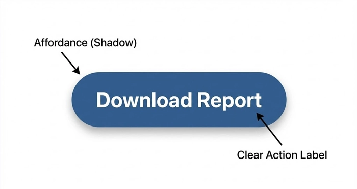
Affordance refers to visual cues—like shadows, gradients, or borders—that suggest an object can be clicked or tapped. Flat design trends often reduce affordance, leading to user friction.
How important is label clarity?
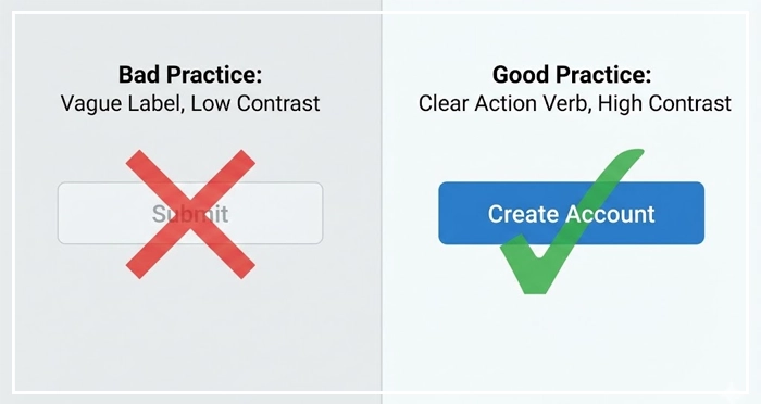
The text inside your Buttons & CTAs determines the click. Vague labels like “Submit” or “Click Here” create cognitive load.
Use action verbs that describe the outcome, such as “Add to Cart,” “Download Report,” or “Create Account.” Clear typography ensures the label is legible against the button background.
[Internal Link: Typography Best Practices]
How Should You Structure Button Hierarchy?
Not every action carries equal weight. If every button screams for attention, the user hears nothing but noise. Effective UI relies on a strict visual hierarchy.
When should you use Primary vs Secondary Buttons?
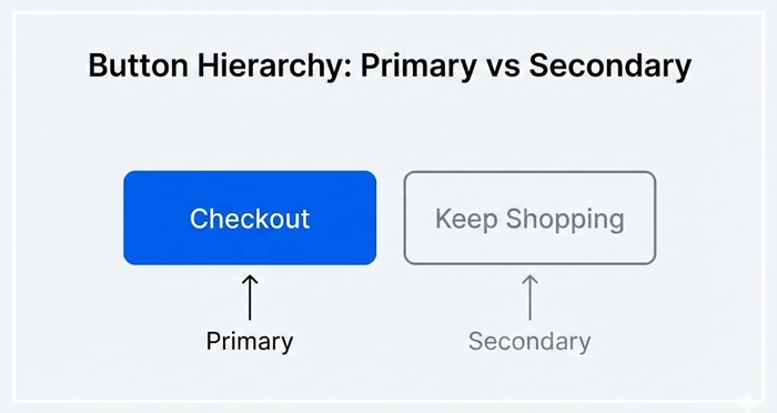
Primary buttons are reserved for the main action of a screen (e.g., “Checkout”). They should have the strongest visual weight, typically using solid, high-contrast colors.
Secondary buttons offer alternative paths (e.g., “Keep Shopping”). They usually feature outlines or lighter background colors to recede visually behind the primary action.
[Internal Link: Color Theory for UI]
What is the role of Ghost Buttons and FABs?
Ghost buttons (transparent with a solid border) are often used for secondary or tertiary actions. They are elegant but can suffer from poor visibility over complex backgrounds.
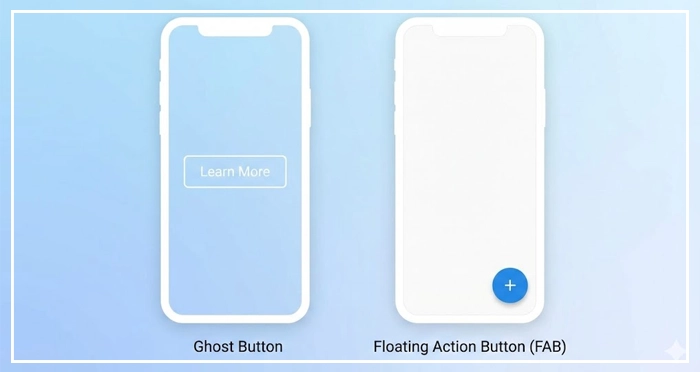
The Floating Action Button (FAB), popularized by Material Design, is the primary trigger for the most common action on a mobile screen. It floats above the UI content, demanding attention.
[Internal Link: Design Systems Documentation]
Visual Anchor: Button Types Comparison
| Button Type | Usage | Visual Weight | Best Context |
| Primary | Main task completion | High (Solid Fill) | “Sign Up,” “Buy Now” |
| Secondary | Alternative actions | Medium (Lighter Fill/Outline) | “Cancel,” “Back” |
| Ghost | Tertiary/Optional actions | Low (Transparent + Border) | “Learn More,” “Filters” |
| FAB | Key promotion action | Highest (Elevated + Icon) | Mobile apps (e.g., “Compose Email”) |
Why Does Placement and Geometry Matter?
The physical properties of Buttons & CTAs dictate their usability. Even the most beautiful button will fail if a thumb cannot reach it.
How does touch target size impact mobile UX?
Fitt’s Law states that the time to acquire a target is a function of the distance to and size of the target. Small buttons frustrate users.
According to the Nielsen Norman Group, interactive elements should generally be at least 1cm x 1cm physically to prevent error.
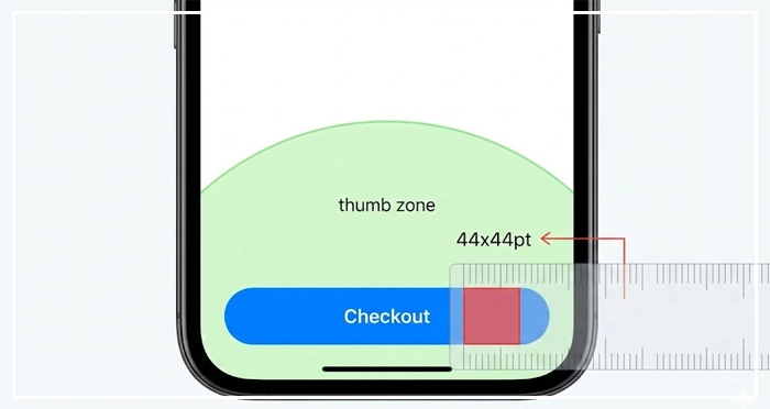
Apple’s Human Interface Guidelines recommend a minimum touch target size of 44x44pt. Android recommends 48x48dp.
[Internal Link: Mobile UI Design Guide]
What are the rules of CTA Placement?
Placement should follow the user’s reading pattern. For desktop, the Z-pattern or F-pattern places the CTA at the terminal point of the visual scan.
On mobile, place primary Buttons & CTAs within the “Thumb Zone”—the bottom third of the screen where the thumb rests naturally.
[Internal Link: White Space in Web Design]
What Role Do Button States Play in Interaction?
Users need confirmation that the system has received their input. Static buttons feel broken.
How many button states do you need?
A robust design system includes five key states:
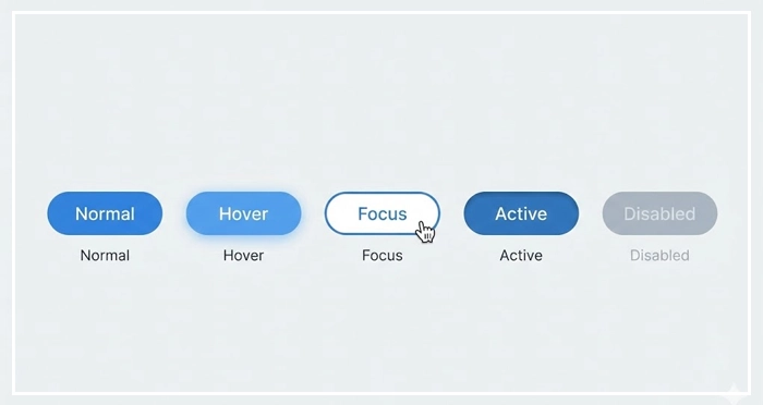
- Normal: The default state, communicating interactability.
- Hover: Visual feedback when the mouse cursors over the element (Desktop only).
- Focus: Essential for keyboard navigation and accessibility.
- Active: The “pressed” state, usually slightly darker or smaller.
- Disabled: Muted visual style indicating the action is currently unavailable.
[Internal Link: Microinteractions in UI]
Why is accessibility non-negotiable?
Disabled buttons often fail contrast ratios. Ensure that even inactive elements are distinguishable. Furthermore, Buttons & CTAs must be navigable via screen readers.
[Internal Link: Accessibility Standards (WCAG)]
- Hierarchy is King: clearly distinguish between primary vs secondary buttons to guide user flow.
- Size Matters: adhere to a minimum touch target size of 44pt to accommodate mobile users.
- Feedback Loops: design all button states (Hover, Active, Disabled) to communicate system status.
- Clarity: Use actionable, specific verbs for your labels rather than generic terms.
- Placement: Position Buttons & CTAs in the natural path of the user’s eye or thumb.
1. What is the optimal corner radius for buttons?
There is no single “best” radius, but consistency is key. Fully rounded buttons (pill shape) often appear more friendly and are common in mobile apps, while slightly rounded corners (4px-8px) are standard for enterprise SaaS to maximize internal text space.
2. How do ghost buttons affect conversion?
Ghost buttons generally have lower click-through rates (CTR) than solid primary buttons because they carry less visual weight. They are best used for secondary actions to avoid distracting from the main goal.
3. What is the best color for a primary CTA?
High-contrast colors that stand out against the background perform best. While red and green are popular, the color should be the one reserved specifically for “action” within your specific color palette to ensure consistency.
4. How much whitespace should surround a button?
Generous whitespace prevents “mistaps” and draws attention to the element. A good rule of thumb is to ensure the padding around the button is at least half the height of the button itself.
5. Should buttons have icons?
Icons can speed up recognition (e.g., a trash can for “Delete”), but they should not replace text unless the icon is universally recognized. Combining text and icons usually offers the highest clarity.
6. What is the difference between a button and a link?
Buttons are for actions that affect the back-end or change the interface state (Submit, Save, Delete). Links are for navigation (taking the user to a different page).
7. How do I handle disabled buttons?
Display them with lower opacity or grayed-out colors. However, some UX experts argue for keeping the button active but showing an error message upon click to explain why the action cannot proceed.
8. What is the ideal length for button copy?
Keep it under 3-4 words. If you need more explanation, place helper text near the button rather than cramming it inside.
9. Can I have two primary buttons on one screen?
Avoid this. It creates “choice paralysis.” If two actions seem equally important, re-evaluate the page goal to determine which one actually drives the primary business metric.
10. How does the “Fold” affect CTA placement?
While “above the fold” is still valuable, users are accustomed to scrolling. It is often better to place a CTA after the value proposition has been explained, rather than blindly forcing it to the top.
11. What is a sticky CTA?
A sticky CTA remains fixed to the bottom or top of the viewport as the user scrolls. This is highly effective on mobile product pages to ensure the “Buy” action is always available.
12. How do I test button performance?
Use A/B testing. Test one variable at a time: change the color, then the copy, then the placement. Measuring CTR (Click-Through Rate) is the standard metric.
13. Why do my buttons look like text on mobile?
This is a lack of affordance. Ensure your buttons have a clear shape, border, or drop shadow so they look distinct from standard body paragraphs.
14. What are dark patterns in button design?
Dark patterns use visual deception, such as making a “Cancel” button invisible or swapping the colors of “Yes/No” to trick users into an unwanted action. Avoid this to maintain trust.
15. How does loading state affect UX?
A loading state (spinner inside the button) confirms the click was registered. Without it, users may rage-click the button multiple times, causing duplicate submissions or errors.
External Resources
Here are 3 credible sources to further explore this topic:

