- What is a wireframe in UI design?
- Why is a Wireframe Essential for UX Strategy?
- How Does Information Architecture Influence Wireframing?
- Lo-Fi vs Hi-Fi: When Should You Increase Fidelity?
- What are the Core Components of a Wireframe Layout?
- Comparison: Sketch vs. Wireframe vs. Prototype
- How Do You Move from Static Layouts to Rapid Prototyping?
- 1. What is the difference between a wireframe and a mockup?
- 2. Which tools are best for creating low-fidelity wireframes?
- 3. Should I include real content in my wireframe?
- 4. How long should the wireframing process take?
- 5. Can I skip wireframing if the project is small?
- 6. What is the role of a wireframe in responsive design?
- 7. Who is responsible for creating wireframes?
- 8. How detailed should a wireframe be for developers?
- 9. What are wireframe annotations?
- 10. Do wireframes need to be interactive?
- 11. How does wireframing improve SEO?
- 12. What is a "gray box" model in wireframing?
- 13. Can I use Figma for wireframing?
- 14. What common mistakes should I avoid in wireframing?
- 15. Is a site map the same as a wireframe?
- External Resources
“Blank Canvas Paralysis” is a real threat to product timelines. Even worse is the cost of refactoring code because a design flaw wasn’t caught early. The solution to both is a robust wireframing.
What is a wireframe in UI design?
A wireframe is a two-dimensional illustration of a page’s interface that specifically focuses on space allocation and prioritization of content, functionalities, and intended behaviors. It serves as a low-fidelity blueprint that connects the underlying conceptual structure (Information Architecture) to the visual surface of the website or mobile app.
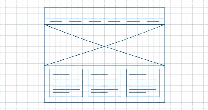
Every digital product requires a blueprint. A wireframe acts as the skeleton of your interface, stripping away visual polish to focus on layout structure. Whether you are drafting low-fidelity wireframes on a napkin or using digital tools, the goal is the same. You must establish information architecture and user flow mapping before a single pixel is colored.
By distinguishing lo-fi vs hi-fi approaches, teams can utilize rapid prototyping to iterate quickly. Using placeholder content ensures stakeholders focus on function over aesthetics.
[Internal Link: UI Design Principles]
Why is a Wireframe Essential for UX Strategy?
A wireframe is not just a drawing; it is a communication tool.
According to the Nielsen Norman Group, spending 10% of your development budget on usability design—starting with wireframing—can improve conversion metrics by up to 83%. This phase separates the structural UX design from the UI styling.
If you skip wireframing, you risk confusing navigation with visual design. This often leads to expensive “scope creep” during the development phase. Wireframing allows you to fail fast and cheaply. It aligns the Product Manager’s requirements with the Designer’s execution.
How Does Information Architecture Influence Wireframing?
You cannot draw a house without a floor plan. Similarly, you cannot build a wireframe without Information Architecture (IA).
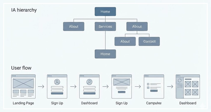
IA dictates how content is organized and labeled. Before opening a design tool, you must understand the hierarchy of data. A wireframe is simply the visual manifestation of your IA.
If the user flow mapping is illogical, the wireframe will highlight it immediately. This is why seasoned designers map out flows before sketching screens.
[Internal Link: Information Architecture Basics]
[Internal Link: User Research Methods]
Lo-Fi vs Hi-Fi: When Should You Increase Fidelity?
The fidelity of your wireframe should match the maturity of your ideas.
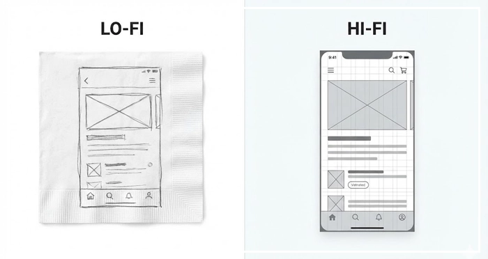
Low-fidelity wireframes (Lo-fi) are rough and abstract. They are best used during brainstorming sessions. They prevent stakeholders from getting distracted by fonts or colors. Use these to validate basic concepts.
High-fidelity wireframes (Hi-fi) are detailed and digital. They use actual grid systems and specific pixel dimensions. Use these when you need to document specific interactions for developers or prepare for rapid prototyping.
[Internal Link: Prototyping Tools Comparison]
What are the Core Components of a Wireframe Layout?
A standard wireframe relies on three main components to communicate design intent.
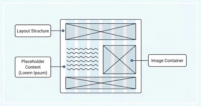
- Layout Structure: This defines the global navigation, footers, and content areas. It establishes the grid that the final UI will rest upon.
- Placeholder Content: Designers often use “Lorem Ipsum” text to represent copy. This holds space for future content without delaying the layout process.
- Image Containers: Boxes with an “X” through them universally signify where images or media will go.
By removing specific images and colors, the wireframe forces the viewer to critique the placement of elements, not the elements themselves.
Comparison: Sketch vs. Wireframe vs. Prototype
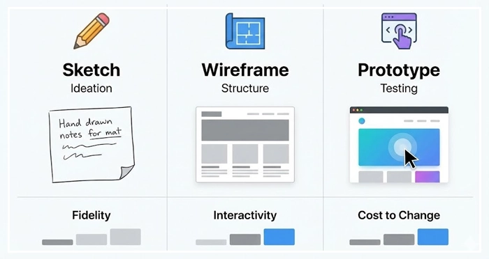
To understand where wireframing fits, we must compare it to its neighbors in the design process.
| Feature | Sketch | Wireframe | Prototype |
| Fidelity | Very Low (Hand-drawn) | Low to Medium (Grayscale) | High (Visuals & Interactivity) |
| Primary Goal | Ideation & Brainstorming | Structure & Layout | User Testing & Interaction |
| Interactivity | None | None (usually static) | Clickable / Dynamic |
| Content | Rough notes | Placeholder content | Real / Near-real content |
| Cost to Change | Negligible | Low | Moderate to High |
How Do You Move from Static Layouts to Rapid Prototyping?
Once the wireframe is approved, the design moves from static to dynamic.
Rapid prototyping involves taking your wireframes and linking them together. This allows you to simulate the user flow. Tools like Figma or Axure allow designers to add “hotspots” to wireframes.
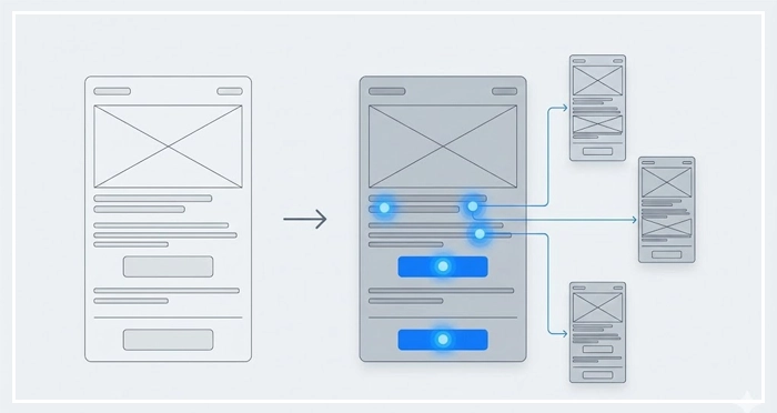
Testing a clickable wireframe reveals usability friction points that static images hide. It is the bridge between the structural blueprint and the final visual design.
[Internal Link: Usability Testing]
[Internal Link: The Handoff Process]
- Definition: A wireframe is a low-fidelity blueprint focusing on structure, not aesthetics.
- Cost Efficiency: Fixing errors during the wireframing phase is significantly cheaper than refactoring code.
- Focus: Using placeholder content and grayscale elements keeps stakeholders focused on layout and functionality.
- Evolution: Start with low-fidelity wireframes for ideation and move to high-fidelity for documentation.
- Validation: Always validate the Information Architecture before finalizing the wireframe.
1. What is the difference between a wireframe and a mockup?
A wireframe is a structural blueprint (low fidelity), while a mockup is a high-fidelity visual representation that includes colors, typography, and brand styling.
2. Which tools are best for creating low-fidelity wireframes?
For low-fidelity wireframes, pen and paper, Balsamiq, and Miro are excellent choices because they prioritize speed and rough layout over precision.
3. Should I include real content in my wireframe?
Generally, no. Use placeholder content to prevent distractions. However, for critical headlines or buttons, real text helps gauge space requirements accurately.
4. How long should the wireframing process take?
The timeline varies, but wireframing should take 20-30% of the design time. Rapid prototyping methodologies encourage quick iterations rather than perfection.
5. Can I skip wireframing if the project is small?
Skipping the wireframe is risky. Even for small projects, a quick sketch ensures alignment on user flow mapping and prevents layout errors.
6. What is the role of a wireframe in responsive design?
Wireframes are crucial for planning how the layout structure adapts across devices (mobile, tablet, desktop) before code is written.
7. Who is responsible for creating wireframes?
Typically, UX Designers or Product Designers create wireframes. However, Product Managers often create rough low-fidelity wireframes to communicate requirements.
8. How detailed should a wireframe be for developers?
For handoff, a wireframe should be detailed enough to show spacing, element hierarchy, and intended behavior, often accompanied by annotations.
9. What are wireframe annotations?
Annotations are notes added to the side of a wireframe explaining specific behaviors, logic, or edge cases that a static image cannot convey.
10. Do wireframes need to be interactive?
Not necessarily. A standard wireframe is static. However, making it clickable turns it into a low-fidelity prototype, which is useful for early testing.
11. How does wireframing improve SEO?
Wireframing helps plan the Information Architecture and heading hierarchy early, ensuring that search engine crawlers can easily understand the page structure.
12. What is a “gray box” model in wireframing?
The gray box model refers to using various shades of gray to denote visual weight and hierarchy in a wireframe without using actual colors.
13. Can I use Figma for wireframing?
Yes, Figma is a leading tool for both wireframing and interface design, allowing for a seamless transition from lo-fi vs hi-fi stages.
14. What common mistakes should I avoid in wireframing?
Avoid focusing on colors, using inconsistent spacing, neglecting the grid system, or trying to solve visual design problems too early.
15. Is a site map the same as a wireframe?
No. A site map shows the hierarchy of pages (the global structure), while a wireframe shows the layout of a specific page (the local structure).
External Resources
Here are 3 credible sources to further explore this topic:
- Nielsen Norman Group: Wireframing 101
- Interaction Design Foundation (IxDF): What is Wireframing?
- Smashing Magazine: A Comprehensive Guide To Wireframing


