- Introduction: The Imperative of Inclusive Design
- How do the POUR Principles Define Accessibility?
- How does Color and Contrast Impact Visual Accessibility?
- Why is Semantic HTML Vital for Screen Reader Compatibility?
- How does Keyboard Navigation Ensure Operability?
- WCAG Compliance Levels: A Comparison
- How Does Cognitive Load Affect Accessibility?
- How Do We Validate Accessibility?
Introduction: The Imperative of Inclusive Design
Accessibility is no longer a “nice-to-have” feature; it is a fundamental requirement for modern digital products. Whether driven by the moral imperative to exclude no one, the business case for widening your market reach, or the legal necessity of preventing lawsuits, inclusive design is critical.
What is Inclusive UI Design?
Inclusive UI Design is the practice of creating digital interfaces that are usable by people of all abilities and backgrounds. It prioritizes accessibility standards to ensure users with visual, auditory, motor, or cognitive impairments can perceive, operate, and understand the interface effectively.
To achieve true inclusivity, designers and developers must move beyond basic compliance. You must integrate a WCAG 2.1 AA checklist into your workflow from day one. This involves ensuring screen reader compatibility for the visually impaired and robust keyboard navigation for those with motor disabilities.
This guide explores the core pillars of inclusive design, including focus indicators, aria-labels, color blindness simulation, and the foundational POUR principles.
How do the POUR Principles Define Accessibility?
The World Wide Web Consortium (W3C) defines four distinct principles that serve as the foundation for Web Content Accessibility Guidelines (WCAG). These are known as the POUR principles.
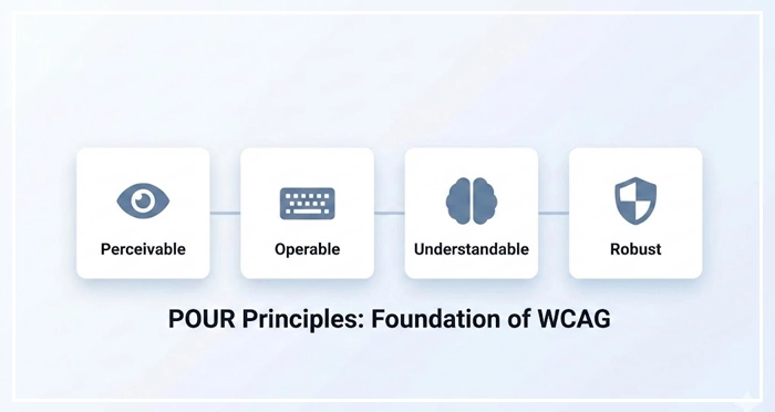
1. Perceivable
Information and user interface components must be presentable to users in ways they can perceive. This means that users must be able to comprehend the information being depicted: it cannot be invisible to all of their senses.
- Text Alternatives: Provide text alternatives for non-text content.
- Captions: Provide captions and other alternatives for multimedia.
2. Operable
User interface components and navigation must be operable. The interface cannot require interaction that a user cannot perform.
- Keyboard Accessible: Make all functionality available from a keyboard.
- Seizures: Do not design content in a way that is known to cause seizures.
3. Understandable
Information and the operation of user interface must be understandable.
- Readable: Make text content readable and understandable. [Internal Link: Typography Readability Guide]
- Predictable: Make Web pages appear and operate in predictable ways.
4. Robust
Content must be robust enough that it can be interpreted reliably by a wide variety of user agents, including assistive technologies.
- Compatible: Maximize compatibility with current and future user agents.
How does Color and Contrast Impact Visual Accessibility?
Visual impairments affect a massive portion of the global population. Relying solely on color to convey information is a critical error in UI design.
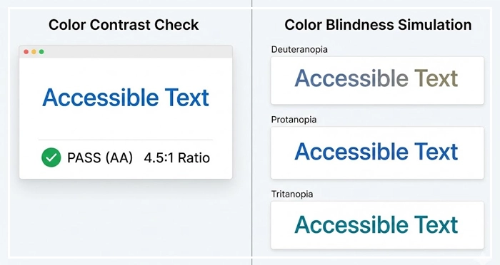
What are the Contrast Ratio Requirements?
To meet WCAG 2.1 AA checklist standards, text must have a specific contrast ratio against its background.
- Normal Text: Requires a contrast ratio of at least 4.5:1.
- Large Text: Requires a contrast ratio of at least 3:1.
- Graphics/UI Components: Requires a contrast ratio of at least 3:1.
[High Contrast Color Palettes]
Why use Color Blindness Simulation?
Approximately 1 in 12 men are color blind (color vision deficiency). Designers should use tools to simulate these conditions during the design phase.
- Deuteranopia: Red-green color blindness (most common).
- Protanopia: Red cone deficiency.
- Tritanopia: Blue-yellow color blindness.
Best Practice: Never use color alone to indicate status (e.g., error states). Always pair color with an icon or text label.
Why is Semantic HTML Vital for Screen Reader Compatibility?
Screen reader compatibility relies heavily on the underlying code structure. A screen reader (like NVDA or VoiceOver) parses the HTML DOM to announce content to the user.
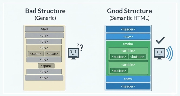
How do we use Semantic Tags?
Using <div> and <span> for everything creates a generic, unhelpful experience for assistive tech.
- Use
<button>for actions. - We can use
<a>for navigation. - Use
<nav>,<main>,<article>, and<aside>to define landmarks.
[Internal Link: Semantic HTML Basics]
When should you use ARIA Labels?
Aria-labels (Accessible Rich Internet Applications) provide accessible names for elements that lack visible text.
- Example: A “hamburger” menu icon might visually look like a menu, but to a screen reader, it is just an image. Adding
aria-label="Main Menu"tells the user exactly what the button does. - Warning: The first rule of ARIA is “Don’t use ARIA” if a native HTML element can achieve the same result.
How does Keyboard Navigation Ensure Operability?
Many users, including those with motor disabilities, cannot use a mouse. They rely entirely on the Tab key to navigate through interactive elements.

What are Focus Indicators?
Focus indicators are the visual cues (usually a ring or outline) that appear around an element when it is selected via a keyboard.
- CSS Rule: Never set
outline: nonewithout providing an alternative style. - Visibility: The indicator must be clearly visible and have high contrast against the background.
How to manage Logical Tab Order?
The focus order should follow the visual flow of the page: left to right, top to bottom.
- DOM Order: The tab order follows the HTML structure, not the visual CSS positioning.
- Skip Links: Provide a “Skip to Content” link at the top of the page to allow keyboard users to bypass repetitive navigation menus.
[Internal Link: Mobile UI Best Practices]
WCAG Compliance Levels: A Comparison
The World Wide Web Consortium (W3C) categorizes Accessibility compliance into three levels. Most legislation (like the ADA in the US or EAA in Europe) targets Level AA.
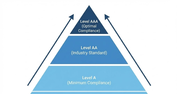
| Level | Definition | Key Criteria Examples | Target Use Case |
| A | Minimum Compliance | • No keyboard traps. • Non-text content has alternatives. • Captions for video. | Essential for basic access. Without this, the site is unusable for many. |
| AA | Acceptable Compliance | • Contrast ratio 4.5:1. • Resizable text (up to 200%). • Focus visible. | The Industry Standard. Required by most government and legal bodies. |
| Level AAA | Optimal Compliance | • Contrast ratio 7:1. • Sign language interpretation. • No timing limitations. | Specialized sites (e.g., government services for the disabled). |
How Does Cognitive Load Affect Accessibility?
Accessibility is also about cognitive inclusion. Interfaces should not overwhelm users with information processing disorders, anxiety, or learning disabilities.
- Consistency: Keep navigation and icons consistent across all pages.
- Clarity: Use plain language. Avoid jargon.
- Feedback: Provide clear success and error messages.
[Internal Link: Designing for Cognitive Load]
How Do We Validate Accessibility?
Testing is the only way to ensure robustness.
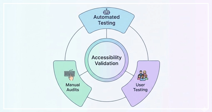
- Automated Testing: Use tools like Lighthouse, Axe, or WAVE to catch 30-40% of errors (mostly syntax).
- Manual Audits: Manually tab through the site to check navigation flows.
- User Testing: There is no substitute for testing with real users who use assistive technology.
According to WHO data, over 1 billion people live with some form of disability. Ignoring this demographic is a massive failure in user research.
[Internal Link: User Testing Methodologies]
[Internal Link: UX Audit Checklist]
Key Takeaways
- Prioritize POUR: Ensure your design is Perceivable, Operable, Understandable, and Robust.
- Validate Contrast: Aim for AA compliance (4.5:1) for all normal text.
- Respect the Keyboard: Test your entire UI without a mouse; ensure focus indicators are always visible.
- Semantics Matter: Use native HTML elements over ARIA where possible for better screen reader compatibility.
- Don’t Rely on Color: Use text labels and icons alongside color to convey state.
1. What is the difference between WCAG 2.1 and WCAG 2.2?
WCAG 2.2 builds upon 2.1 by adding new success criteria primarily focused on users with cognitive or learning disabilities and users on mobile devices. It does not remove existing criteria from 2.1.
2. Is accessibility required by law for private websites?
Yes, in many jurisdictions. In the US, the ADA (Americans with Disabilities Act) has been interpreted by courts to apply to websites. in the EU, the European Accessibility Act (EAA) mandates accessibility for many digital products by 2025.
3. How do I fix “missing alt text” errors?
Locate the <img> tag in your HTML and add an alt="" attribute. Inside the quotes, write a concise description of the image’s function or content. If the image is purely decorative, leave the attribute empty (alt="").
4. Can automated tools catch all accessibility errors?
No. Automated tools generally catch only 30% to 50% of accessibility issues. Manual testing (keyboard navigation, screen reader testing) is required for full compliance.
5. What is a “keyboard trap”?
A keyboard trap occurs when a user navigates into a component (like a modal or a video player) using the Tab key but cannot navigate out of it using the keyboard alone.
6. How does accessible design improve SEO?
Search engines are essentially blind users. They rely on semantic HTML, alt text, and clear structure to understand content. Optimizing for accessibility directly improves your on-page SEO signals.
7. What fonts are best for accessibility?
Sans-serif fonts like Arial, Verdana, and Open Sans are generally considered more readable. Avoid decorative or handwritten fonts. ensure a minimum size of 16px for body text.
8. What is the role of “skip navigation” links?
Skip links allow keyboard and screen reader users to bypass repeated header navigation and jump directly to the main content, saving them time and reducing fatigue.
9. How do I make PDFs accessible?
Accessible PDFs must be tagged properly to define reading order, headings, and alt text for images. Standard “Print to PDF” usually does not create an accessible document.
10. What is “focus visible” in WCAG?
Focus visible is a criterion requiring that any element receiving keyboard focus must have a visible indicator (like a border or color change) so the user knows where they are on the page.
11. Does dark mode improve accessibility?
It depends on the user. For some with photophobia (light sensitivity), dark mode is essential. For others with astigmatism, high contrast light mode is better. The best approach is to offer a choice.
12. What are “reduced motion” preferences?
This is a media query (prefers-reduced-motion) that allows developers to disable or minimize animations for users who experience vestibular disorders or motion sickness.
13. How do I test for screen reader compatibility on Mac?
Macs come with a built-in screen reader called VoiceOver. You can activate it by pressing Command + F5 to test your website.
14. What is the difference between aria-label and aria-labelledby?
aria-label allows you to define a string of text as the label. aria-labelledby points to the ID of another element on the page to use as the label (e.g., using a heading to label a section).
15. Why is “click here” bad for accessibility?
Link text should be descriptive. “Click here” gives no context to a screen reader user browsing a list of links. Use text like “Read our Accessibility Guide” instead.
External Resources
Here are 3 credible sources to further explore this topic:
- The World Wide Web Consortium (W3C)
- WebAIM (Web Accessibility In Mind) – Contrast Checker
- Microsoft Inclusive Design Toolkit


