- What is Design System
- Why is a Design System Essential for Scaling?
- The Core Elements of a Spatial System
- Implementing the Proximity Principle via Tokens
- Comparison of Design System Methodologies
- Establishing Typography and Color within the System
- Mobile Responsiveness and Adaptation
- 1. What is the difference between a Style Guide and a Design System?
- 2. How do I start building a Design System from scratch?
- 3. What tools are best for managing a Design System?
- 4. How does a Design System improve SEO?
- 5. What is the Atomic Design methodology?
- 6. How do I measure the success of a Design System?
- 7. Can a small team benefit from a Design System?
- 8. What are Design Tokens?
- 9. How often should a Design System be updated?
- 10. How does a Design System handle accessibility?
- 11. What is the cost of building a Design System?
- 12. How do I get stakeholder buy-in for a Design System?
- 13. What is the role of a Design System Ops manager?
- 14. How does a Design System help with rebranding?
- 15. Why is documentation critical in a Design System?
What is Design System
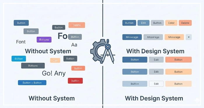
A Design System is a comprehensive collection of reusable components, guided by clear standards, that can be assembled together to build any number of applications. It goes beyond a style guide by defining code, behavior, and the proximity principle to ensure consistency and efficiency across product teams.
Is your product suffering from visual inconsistency as you scale? When teams grow, maintaining layout balance and managing negative space becomes a chaotic battle without a single source of truth. A robust Design System is the only way to scale fast without breaking your user experience.
Why is a Design System Essential for Scaling?
Scaling a product without a system leads to “design debt.” According to a 2023 study by Sparkbox, teams using a mature Design System report a 50% increase in engineering efficiency. Without these guardrails, designers reinvent the wheel, leading to disjointed user flows.
Implementing a Design System does more than just organize buttons; it enforces clutter reduction and standardizes visual breathing room. By defining strict rules for macro vs micro whitespace, you ensure that every interface element adheres to the proximity principle, resulting in significant cognitive load reduction for your users.
[Internal Link: UX Audit Checklist]
How does a Design System reduce cognitive load?
Consistency breeds familiarity.
When a Design System standardizes patterns, users don’t have to re-learn how to interact with your interface on every new page. This predictability contributes directly to cognitive load reduction, allowing users to focus on tasks rather than interpreting the UI.
[Internal Link: Understanding User Attention]
The Core Elements of a Spatial System
A common misconception is that design systems are just libraries of components like buttons and inputs.
However, the most critical “invisible” component of a Design System is how it handles space.
How do we standardize macro vs micro whitespace?
To achieve visual breathing room, your system must define spatial tokens. Micro whitespace refers to the padding inside components (e.g., inside a button), while macro whitespace defines the layout margins between major sections. Codifying these ensures that layout balance is mathematically consistent across the entire product.
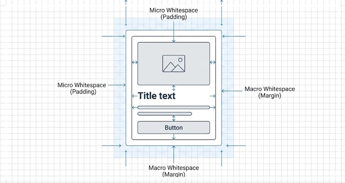
- Micro: Defines legibility and component structure.
- Macro: Defines the overall flow and hierarchy.
[Internal Link: White Space in Web Design]
Implementing the Proximity Principle via Tokens
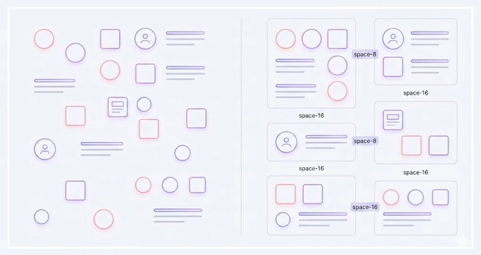
The proximity principle states that objects close to each other are perceived as a group. In a Design System, we enforce this using “space tokens” (e.g., space-4, space-8, space-16).
By restricting designers to a set scale, you automatically force unrelated items apart, aiding in clutter reduction.
[Internal Link: Gestalt Principles Deep Dive]
Comparison of Design System Methodologies
There are different ways to structure your system.
Below is a comparison to help you choose the right architecture for your team.
| Feature | Atomic Design | Modular Design | Isolated Component (Snowflake) |
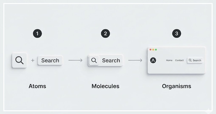
| Core Concept | Bio-inspired (Atoms $\rightarrow$ Molecules $\rightarrow$ Organisms) | Independent, interchangeable blocks | Unique, one-off solutions |
| Scalability | High (Best for large teams) | Medium (Good for predictable layouts) | Low (Creates technical debt) |
| Consistency | Enforced via strict hierarchy | Enforced via module reuse | Low consistency |
| Maintenance | Updates cascade globally | Module-level updates | High maintenance effort |
| Best For | Complex, multi-platform apps | Marketing sites, Dashboards | MVPs, Prototypes |
Establishing Typography and Color within the System
While space creates structure, typography and color create hierarchy.
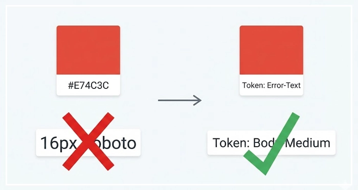
Your Design System must treat these as “tokens” rather than hard-coded values.
How does typographic scale impact hierarchy?
A rigid typographic scale ensures that headers and body text always maintain the correct visual weight relative to one another. This prevents the “clutter” of having 50 different font sizes across an application.
Why is semantic color usage important?
Don’t just name colors “Blue” or “Red.” Name them by function: “Action-Primary,” “Error-Text,” or “Background-Subtle.” This semantic naming convention helps developers apply the correct layout balance and visual weight without guessing.
[Internal Link: Color Theory for UI]
Mobile Responsiveness and Adaptation
A Design System must account for different viewports naturally. This is where your spatial rules are tested. Does your macro whitespace shrink proportionally on mobile? Do your touch targets maintain accessibility standards?
[Internal Link: Mobile UI Design Guide]
- Single Source of Truth: A Design System bridges the gap between design and development, ensuring consistency.
- Spatial Governance: codifying macro vs micro whitespace is as important as designing buttons.
- Efficiency: Reusable components lead to massive cognitive load reduction for users and faster build times for teams.
- Proximity is Key: Use design tokens to enforce the proximity principle and achieve automatic clutter reduction.
- Scale: Choose a methodology (like Atomic Design) that supports long-term growth.

1. What is the difference between a Style Guide and a Design System?
A style guide is a static document listing colors and logos. A Design System is a dynamic infrastructure including code components, documentation, and governance rules for product development.
2. How do I start building a Design System from scratch?
Start by auditing your current UI. Catalog existing components, identify inconsistencies, and standardize the foundational elements (colors, typography, spacing) before building complex components.
3. What tools are best for managing a Design System?
Figma is the industry standard for design, often paired with Storybook for documenting the code components (React, Vue, etc.) for developers.
4. How does a Design System improve SEO?
It improves page speed and Core Web Vitals by using cleaner, standardized code. Better UX and lower cognitive load also reduce bounce rates, signaling quality to search engines.
5. What is the Atomic Design methodology?
It is a framework created by Brad Frost that breaks interfaces down into five levels: Atoms, Molecules, Organisms, Templates, and Pages, facilitating scalable design.
6. How do I measure the success of a Design System?
Track metrics like “time to market” for new features, reduction in design/dev QA tickets, and adoption rates of system components across the product.
7. Can a small team benefit from a Design System?
Yes. Even a small “UI Kit” establishes layout balance and consistency early, preventing massive design debt as the company scales.
8. What are Design Tokens?
Design Tokens are the visual design atoms of the design system—specifically, they are named entities that store visual design attributes (like color, type, spacing) in a platform-agnostic format.
9. How often should a Design System be updated?
It is a living product. Updates should happen regularly (e.g., bi-weekly sprints) based on feedback from the product teams using it.
10. How does a Design System handle accessibility?
Accessibility rules (contrast, focus states, aria-labels) are baked into the components. This ensures that every instance of a component is accessible by default.
11. What is the cost of building a Design System?
The upfront cost is high in time and resources, but the long-term ROI regarding cognitive load reduction for teams and speed of shipping is exponential.
12. How do I get stakeholder buy-in for a Design System?
Focus on efficiency and money. Show how much time is wasted rebuilding the same components and how a system creates visual breathing room for innovation.
13. What is the role of a Design System Ops manager?
This role facilitates the workflow between designers and developers, manages the system’s governance, and ensures version control and documentation are maintained.
14. How does a Design System help with rebranding?
Since visual values are stored as tokens, a rebrand often requires changing values in one central file, which then propagates to the entire application instantly.
15. Why is documentation critical in a Design System?
Without documentation on “how” and “why” to use components (e.g., rules for macro vs micro whitespace), the system becomes just a sticker sheet that teams will misuse.
External Resources
Here are 3 credible sources to further explore this topic:
- Atomic Design by Brad Frost
- Nielsen Norman Group: The Law of Proximity
- Sparkbox: The Design Systems Survey


