- What is Color Theory in UI Design?
- Color Psychology and Emotion
- How does Color Psychology influence user behavior?
- Technical Foundations: Models and Rendering
- Structuring Your Palette
- How do you balance a Primary vs. Secondary Palette?
- Application Rules: Balancing Visual Weight
- Accessibility & Compliance for Color Theory
- Why is WCAG Color Compliance non-negotiable?
- How to use a Contrast Ratio Checker effectively?
- 1. What is the difference between additive and subtractive color theory?
- 2. How do I choose a color palette for a UI project?
- 3. What is the best color for Call-to-Action (CTA) buttons?
- 4. How does Dark Mode affect color theory?
- 5. What are complementary colors in UI?
- 6. What tools help with WCAG color compliance?
- 7. Can I use pure black in UI design?
- 8. What is a monochromatic color scheme?
- 9. How many colors should be in a UI palette?
- 10. What is color blindness simulation?
- 11. What is the importance of whitespace in color theory?
- 12. How do cultural differences affect color theory?
- 13. What is the difference between Tint and Shade?
- 14. Why is contrast ratio important for mobile design?
- 15. How do I hand off color codes to developers?
- External Resources
Inconsistent usage of color is the fastest way to erode trust in a digital product. To move beyond subjective preferences, designers must master Color Theory as a functional tool rather than just an artistic choice.
What is Color Theory in UI Design?
Color Theory in User Interface design is the logical framework for organizing and mixing colors to create effective visual communication. It encompasses the 60-30-10 rule for balance, WCAG color compliance for accessibility, and the creation of a semantic color system to guide user behavior and emotional response.
Effective UI requires more than picking a pretty palette. It requires a rigorous adherence to accessibility standards using a contrast ratio checker. It demands a deep understanding of technical models like HSL vs RGB to ensure consistency across devices.
Whether you are defining a primary vs secondary palette or leveraging color psychology keywords to influence conversion, this guide covers the engineering behind the art. By the end of this post, you will understand how to orchestrate color to improve usability and brand perception.
The Science of Color : Psychology and Emotion
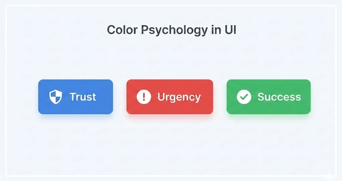
How does Color Psychology influence user behavior?
Color psychology is the study of how colors affect human mood and decision-making. In UI design, specific hues function as shorthand for interaction patterns.
- Blue: Trust, security, and stability (common in Fintech).
- Red: Urgency, error, or excitement (vital for alerts or clearance sales).
- Green: Success, growth, and validation.
However, context is critical. A red button might signify “Delete” in a settings menu but “Buy Now” on an e-commerce site. Color psychology keywords must align with the user’s mental model of the interface.
[Internal Link: User Psychology in UX]
According to research by the Institute for Color Research, users make a subconscious judgment about a product within 90 seconds of initial viewing. Up to 90% of that assessment is based on color alone.
[Internal Link: Branding for Interfaces]
Technical Foundations: Models and Rendering
HSL vs. RGB: Which color model is best for UI?
HSL (Hue, Saturation, Lightness) is generally the superior model for UI design compared to RGB or HEX. HSL aligns with how humans perceive color changes, making it easier to build consistent tonal variations.
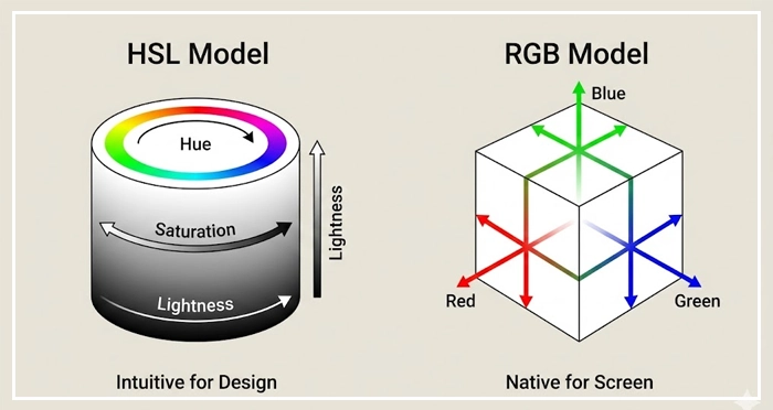
When building a design system, HSL allows you to keep the Hue value distinct while mathematically adjusting Lightness to create hover states or borders.
Color Model Comparison Table
| Feature | HSL (Hue, Saturation, Lightness) | RGB (Red, Green, Blue) | HEX (Hexadecimal) |
| Primary Use | UI Design & System creation | Digital Screen Rendering | Code hand-off & Web CSS |
| Human Readable? | Yes (Intuitive) | No (Abstract) | No (Cryptic) |
| Pros | Easy to generate semantic scales | Native to screen hardware | Universally supported standard |
| Cons | CSS support was historically lower | Hard to adjust intuitively | Impossible to guess variations |
| Best For | Designing Palettes | Final Export | Development Handoff |
Structuring Your Palette
Why is a Semantic Color System essential?
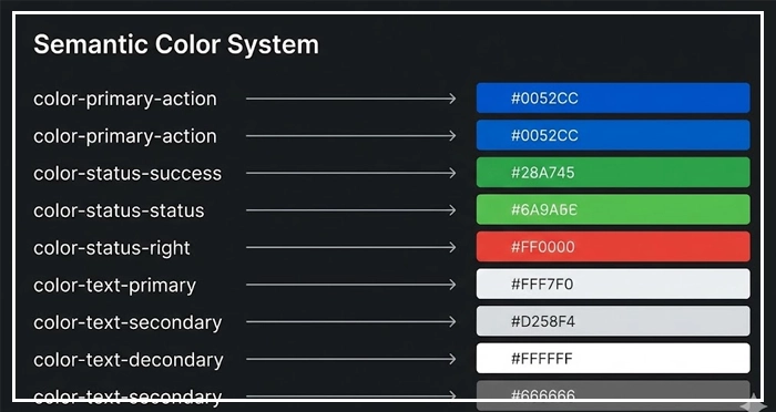
A Semantic Color System assigns names to colors based on their function (e.g., color-action-primary, color-danger) rather than their appearance (e.g., dark-blue, bright-red). This decoupling ensures that design tokens remain scalable.
If you rebrand, you only change the value of the token. You do not have to hunt down every instance of “Blue” in your codebase.
[Internal Link: Design Systems Guide]
How do you balance a Primary vs. Secondary Palette?
Your primary palette consists of your brand colors and creates the dominant identity of the interface. This usually includes one main brand color and neutral shades for text and backgrounds.
Your secondary palette supports the primary colors. It includes:
- Accents: For emphasis.
- Functional Colors: Semantic states for success, warning, error, and information.
Avoid overusing the secondary palette. It should only appear when a specific user action or system status requires it.
[Internal Link: Dark Mode Design Guide]
Application Rules: Balancing Visual Weight
What is the 60-30-10 Rule?
The 60-30-10 rule is a timeless interior design principle adapted for UI to ensure visual balance.
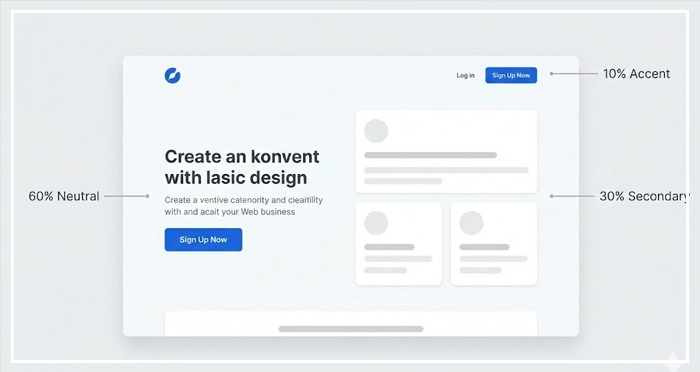
- 60% Neutral: The background and negative space (White, Grey, or Black).
- 30% Secondary: The typography, cards, or subtle graphical elements.
- 10% Primary/Accent: Call-to-Action (CTA) buttons and key interactive elements.
This ratio prevents cognitive overload. It guides the user’s eye naturally to the 10%—the action you want them to take.
Managing Contrast and Typography
Color does not exist in a vacuum; it relies on typography for communication. Text legibility is heavily dependent on the background color.
[Internal Link: Typography Best Practices]
Ensure that your body text is never pure black (#000000) on pure white (#FFFFFF). This creates eye strain. Use a dark grey (e.g., #121212) to soften the contrast while maintaining readability.
Accessibility & Compliance for Color Theory
Why is WCAG Color Compliance non-negotiable?
WCAG Color Compliance refers to adhering to the Web Content Accessibility Guidelines. Failing to meet these standards excludes users with visual impairments and opens your organization to legal risk.
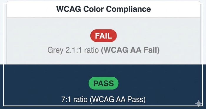
WCAG 2.1 Level AA requires a contrast ratio of at least:
- 4.5:1 for normal text.
- 3:1 for large text and UI components.
[Internal Link: Accessibility Audit Checklist]
How to use a Contrast Ratio Checker effectively?
A contrast ratio checker is a tool that mathematically compares the luminance of the foreground color against the background color. Do not rely on your eyes.
Many color combinations, such as grey text on a light grey background, often fail compliance despite looking “aesthetic.” Always validate your primary vs secondary palette choices against a checker during the wireframing phase, not just before launch.
- Function over Form: Treat Color Theory as a usability tool, not just decoration.
- The 60-30-10 Rule: Use this ratio to manage visual hierarchy and guide user attention.
- Semantic Systems: Name colors by function (e.g.,
error-state) to future-proof your design system. - Accessibility First: Always use a contrast ratio checker to meet WCAG color compliance.
- HSL for Design: Use the HSL model for creating consistent tonal variations and palettes.
1. What is the difference between additive and subtractive color theory?
Additive color (RGB) uses light to create color on screens, where mixing all colors creates white. Subtractive color (CMYK) uses ink for print, where mixing all colors creates black.
2. How do I choose a color palette for a UI project?
Start with the brand’s primary color, then use a tool like Adobe Color to generate complementary or analogous harmonies. Test these against the 60-30-10 rule for balance.
3. What is the best color for Call-to-Action (CTA) buttons?
There is no single “best” color, but the CTA must have the highest contrast relative to the rest of the page. Red and Green are common, but the key is isolation and prominence.
4. How does Dark Mode affect color theory?
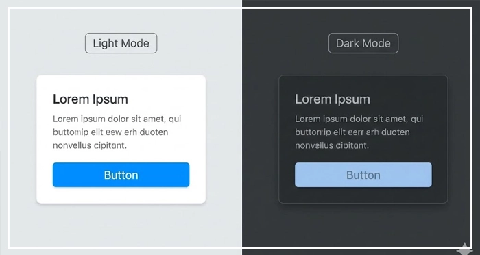
Dark mode requires desaturating bright colors to prevent eye strain. You cannot simply invert the colors; you must use lighter surfaces to denote elevation rather than shadows.
5. What are complementary colors in UI?
Complementary colors sit opposite each other on the color wheel (e.g., Blue and Orange). They create maximum contrast and are best used for highlighting critical alerts or notifications.
6. What tools help with WCAG color compliance?
Tools like the Stark plugin for Figma, WebAIM’s contrast checker, and Google Chrome’s Lighthouse audit tool are industry standards for verifying accessibility.
7. Can I use pure black in UI design?
Avoid pure black (#000000). It creates high eye strain when paired with bright white and causes “smearing” on OLED screens. Use dark greys like #121212.
8. What is a monochromatic color scheme?
A monochromatic scheme uses a single base hue and varies its saturation and lightness. It is the safest choice for creating a clean, cohesive interface.
9. How many colors should be in a UI palette?
Keep it minimal. A standard palette needs 1-2 primary colors, 3-4 neutrals (greys), and 4 semantic utility colors (Success, Warning, Error, Info).
10. What is color blindness simulation?
This is the process of viewing your design through filters that mimic visual impairments (like Protanopia). It ensures your interface is usable for the 8% of men who are color blind.
11. What is the importance of whitespace in color theory?
Whitespace (negative space) acts as a buffer. It prevents colors from vibrating against each other and reduces visual noise, allowing the primary colors to stand out.
12. How do cultural differences affect color theory?
Colors carry different meanings globally. For example, White signifies purity in the West but mourning in some Eastern cultures. Always research your target locale.
13. What is the difference between Tint and Shade?
A Tint is a color mixed with white (increasing lightness). A Shade is a color mixed with black (reducing lightness). These are vital for creating button states (hover/active).
14. Why is contrast ratio important for mobile design?
Mobile screens are viewed in varying lighting conditions (direct sunlight, dark rooms). High contrast ratios ensure the UI remains legible in difficult environments.
15. How do I hand off color codes to developers?
Provide a design token list using Hex codes for values, but organize them semantically (e.g., Primary-500: #3B82F6). This bridges the gap between design and code.
External Resources
Here are 3 credible sources to further explore this topic:
- WebAIM: Contrast and Color Accessibility
- Material Design 3: The Color System
- Interaction Design Foundation: Color Theory for Designers


